Playing with b&w editing
Mar 22, 2022 18:22:27 #
uslsnb
Loc: USA
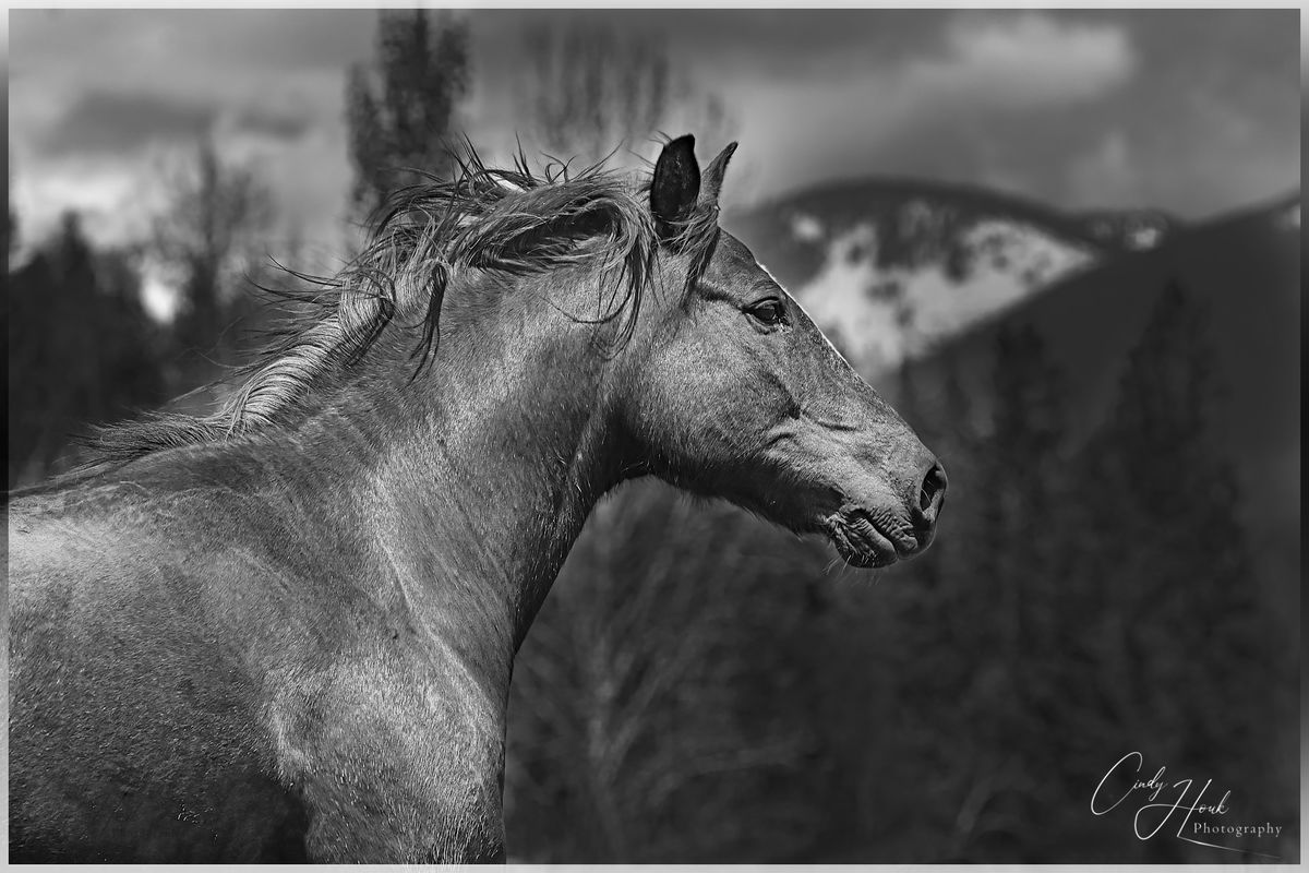
Absolutely stunning images Cindy. In the old days, we used colored lens filters to alter B&W contrast and tonal gradation. Photoshop includes all these traditional filters in the Black and White layer conversion utility. They are available under the "Presets" drop-down. Try using a green filter on the horse and you'll get better separation between him and the background. You can achieve similar results by adjusting the green slider as Wallen suggested.
Forgive me if you already knew these tools existed. Many people miss them because they're not immediately visible. Again, great photos and best of luck in your monochrome journey!
Forgive me if you already knew these tools existed. Many people miss them because they're not immediately visible. Again, great photos and best of luck in your monochrome journey!
Mar 22, 2022 19:09:55 #
In virtually every recent version of photoshop there are options for converting color to b & w. These options/filters mimic what b & w filters do. Plus there are red, yellow, green, cyan, blue & magenta sliders which you can also use. Usually the yellow and red sliders have the most impact on a b/w conversion.
Since the horse has a lot of red in it and the sky and mountains are mostly blue, you could have made the horse a little lighter and the background a little darker. This would have set the horse apart from the background a little more. Having said all this, your personal interpretation of the conversion is what counts most -- not necessarily some guy who you don't know, passing on technical information which may or may not be useful.
Since the horse has a lot of red in it and the sky and mountains are mostly blue, you could have made the horse a little lighter and the background a little darker. This would have set the horse apart from the background a little more. Having said all this, your personal interpretation of the conversion is what counts most -- not necessarily some guy who you don't know, passing on technical information which may or may not be useful.
Mar 22, 2022 19:30:29 #
Mar 22, 2022 19:43:06 #
Paul Murray wrote:
In virtually every recent version of photoshop the... (show quote)
Paul, you bring up a good point. I am glad I read your post.
Mar 22, 2022 19:54:29 #
CindyHouk wrote:
Thanks Bob...just messing around to see what I can learn in PS!
Keep on keeping' on with the learning. We all benefit from your education.
Mar 22, 2022 21:34:33 #

Thanks everyone for commenting and giving me some direction on how to make the horse shot better. I played around with it more today and I think I was able to get the horse to stand out more from the background.
Played around with the green sliders, also made additional adjustment layers for the background and played with the brightness/contrast then made another layer selecting just the horse and made an adjustment layer for brightness/contrast and sharpened it a little more. Like it better than the first one but still like the color version better.
Played around with the green sliders, also made additional adjustment layers for the background and played with the brightness/contrast then made another layer selecting just the horse and made an adjustment layer for brightness/contrast and sharpened it a little more. Like it better than the first one but still like the color version better.
Mar 22, 2022 21:42:39 #

CindyHouk wrote:
Thanks everyone for commenting and giving me some ... (show quote)
I think throwing more light on the horse helped. The one darker tree is still a bit distracting. I'm not good enough to know what to do with it.
Mar 22, 2022 21:58:18 #
AzPicLady wrote:
I think throwing more light on the horse helped. The one darker tree is still a bit distracting. I'm not good enough to know what to do with it.
The one at the top of his head...ya...I couldn't figure out how to get that lighter without creating a line around it that showed up!! That just means I have more learning to do

Mar 22, 2022 22:22:13 #
CindyHouk wrote:
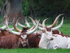
That's what the hubby says too....he really doesn't like B&W at all. That bull is amazing! He was the herd bull for a few years, haven't seen him this year yet, hopefully he made it and is just hiding out somewhere. Why do you never seen those guys in hunting season!! 
Hey, they don't get that big and bad by being stupid!
 I suspect that he doesn't have more than one or two breeding seasons left. He looks very healthy but making it through the breeding season takes a lot out of a top Bull. As he gets older he will eventually not be able to put enough weight back on to survive the winter. Very few Bulls are smart enough to let the younger Bulls take over at a certain point. Kinda like people!
Mar 22, 2022 23:06:47 #
RodeoMan
Loc: St Joseph, Missouri
I like the B&W elk. It reminds me of something I might have seen in an old issue of Sports Afield, Outdoor Life or Field & Stream. Good work.
Mar 23, 2022 03:25:53 #
I like them, Cindy. My first impression of the first pair is that there's insufficient contrast between the subject and background. That is NOT the case for the second pair, and I think that really helped the second B&W. In the color photo of the horse, the reddish coat contrasts with the background to separate them, but the general dark tones of the B&W blend together quite a bit. There are tools for adjusting the gray value of each color separately, and I would probably darken the background colors a bit more and lighten the horse. There's lots of detail in the horse which would show better if it were generally lighter. You might combine that with bumping up the contrast in the horse if the details don't show up when you brighten the subject. Just some thoughts. Definitely worth working on. Good luck. jak
Mar 23, 2022 04:47:05 #
CindyHouk wrote:
The one at the top of his head...ya...I couldn't figure out how to get that lighter without creating a line around it that showed up!! That just means I have more learning to do
Dodge & Burn or Screen with masking.
Mar 23, 2022 12:15:30 #
AzPicLady wrote:
I think throwing more light on the horse helped. The one darker tree is still a bit distracting. I'm not good enough to know what to do with it.
IMHO a step-in the correct direction. Now just that one tree. Remove it? I dunno...
Mar 24, 2022 14:12:48 #
CindyHouk wrote:
Nothing to do today so been playing in Photoshop. Edited these two for B&W....what do ya think? Good, bad, what would you do different, which one do you like better?
Two very nice shots! I like the b&w treatment as the critters to have more "drama" surrounding them. Great work thanx for sharing!
If you want to reply, then register here. Registration is free and your account is created instantly, so you can post right away.