Remove Color Cast in Photoshop
Apr 5, 2021 19:16:01 #
Apr 5, 2021 19:35:05 #

The original is better. There is a distinct lack of saturation.
May I post an alternative?
May I post an alternative?
Apr 5, 2021 20:00:11 #
Rongnongno wrote:
The original is better. There is a distinct lack of saturation.
May I post an alternative?
May I post an alternative?
Thanks for looking and commenting. I'll play with the saturation slider and see how I like it. I would like to see exactly what you mean. My information says "Feel free to modify my posts in any was as long as you tell me what and how you did it."
Apr 5, 2021 20:14:30 #
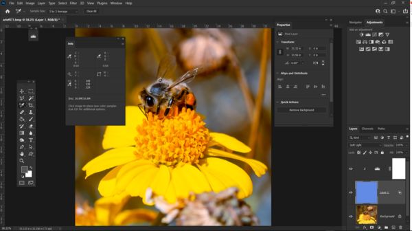
PS CC
Duplicate layer (adjust)
Average
Created a control point
Disabled background layer
Created a level adjustment, tied to the 'adjust' layer
Adjusted red, blue and green so that the average is grey
Inverted the layer
Enabled background layer
Changed the 'adjust' layer to 'soft light'
Adjusted opacity down to 50%
It sounds complex but it really is not.
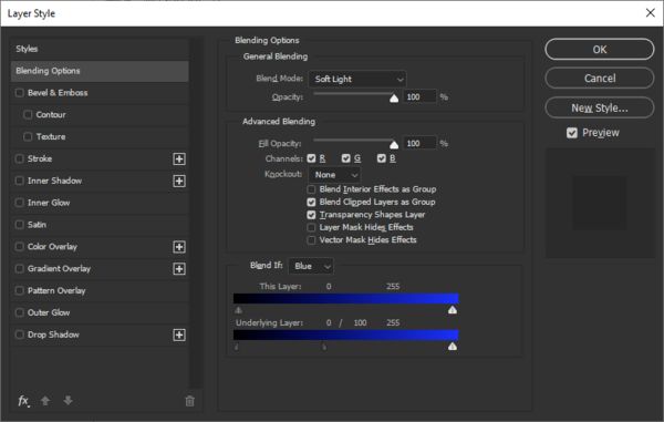
You can then use Blend IF (blue channel) to tone down the magenta in highlights.
Duplicate layer (adjust)
Average
Created a control point
Disabled background layer
Created a level adjustment, tied to the 'adjust' layer
Adjusted red, blue and green so that the average is grey
Inverted the layer
Enabled background layer
Changed the 'adjust' layer to 'soft light'
Adjusted opacity down to 50%
It sounds complex but it really is not.
You can then use Blend IF (blue channel) to tone down the magenta in highlights.
Apr 5, 2021 20:30:38 #

That is a very good video. I don't use Lightroom or Photoshop but I think I may be able to do something similar.
Apr 5, 2021 20:50:36 #

Apr 5, 2021 21:30:39 #
kpmac wrote:
I like #1 better, also.
I am bloodied but unbowed
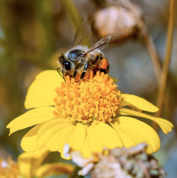
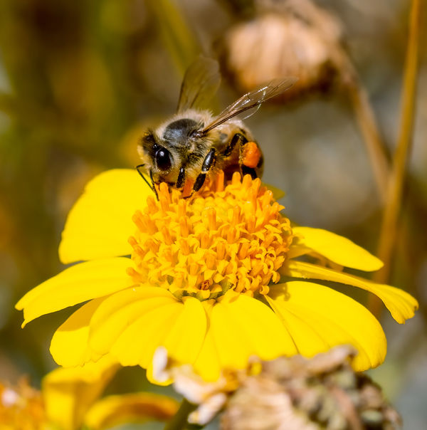
 I was trying to duplicate what I saw as I took the shot. Neither one is perfect but the second one is closer
Apr 5, 2021 22:31:58 #
Just watched the video, basically the same method.
Differences:
I almost never use overlay. It is a sledgehammer.
I also make the average grey using levels before inverting it.
The blend if is in addition to the opacity as with it, I can address a single color this way.
Differences:
I almost never use overlay. It is a sledgehammer.
I also make the average grey using levels before inverting it.
The blend if is in addition to the opacity as with it, I can address a single color this way.
Apr 6, 2021 11:28:59 #

I seem to like the original post although I can't explain specifically why.
Apr 6, 2021 14:47:34 #
EddieE
Loc: Dallas, TX
I tend to do something similar to the video, but do not use the entire picture for the sample. I made a copy layer from the semi-neutral area between the back of the bee and the stem. Averaged that sample and then filled the layer with a brush of that average color. Inverted, overlayed, and dropped the opacity a bit.
Apr 6, 2021 15:17:15 #
EddieE wrote:
I tend to do something similar to the video, but do not use the entire picture for the sample. I made a copy layer from the semi-neutral area between the back of the bee and the stem. Averaged that sample and then filled the layer with a brush of that average color. Inverted, overlayed, and dropped the opacity a bit.
I think I am beginning to see the reasons so many people like the first one.
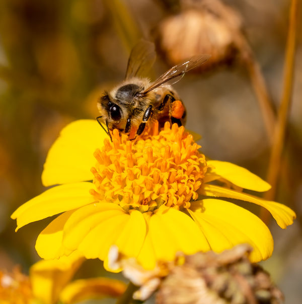
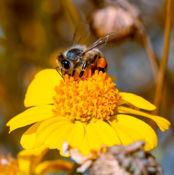
 The post is of a flower with a bee on it with a slightly out of focus background. The first one has a decidedly warmer tone which I agree is appropriate for that image. Had I cropped it down to make the image just the bee and made the image a macro accurate color would have been more appropriate.
Apr 6, 2021 15:18:01 #
Curmudgeon wrote:
I think I am beginning to see the reasons so many people like the first one. The post is of a flower with a bee on it with a slightly out of focus background. The first one has a decidedly warmer tone which I agree is appropriate for that image. Had I cropped it down to make the image just the bee and made the image a macro, accurate color would have been more appropriate.
The post is of a flower with a bee on it with a slightly out of focus background. The first one has a decidedly warmer tone which I agree is appropriate for that image. Had I cropped it down to make the image just the bee and made the image a macro, accurate color would have been more appropriate.Apr 6, 2021 22:56:44 #

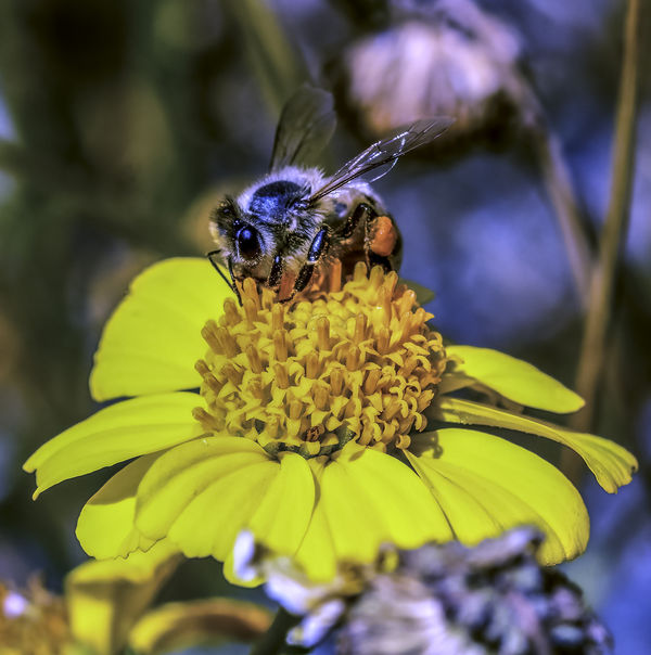
I'll pitch in on this one and run my usual hue correction process on the photograph. The concept is to find the arithmetic mean of the R, G, and B components of the image. Then, determine the correction to place those values at R,G,B= 127, 127, 127. Here's my result.
--Bob
--Bob
Curmudgeon wrote:
From Tony Morganti https://www.youtube.com/watch?v=Fb-Nh-5tl8I. Works for me.

Apr 7, 2021 00:56:13 #
Thanks for posting Bob. Yours seems to have a decided blue cast. The bee was black when I first observed it and in my original shot
Apr 7, 2021 03:48:47 #
Curmudgeon wrote:
From Tony Morganti https://www.youtube.com/watch?v=Fb-Nh-5tl8I. Works for me.
I watched Morganti's video and read the methods posted here. In PS, there's always many different ways to accomplish a task, from very simple to very complicated. Bob had one of the simpler method and does an amazing job on more than 90% of all my images. The problem with this image is that there's a lot of highly saturated yellow. Averaging the entire image to neutral gray requires adding a lot of blue (the opposite of yellow) to compensate.
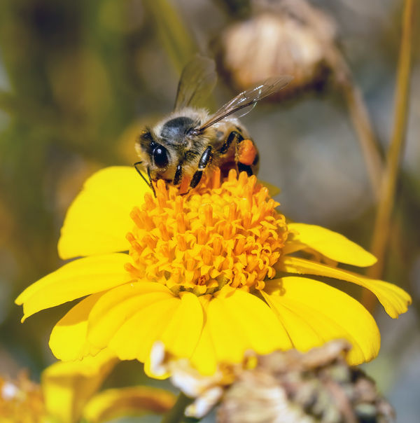
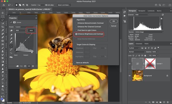
But there are other ways of color correcting in PS. The simplest method is to let PS do it automatically. This works most of the time. The image I attached was done in two steps.
1) add a curves layer and select auto to color correct. If that doesn't work, then press option (alt on a PC) and select auto to bring up more color correction options. For my taste, I used the first option in the additional option menu.
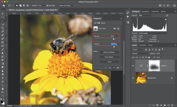
2) I felt the yellow in the flower was a little muted, so I created a mask, masking the yellow flower and its pistils.
You can adjust how much of the color correction to apply to the image using the layer opacity. You can further reduce how much color correction to applied to the flower by adjusting the density of the mask.
Hope this helps
Mike
(Download)
add and adjust the auto color correction to the image
(Download)
adjust the auto color correction to the flower
(Download)
If you want to reply, then register here. Registration is free and your account is created instantly, so you can post right away.