How much background is enough background
Dec 19, 2020 19:53:29 #

bleirer wrote:
Here is a nice video using tilt-shift blur in photoshop. Something to add to the arsenal. https://youtu.be/m_Qk8QsLbAs
This is a good channel to subscribe to: photoshop training channel. You get another vid in the email every couple of weeks, always something I didn't know how to do. Another good one is piximperfect.
This is a good channel to subscribe to: photoshop training channel. You get another vid in the email every couple of weeks, always something I didn't know how to do. Another good one is piximperfect.
Thanks bleire. I'll check them out
Dec 19, 2020 20:20:20 #

WDCash wrote:
Longshadow, My wife agrees with you.
Thanks
Thanks
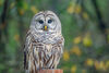
The blue and the green just seem easier on the eye as a background when focused on the bird.
Dec 20, 2020 08:42:10 #

While I like the "in" and "out" of focus work in the second and third, I like the colours in the background of #1 better.
Dec 20, 2020 15:18:16 #
AzPicLady wrote:
While I like the "in" and "out" of focus work in the second and third, I like the colours in the background of #1 better.
Thanks
And thanks for your thoughts
Dec 20, 2020 19:50:39 #
Bankshot
Loc: Henderson, NV, USA
I like the first one, because the Heron is more defined from the background. I think all the backgrounds are fine!
Dec 20, 2020 19:51:01 #
Bankshot
Loc: Henderson, NV, USA
I like the first one, because the Heron is more defined from the background. I think all the backgrounds are fine!
Dec 20, 2020 19:51:32 #
Bankshot
Loc: Henderson, NV, USA
I like the first one, because the Heron is more defined from the background. I think all the backgrounds are fine!
Dec 21, 2020 16:13:19 #
WDCash wrote:
I have been watching instructional vids on wildlif... (show quote)
GBHs make great subjects. Background should please you first! Thanx for sharing and happy holidaz!
Dec 21, 2020 18:31:42 #
Sinewsworn wrote:
GBHs make great subjects. Background should please you first! Thanx for sharing and happy holidaz!
Thanks Timothy.
Merry Christmas
Dec 21, 2020 18:32:35 #
Bankshot wrote:
I like the first one, because the Heron is more defined from the background. I think all the backgrounds are fine!
Thanks Bankston.
Dec 21, 2020 19:10:10 #

No matter what background you use, that heron with the beady yellow eyes looks like he has a great startle response... I like the third.
Dec 21, 2020 20:18:04 #

Dec 21, 2020 20:42:13 #
joecichjr wrote:
No matter what background you use, that heron with the beady yellow eyes looks like he has a great startle response... I like the third.
Thanks Joe,
We woke him up.
Dec 23, 2020 07:10:38 #

To me, the second one is best. The dull grey bird stands out better against the more colorful background. The third image looks rather muddy, dull foreground and background. Probably adding some noise to the background would help, since your subject has noise and your substituted background does not.
Dec 23, 2020 10:48:40 #
Dan Thornton wrote:
To me, the second one is best. The dull grey bird stands out better against the more colorful background. The third image looks rather muddy, dull foreground and background. Probably adding some noise to the background would help, since your subject has noise and your substituted background does not.
Thanks for your thoughts Dan
If you want to reply, then register here. Registration is free and your account is created instantly, so you can post right away.