How much background is enough background
Dec 19, 2020 16:30:02 #

I have been watching instructional vids on wildlife photography. There seems to be a general consensus that less background
is preferable and that what background there is should be out of focus.
I'm experimenting with what I find to be my own version of the "buttery background". I'm finding I prefer, I think, a bit Chunky vs creamy.
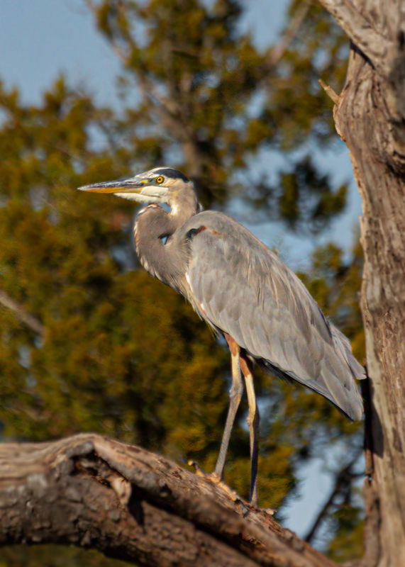
I found this Heron napping in a tree when I was looking for a dead tree for another background.
Image 1 was a quick poor edit done in LR with brush tool applied unsharpening. Something I no longer plan to use.
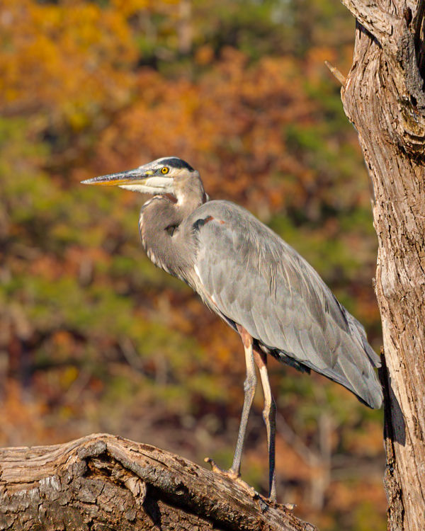
Vr. 2 was masked and layered out in PS and a new background applied. After some reflection I decided the dead tree was too bold so I layered the tree out. Then altered the tree with a couple adjustment layers. Afterwards I decided the background itself was too colorful so I toned that down as well.
Photoshop seemed very confusing to me for a while. Now I think I'm starting to get a handle on its possibilities. I think, for me, beginning to think of what might be done, or possible to do, turned on a switch to learning PS. I still have a lot to learn, just getting started.
is preferable and that what background there is should be out of focus.
I'm experimenting with what I find to be my own version of the "buttery background". I'm finding I prefer, I think, a bit Chunky vs creamy.
I found this Heron napping in a tree when I was looking for a dead tree for another background.
Image 1 was a quick poor edit done in LR with brush tool applied unsharpening. Something I no longer plan to use.
Vr. 2 was masked and layered out in PS and a new background applied. After some reflection I decided the dead tree was too bold so I layered the tree out. Then altered the tree with a couple adjustment layers. Afterwards I decided the background itself was too colorful so I toned that down as well.
Photoshop seemed very confusing to me for a while. Now I think I'm starting to get a handle on its possibilities. I think, for me, beginning to think of what might be done, or possible to do, turned on a switch to learning PS. I still have a lot to learn, just getting started.
Dec 19, 2020 16:31:24 #
Dec 19, 2020 16:33:35 #

Great photo of GBH. As for the background, any of the three look ok to me.
Dec 19, 2020 16:36:53 #

I like the first shot the most.
(Concentrating on the bird and not the limb or background.)
(Concentrating on the bird and not the limb or background.)
Dec 19, 2020 16:37:19 #

Dec 19, 2020 16:37:54 #
Dec 19, 2020 16:43:59 #

Two thoughts:
1) Have your 1/3 guides active when cropping. They'll help you position and 'feel' how to place the subject within the frame. Try for the subject's eye on one of the 1/3 guides and / or the horizontal or vertical guides through the image.
2) Sharing digital images tends to force a tight crop. There's no compelling reason to look further at a too-small-in-frame subject. A tight crop where the subject is nearly exploding out of the frame is a better viewing experience.
Dec 19, 2020 16:44:37 #
Here is a nice video using tilt-shift blur in photoshop. Something to add to the arsenal. https://youtu.be/m_Qk8QsLbAs
This is a good channel to subscribe to: photoshop training channel. You get another vid in the email every couple of weeks, always something I didn't know how to do. Another good one is piximperfect.
This is a good channel to subscribe to: photoshop training channel. You get another vid in the email every couple of weeks, always something I didn't know how to do. Another good one is piximperfect.
Dec 19, 2020 17:04:12 #
Cany143
Loc: SE Utah
I think you're already well aware of what I'm going to say... because with each iteration you corrected for....
#1 is disconcerting. All (but the feet/legs) of the heron is fine, but de-focusing the branch and the tree trunk --that would lie in the same general plane of focus-- detracts from the image overall. Secondarily, while the (appropriately) out-of-focus background trees might arguably be a bit too deep color-wise, a darkish area in the background toward the back of the heron's head and neck decreases the spatial separation you'd otherwise probably want between the bird and the background.
#2 is greatly improved. The heron (that is, all the heron, including its legs and feet) AND the plane of focus branch and tree trunk are back in natural register. Having swapped out the out of focus background might or might not have been for the best (likely a better idea to have the more uniform tones in the unbroken foliage than the broken warm toned foliage competing with the cool toned sky seen in the pre-replaced original #1 image), but that's an entirely subjective call. At issue is the intensity/saturation of the background. It competes negatively.
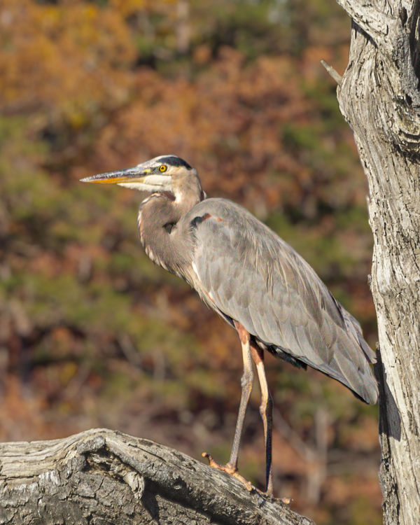
And then in #3, the issues mentioned above have been eliminated by doing little more than having brought the background intensity down a touch.
Half a dozen or more ways to have accomplished any or all of the above in either Lr or Ps singly, or the two used in conjunction as they're meant to be effectively used.
You done good.
<addendum: No, I did not address your crop or the resulting slight decrease in the total 'volume' of your image/background. Those are largely moot issues.>
#1 is disconcerting. All (but the feet/legs) of the heron is fine, but de-focusing the branch and the tree trunk --that would lie in the same general plane of focus-- detracts from the image overall. Secondarily, while the (appropriately) out-of-focus background trees might arguably be a bit too deep color-wise, a darkish area in the background toward the back of the heron's head and neck decreases the spatial separation you'd otherwise probably want between the bird and the background.
#2 is greatly improved. The heron (that is, all the heron, including its legs and feet) AND the plane of focus branch and tree trunk are back in natural register. Having swapped out the out of focus background might or might not have been for the best (likely a better idea to have the more uniform tones in the unbroken foliage than the broken warm toned foliage competing with the cool toned sky seen in the pre-replaced original #1 image), but that's an entirely subjective call. At issue is the intensity/saturation of the background. It competes negatively.
And then in #3, the issues mentioned above have been eliminated by doing little more than having brought the background intensity down a touch.
Half a dozen or more ways to have accomplished any or all of the above in either Lr or Ps singly, or the two used in conjunction as they're meant to be effectively used.
You done good.
<addendum: No, I did not address your crop or the resulting slight decrease in the total 'volume' of your image/background. Those are largely moot issues.>
Dec 19, 2020 17:04:25 #

Dec 19, 2020 19:43:10 #
CHG_CANON wrote:
Two thoughts:
1) Have your 1/3 guides active when cropping. They'll help you position and 'feel' how to place the subject within the frame. Try for the subject's eye on one of the 1/3 guides and / or the horizontal or vertical guides through the image.
2) Sharing digital images tends to force a tight crop. There's no compelling reason to look further at a too-small-in-frame subject. A tight crop where the subject is nearly exploding out of the frame is a better viewing experience.
1) Have your 1/3 guides active when cropping. They'll help you position and 'feel' how to place the subject within the frame. Try for the subject's eye on one of the 1/3 guides and / or the horizontal or vertical guides through the image.
2) Sharing digital images tends to force a tight crop. There's no compelling reason to look further at a too-small-in-frame subject. A tight crop where the subject is nearly exploding out of the frame is a better viewing experience.
Paul,
Thanks,
I was trying to stay at or close to a 2x3 ratio. At least I think that was what I was thinking. Seemed a good idea at the time but you are correct.
Dec 19, 2020 19:47:00 #
Cany143 wrote:
I think you're already well aware of what I'm goin... (show quote)
Thanks Cany.
I appreciate you putting that all into words.
I started off, with v3, thinking of bringing the tree to an almost driftwood look, ant the tree background more drained of color. But it seemed, to me, at that moment, to feel about right.
Dec 19, 2020 19:50:52 #
ShelbyDave wrote:
Great photo of GBH. As for the background, any of the three look ok to me.
Thanks Dave,
I almost missed the GBH. Took several shots of the tree from a distance. I was focusing on the tree and its surroundings. The Heron was facing away. As I put the boat into gear my wife said mentioned the Heron. I said, "What Heron, there was a Heron in the tree?"
Dec 19, 2020 19:51:43 #
Longshadow wrote:
I like the first shot the most.
(Concentrating on the bird and not the limb or background.)
(Concentrating on the bird and not the limb or background.)
Longshadow, My wife agrees with you.
Thanks
Dec 19, 2020 19:52:29 #
If you want to reply, then register here. Registration is free and your account is created instantly, so you can post right away.