Looking for Critique
Oct 2, 2020 09:12:30 #

If it were a perfect world. . . . and of course, it isn't. I like the log in the foreground. It's really interesting and makes for nice foreground material. The bog sort of goes with it, and it's nice. The turned trees in the background are lovely with just the right amount of colour. The plants (grass? ground cover?) colour is really nice and quite interesting. The dead trees between me and the turned trees is a real turn-off for me. And I actually like dead trees! The sky is pretty blah, and I love brilliant blue skies. The cloud is nice, but it sort of gets lost in the colour of the sky.
I'm not good at PP, so I have no clue what you might could do with this one. If it's possible to recreate the image, I'd try to get beyond the dead trees physically to shoot the turned ones. But then you'd be missing the log. Well, it's not a perfect world. Perhaps the reason for this image is to force us to find the beauty amid the unbeauty.
I'm not good at PP, so I have no clue what you might could do with this one. If it's possible to recreate the image, I'd try to get beyond the dead trees physically to shoot the turned ones. But then you'd be missing the log. Well, it's not a perfect world. Perhaps the reason for this image is to force us to find the beauty amid the unbeauty.
Oct 2, 2020 11:30:08 #

Once again, it seems that it is very hard to disagree with Linda's opinions. She has a very good eye and she is a great photographer. This is my personal view and as Linda said, the vision of others is not necessary like mine.
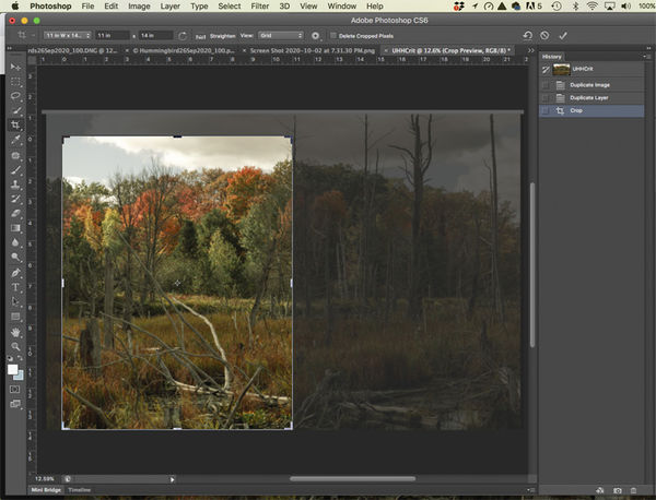
I see chaos in this image. There is no clear center of interest although the colored trees in the background command attention. In my humble opinion a change in the composition could make it different, perhaps more eye catching. Those colors need contrast and a bit of saturation to make them eye popping. Consider that warm colors attract the eye and you do not want those colors to look dull.
This is my version. I am not saying this is the best that can be done since others could have a better approach than mine. The image was cropped to taste, colors saturated and contrast added.

Oct 2, 2020 12:56:11 #
Oct 2, 2020 19:41:03 #

BooIsMyCat wrote:
What could be done to make this more of an eye-catcher?
This is one idea...
Oct 3, 2020 11:01:41 #
BooIsMyCat
Loc: Somewhere
camerapapi wrote:
Once again, it seems that it is very hard to disag... (show quote)
WAY overdone for my tastes but, thanks for the input.
If you want to reply, then register here. Registration is free and your account is created instantly, so you can post right away.