Looking for Critique
Oct 1, 2020 18:02:42 #
Oct 1, 2020 18:10:04 #

BooIsMyCat wrote:
What could be done to make this more of an eye-catcher?
if you reload the image and check the store original box so we can enlarge the photo, it would help to get a better look

Oct 1, 2020 18:15:54 #
Oct 1, 2020 18:31:29 #
BooIsMyCat
Loc: Somewhere
tdozier3 wrote:
if you reload the image and check the store original box so we can enlarge the photo, it would help to get a better look
done
Oct 1, 2020 18:32:04 #
BooIsMyCat
Loc: Somewhere
rthurlow wrote:
I you got more of the water and the fallen tree it might have had more interest.
There was no more water... just a puddle and muck in that lower-right area.
Oct 1, 2020 18:35:47 #

Next time post it in the Photo Analysis or For Your Consideration sections. If your concern is what can be done with this particular shot, the Post Processing section is helpful
Oct 1, 2020 18:40:20 #

While I tend to include more in my landscapes than is probably wise, it's easier for me to critique someone else's than my own 😊
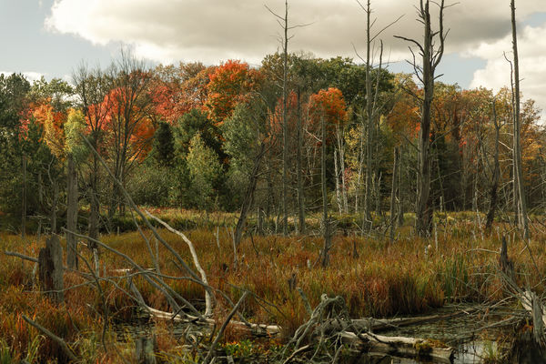
I don't know what you were drawn to (what is the subject?). There are pretty autumn colors, but I have to work my way through dead trees to see them. The dead trees could be a compelling image, but the depth of field, focal length and light cause them to be a bit lost here. It's also unfortunate that their tops are cut off. That leads my eye out of the frame if I'm studying them. I'm curious if you tried other compositions, including vertical of just the right half of the scene?
Overall, the lighting and colors are similar throughout, as is the size of the elements, so I don't find a place to start or end my journey through the frame. If you want to work with this image rather than reshoot, try using just the right half, and significantly lighten the grasses under and in front of the dead trees and then use levels or curves to darken the midtone tree trunks.
If you use just the left side, you have the white branch kind of pointing us to the colored leaves that are sunlit. I would brighten the colored leaves and try to pull more detail from the clouds in the area where they are featureless. Shot in raw or jpg?
Thanks for the opportunity to offer opinions.
Oct 1, 2020 18:45:13 #
Oct 1, 2020 19:02:05 #
BooIsMyCat
Loc: Somewhere
Linda From Maine wrote:
While I tend to include more in my landscapes than... (show quote)
Thank you.
You made me think a bit.
I always shoot in raw because the jpg gets stored in the raw so, raw gives me both where jpg only gives me jpg.
Oct 1, 2020 19:08:51 #
BooIsMyCat wrote:
Any suggestions or observations I make are intended as simply food for thought. I try to remember that someone else's vision may not be my own 🤗Thank you. You made me think a bit...
Best to you Boo!
Oct 1, 2020 22:08:32 #
I would increase the saturation in the blue sky to start. Then use a bit of sharpening, followed by a small increase in the overall saturation and a bit more contrast. That should improve the textures in the wood and the extra blue would stop the eye from wandering out of the frame. I just came back from 3 days in one of our Provincial parks with lots of images which are quite similar, and have been using that sort of approach. Of course, as Linda says, we all "see" things differently. The main thing is that you have a nice sharp image to start with and only your imagination can limit the results! Stay well down under and keep on posting!
Oct 2, 2020 06:47:08 #

More POP! There is some good color here but, for me, the whole image is flat. Some folks here like to "go overboard" with PP color enhancing. I'm not advocating that. But personally, I like more contrast and brighter colors in landscapes. Don't know what camera you used but a tad less exposure during the shot would have helped.
Oct 2, 2020 07:57:13 #
AirWalter
Loc: Tipp City, Ohio
BooIsMyCat wrote:
What could be done to make this more of an eye-catcher?
I'm no expert, but there is something about this image that I'm attracted to. I like it the way it is. If anything, maybe the sky needs to "pop" a little more.
Oct 2, 2020 09:04:51 #

Linda From Maine wrote:
While I tend to include more in my landscapes than... (show quote)
LFM: what a wonderful and kindly evaluation. Good ideas, friendly information, and NICE way to address the issue, and image. My impression was much the same, but i went BLUNTLY to the fact that “I don’t see a reason for having TAKEN this picture.. My hat’s off to you for having such a NICE critique!!..RJM
Oct 2, 2020 09:11:39 #
digit-up wrote:
Thanks. As I mentioned in my follow-up comment to Boo, I try to remember that my own vision and tastes aren't necessarily (or often) someone else's. So, if I give negative feedback, I try hard to explain the why. That way the photographer can thoughtfully chew, swallow what's of value to them, and simply spit out the rest 😇LFM: what a wonderful and kindly evaluation. Good ideas, friendly information, and NICE way to address the issue, and image. My impression was much the same, but i went BLUNTLY to the fact that “I don’t see a reason for having TAKEN this picture.. My hat’s off to you for having such a NICE critique!!..RJM
If you want to reply, then register here. Registration is free and your account is created instantly, so you can post right away.