Clearing Storm
Jun 2, 2020 13:16:34 #

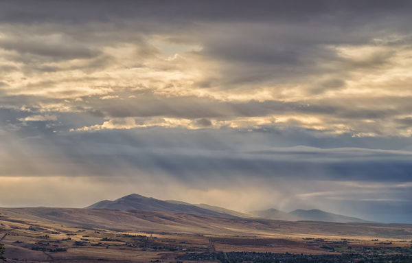
I'm posting two versions of the closer shot because I have not yet decided what colors I like best, nor how much detail I want. Perhaps you can help me? 
Feedback and suggestions welcomed on all. Many thanks for your time.

clearing3, on Flickr
.

clearing1, on Flickr
.

clearing2, on Flickr
Feedback and suggestions welcomed on all. Many thanks for your time.
clearing3, on Flickr
.
clearing1, on Flickr
.
clearing2, on Flickr
Jun 2, 2020 13:32:48 #
Jun 2, 2020 13:33:01 #
Clearing 3 has a certain mystery that is compelling. we watch the sunset over the Olympics nightly and so Clearing 2 is just a bit less than a tie. Your images are always terrific.
Jun 2, 2020 13:35:37 #
Jun 2, 2020 13:45:27 #

Jun 2, 2020 13:45:33 #

GeorgeK wrote:
FWIW I prefer the 2nd. For me there is an unpleasant blue cast to the 1st.
I agree that there is too much of a blue cast to the first and in my mind it's a toss up between the other two.I would like to have been able to see these images full screen and in greater detail on my 27" iMac.
Jun 2, 2020 13:58:02 #
Jun 2, 2020 14:06:26 #

Jun 2, 2020 14:26:02 #

I like the third one, but would like to see it with a little of the top layer of dark clouds cropped out.
Jun 2, 2020 14:52:21 #
Thank you all so much for your opinions and suggestions! It occurs to me that I should have named them in the order I was going to post them so there wouldn't be confusion over position vs. caption. Boy howdy 
Dana, you suggested a crop of sky. Scrolling down the page I think I agree with you. Thanks!
Flyguy, here is one of pics without re-sizing. It's unlikely you will be impressed A wobbly photographer not using a tripod, a 16 mp camera and a tendency to dislike anything that looks like "sharpening." And this particular case, it's a very long-distant view.
I try to make my photos be about light and mood and first impressions. Appreciate your interest.
Dana, you suggested a crop of sky. Scrolling down the page I think I agree with you. Thanks!
Flyguy, here is one of pics without re-sizing. It's unlikely you will be impressed
A wobbly photographer not using a tripod, a 16 mp camera and a tendency to dislike anything that looks like "sharpening." And this particular case, it's a very long-distant view.I try to make my photos be about light and mood and first impressions. Appreciate your interest.
Jun 2, 2020 15:28:07 #
They’re all very good, Linda, but number three would be my first choice followed by number one then number two. I think my final choice would depend on the room, lighting and colors where I hang it. Each one could be ideal in a given setting.
Jun 2, 2020 17:39:14 #
John Lawrence wrote:
Many thanks John!They’re all very good, Linda, but number three would be my first choice followed by number one then number two. I think my final choice would depend on the room, lighting and colors where I hang it. Each one could be ideal in a given setting.
Jun 2, 2020 18:07:53 #
Jun 2, 2020 18:39:33 #
Guyserman wrote:
Appreciate your visit, Guy, thanks! I didn't change anything with the rays; they are all Mother Nature's show I like them all. However the angle of the light rays seems unnatural.
There were a couple of very localized rain showers and the sun peeking through layers of clouds, so the light is pretty jumbled.
Jun 2, 2020 20:06:26 #

Your usual excellent landscapes often have that mysterious fog layer. I like the colors of the third version. Did you do much enhancement of the sky? It looks very natural. Excellent work!
Andy
Andy
If you want to reply, then register here. Registration is free and your account is created instantly, so you can post right away.