A matter of Choice - and your choice is ............()?
Apr 23, 2020 12:18:55 #
Apr 23, 2020 12:26:41 #
ggab
Loc: ?
My public apologies to Bob. I did not see his note regarding uploading images.
It is past my ability to remove the image.
I did report the post to Admin, requesting the image be removed.
There was certainly no disrespect meant
George
It is past my ability to remove the image.
I did report the post to Admin, requesting the image be removed.
There was certainly no disrespect meant
George
Apr 23, 2020 12:27:30 #

Apr 23, 2020 12:32:22 #
amfoto1
Loc: San Jose, Calif. USA
Honestly, I like them both! The color image is somewhat muted and that works well with the very formal, centered image.
The B&W image would work better with more "punch", in my opinion. I'd dial up the whites and overall contrast, and maybe deepen the greens with a red filter.
It also might be interesting to see what a "warmed" B&W version looked like (maybe a light sepia toning)....
Likewise, I wonder how it would look as a "cooler" B&W?
I'd show you what I mean, but I see your request for folks to not edit your images without permission. Let me know if you'd like me to try and show you what I mean.
These are just alternative "interpretations"... there's nothing at all wrong with either of them now! If I had to pick, I'd probably go with the color image. Of the two I think it "works best" with the understated colors and muted dynamic range. (It almost looks like a B&W shot that was colorized with pastels.)
I don't agree with some other responses about making the background solid black... at least not in the color version. In this case, I like the very slight, out of focus details that can be seen there.
Apr 23, 2020 12:40:50 #
Apr 23, 2020 14:59:00 #

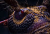
It is not always my intent to make my B&W images pop (those images I consider to be High Contrast Monochrome). I kept my contrast light on this particular image because I wanted to preserve as much of the detail in the veining of the flower as I could. Flowers petals are soft, so I was going for subtlety. When I upped the contrast or brightness, a large part of the flower became blown out - exactly what I did NOT want. This all comes down to subjective likes and dislikes. I will tell you that I liked the way this image has been presented.
Apr 23, 2020 15:44:23 #
I would go with the color version and maybe a different color background but not sure what color and if it should be solid or some texture. I would take some experimenting.
Apr 24, 2020 06:12:50 #

Apr 24, 2020 06:49:16 #

Apr 24, 2020 07:24:11 #

Bob Yankle wrote:
Yes?
#2 Bob.....it's just more alive and appealing.

Apr 24, 2020 08:39:05 #

Although I really like B&W images, the iris in color seems to be better in this case. The yellows add a great deal of detail you don't really see in the B&W version. So, fellow Carolinian, number 2 gets my vote.
Apr 24, 2020 08:57:18 #
Apr 24, 2020 08:59:56 #

Apr 24, 2020 09:18:39 #

#1... Tones, Texture, Imagination, Creativity, Thought.
Apr 24, 2020 09:20:08 #
. dang...still Uno though fo'me! The color is JUST another flower image that are prolific here on UHH....
If you want to reply, then register here. Registration is free and your account is created instantly, so you can post right away.