Really, I just can't decide.
Apr 19, 2020 10:21:30 #
bluezzzzz wrote:
Quote:I have two cropped versions of the same phot... (show quote)
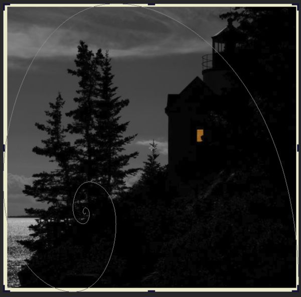
The more I look at that first image the better I like it! Good job! This is what my eye does when I look at it. Those treetops and clouds at the top are important, I believe.
Apr 19, 2020 10:36:07 #

The first is more appealing, nothing cut off, and the crop follows the natural step of the buildings..very nice!!
Apr 19, 2020 10:38:18 #

Hmmm. Used this site many times but can't figure out why it won't let me put reworked pictures some of you suggested in this reply. I cropped more off the horizontal version as several suggested, but that threw the rule of thirds right out the window. Longshadow I can't locate original you asked for. It was color, daytime, horizontal, with no light or woman's shadow in the window. Thanks to all for your replied.
Apr 19, 2020 10:54:35 #
AndyT wrote:
Hmmm. Used this site many times but can't figure out why it won't let me put reworked pictures some of you suggested in this reply. I cropped more off the horizontal version as several suggested, but that threw the rule of thirds right out the window. Longshadow I can't locate original you asked for. It was color, daytime, horizontal, with no light or woman's shadow in the window. Thanks to all for your replied.
Maybe I need to be in the main photography section in order to add posts??
Apr 19, 2020 12:46:58 #

# 1 has all the elements of the shot ...the moon lit ocean.. the trees all the way to the top .., the house with the silhouette of the women in the Window .., and the lighthouse .., the focus of the shot is not the women in the window .., she is desert to to the main body of the photograph as a whole to those looking at the picture .
Apr 19, 2020 13:33:19 #
Thanks to everyone taking the time to reply. You've given me things to think about. Stay well.
Apr 19, 2020 13:40:51 #
YNY
Loc: Youngstown NY (Western New York)
The first (square format) photo. I like the image of solitary person in the small window of the large light house. I think it emphasizes the solitariness of the person against the bulk of the lighthouse.
Apr 20, 2020 05:56:41 #
AndyT wrote:
I have two cropped versions of the same photo here that I'm going to submit to a local camera club competition. I like the square format because of it's composition, but then I like the horizontal one because it draws more attention to the woman sitting in the window. Which do you like better and think the judges might score higher?
2nd one is my choice
Apr 20, 2020 06:09:21 #
The first one. After the eye is attracted to the red square and the person in the window it wanders up to see what might be a lighthouse. The mass of the tree on the left balances the red square.
Apr 20, 2020 07:13:22 #

I prefer the square version. It has everything it needs, the tree, the water, the girl in the window. Anything else in the photo is extraneous. I believe, based on experience of judges’ comments, that they will prefer the square photo because it has everything it needs to tell the story.
Apr 20, 2020 07:22:55 #
Interesting tally. If I counted right 11 liked the landscape and 10 the square.
Apr 20, 2020 07:38:29 #

AndyT wrote:
I have two cropped versions of the same photo here that I'm going to submit to a local camera club competition. I like the square format because of it's composition, but then I like the horizontal one because it draws more attention to the woman sitting in the window. Which do you like better and think the judges might score higher?
# 2
Apr 20, 2020 08:01:52 #

AndyT wrote:
I have two cropped versions of the same photo here that I'm going to submit to a local camera club competition. I like the square format because of it's composition, but then I like the horizontal one because it draws more attention to the woman sitting in the window. Which do you like better and think the judges might score higher?
What I like about the square format is the addition structural detail of the building visible to the upper right. The landscape format needs to be cropped on the right side because there is nothing of interest in that black section which takes up a large portion of the photo. Of course, doing that turns it into another square format.
Apr 20, 2020 08:05:28 #
Apr 20, 2020 08:12:23 #

imagemeister wrote: - but I think I would crop a bit off the right side of the landscape - too much no information over there for my taste.
.
- but I think I would crop a bit off the right side of the landscape - too much no information over there for my taste. .
If you want to reply, then register here. Registration is free and your account is created instantly, so you can post right away.