Really, I just can't decide.
Apr 19, 2020 09:34:05 #
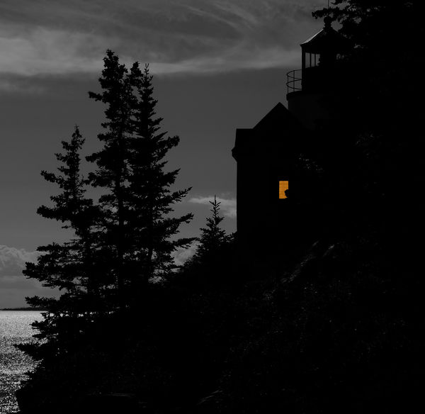
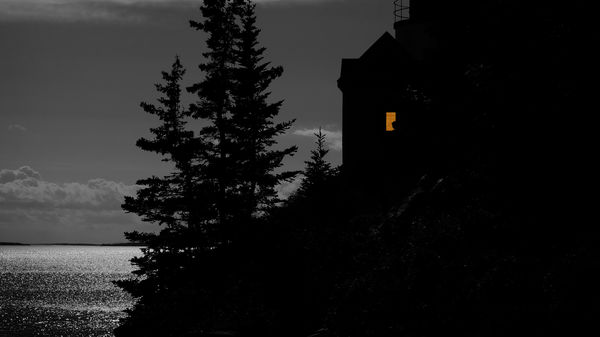
I have two cropped versions of the same photo here that I'm going to submit to a local camera club competition. I like the square format because of it's composition, but then I like the horizontal one because it draws more attention to the woman sitting in the window. Which do you like better and think the judges might score higher?


Apr 19, 2020 09:39:43 #
I prefer the landscape version because it provides more information about what the woman in the window is looking at. The square version does not do that for me, other than telling me the woman is looking at the tree, maybe.
Apr 19, 2020 09:43:45 #
Apr 19, 2020 09:45:28 #
Nalu wrote:
I prefer the landscape version because it provides more information about what the woman in the window is looking at. The square version does not do that for me, other than telling me the woman is looking at the tree, maybe.

 - but I think I would crop a bit off the right side of the landscape - too much no information over there for my taste.
 .
Apr 19, 2020 09:50:38 #
imagemeister wrote:
 - but I think I would crop a bit off the right side of the landscape - too much no information over there for my taste.
.

 - but I think I would crop a bit off the right side of the landscape - too much no information over there for my taste.
 .
That's what I was thinking also.
I like having more water in the shot, but would crop the right to get the window closer to a "third" mark.
Apr 19, 2020 09:56:09 #
imagemeister wrote:
 - but I think I would crop a bit off the right side of the landscape - too much no information over there for my taste.
.

 - but I think I would crop a bit off the right side of the landscape - too much no information over there for my taste.
 .
👍👍 Agree.
Apr 19, 2020 10:00:43 #
Unless there is a reason more on the left side, or if #2 is as much as you have, like most other commentators, less on the right in either case.
Apr 19, 2020 10:03:49 #
StanMac
Loc: Tennessee
imagemeister wrote:
 - but I think I would crop a bit off the right side of the landscape - too much no information over there for my taste.
.

 - but I think I would crop a bit off the right side of the landscape - too much no information over there for my taste.
 .
I agree with Larry’s comment.
Stan
Apr 19, 2020 10:07:45 #
Apr 19, 2020 10:10:09 #
Quote:I have two cropped versions of the same photo here that I'm going to submit to a local camera club competition. I like the square format because of it's composition, but then I like the horizontal one because it draws more attention to the woman sitting in the window. Which do you like better and think the judges might score higher?Unquote
I'll have to disagree with most of the posters today. I believe that the first image is the better, and a more complete composition. Cutting off the treetops in the second one just seems wrong to me.
Marshall
I'll have to disagree with most of the posters today. I believe that the first image is the better, and a more complete composition. Cutting off the treetops in the second one just seems wrong to me.
Marshall
Apr 19, 2020 10:12:27 #
Apr 19, 2020 10:16:06 #
AndyT wrote:
I have two cropped versions of the same photo here that I'm going to submit to a local camera club competition. I like the square format because of it's composition, but then I like the horizontal one because it draws more attention to the woman sitting in the window. Which do you like better and think the judges might score higher?
The composition of the first shot has better symmetry. You have cropped off the top of the tree in the second shot and the vast expanse of bright water in the lower left draws attention from the window and acts as a leading line to the cloud bank in the background. Also, the second shot has cropped out what appears to be a lighthouse in the upper right-hand part. I really can't tell what that is silhouetted in the lighted window but the window seems to be what your subject is and the first picture shows it better. Based on these observations I believe the first shot will get higher points. Good luck.
Apr 19, 2020 10:17:20 #
Linda Ewing
Loc: Lincolnshire,UK
I like the second one best, but I do think it should be cropped on the right side as there is nothing to attract the eye, just a tad it would be great.
Apr 19, 2020 10:18:00 #
Apr 19, 2020 10:18:21 #
If you want to reply, then register here. Registration is free and your account is created instantly, so you can post right away.


