If you had to choose ----
Feb 29, 2020 09:10:27 #

Linda From Maine wrote:
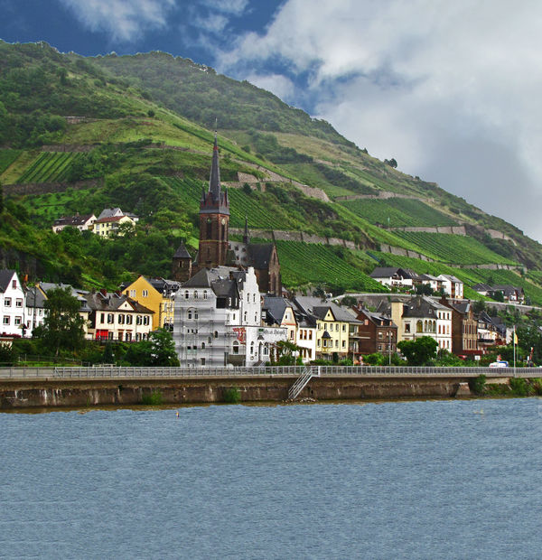
The center element in #1 kind of divides the image... (show quote)

Thank you, Linda for taking the time to put together a critique as wells suggestions for improvement. I value your opinion; you set a good example for all of us on UHH.
Feb 29, 2020 09:11:27 #
jackm1943 wrote:
I think #2 has a lot of potential but would require quite a lot PP, including cropping off much of he foreground, color toning, and maybe some softening of the very background. Good luck.
I agree with the others that #3 has a lot of potential also.
I agree with the others that #3 has a lot of potential also.
Thank you for your help. Your suggestions are well taken.
Feb 29, 2020 09:12:06 #
Longshadow wrote:
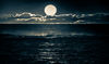
Even with the horizon artifacts in number two, I'd hang it on my wall.
Thank you for your attention.
Feb 29, 2020 09:13:51 #
Linda From Maine wrote:
That's not a bad idea; I've always thought that was a good shot. Thanks again.
Feb 29, 2020 09:16:19 #
CO wrote:
It would be #3 for me but I would crop away the sl... (show quote)
Thank you for your help; your suggestions are right on.
Feb 29, 2020 09:17:19 #
bbrown5154 wrote:
#2 but you need to crop the woman out on the right.
Not sure whats going on with #3 it looks "manipulated" like you added the sky from another shot, and the hillside resolution is off.
If so thats probably a big no no in your competition.
Not sure whats going on with #3 it looks "manipulated" like you added the sky from another shot, and the hillside resolution is off.
If so thats probably a big no no in your competition.
Thank you for your help.
Feb 29, 2020 09:18:29 #
Wanda Krack wrote:
#2, after a bottom crop, relatively heavy, and a slight crop on the right.
Thank you for your help.
Feb 29, 2020 09:19:22 #
angler wrote:
Three for me and I liked them all.
Thank you Jim. I value your opinion.
Feb 29, 2020 09:46:17 #
Linda From Maine wrote:
The center element in #1 kind of divides the image... (show quote)
Good eye Linda. I agree with you
Feb 29, 2020 10:22:57 #

The first one, as it has less blown-out clouds as the rest.
--Bob
--Bob
mffox wrote:
I'm new to landscape photo competition, so would appreciate a bit of guidance. If you had to choose one of these images for a competition, which would it be?
Thanks for your consideration.
Thanks for your consideration.
Feb 29, 2020 11:01:07 #

I hope it's OK. I took photo #3 and did an expand canvas and content aware fill in Photoshop to see how it would look if it wasn't cropped so tightly. Because I had to do the content aware fill in sections, the expanded portions are kind of choppy. I just wanted to see how it would be. The sliver of water at the bottom of the original is not enough to keep in - it becomes a little bit of a distraction. By having more water, it's worth including in the photo. Is your original shot cropped that tightly? If it's not, maybe you could crop not so tightly. Just my idea.
Feb 29, 2020 11:05:19 #

Linda From Maine wrote:
At ease, Marine. The OP and I have been corresponding regularly.

Feb 29, 2020 11:15:47 #
Linda From Maine wrote:
At ease, Marine. The OP and I have been corresponding regularly.
No problem. To me, who remembers pictures from 3 years ago and who took them?
Yankee Papa ...out.
Feb 29, 2020 11:21:36 #
Feb 29, 2020 12:37:05 #
ICN3S wrote:
#1 but crop off the right side and make it square!
?
To me the bush (tree) on the right gives the image depth.
If you want to reply, then register here. Registration is free and your account is created instantly, so you can post right away.