If you had to choose ----
Feb 28, 2020 20:24:23 #

I'm new to landscape photo competition, so would appreciate a bit of guidance. If you had to choose one of these images for a competition, which would it be?
Thanks for your consideration.
Thanks for your consideration.
Feb 28, 2020 20:28:54 #

Feb 28, 2020 20:43:39 #

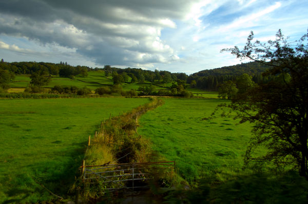
The center element in #1 kind of divides the image into two parts. Perhaps crop from the left side, making that element run closer to the edge of frame, and lift the shadows some. I sent you a pm.
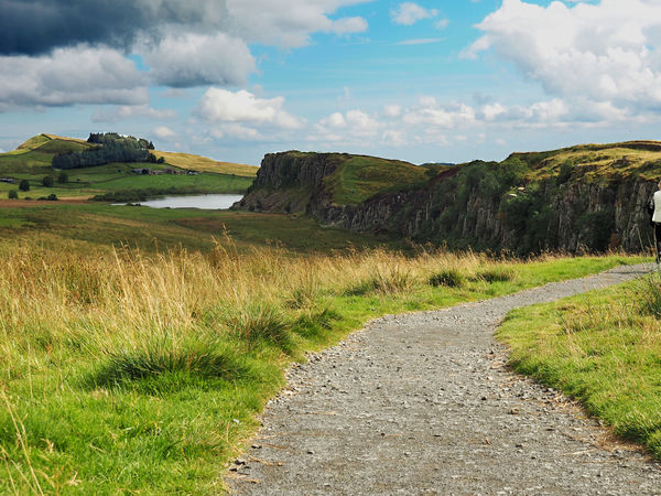
In #2 the gravel path takes up a lot of space but leads us out of the frame. A potentially interesting element - the cliffs - are in shadow. Zooming in, I see several editing issues with the sky where it meets the landscape, as well as a distinctive hard-brush attempt at lightening the distant group of trees. Crop out the sliver of person on the right.
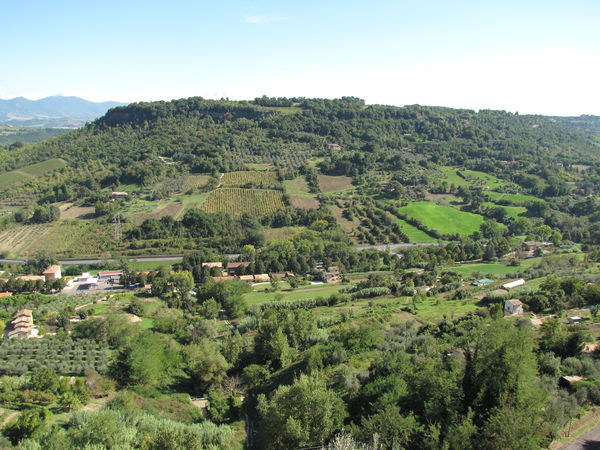
In #4 the landscape is very busy with lots of same-sized, same-color elements, much of which is due to the light (time of day). Perhaps consider cropping out some of the sky and a lot of the foreground? Work with curves or levels to try to separate tones a bit.
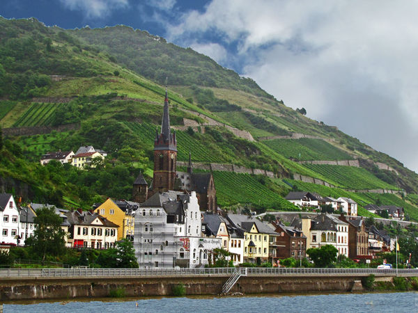
#3 could be awesome, but there is a distinctive white line where your sky meets the landscape, especially at the top left. You replaced the sky or did extensive editing?
For me the light was not your friend in any of these choices. Were the photos taken during a tour/trip when you didn't have the luxury of scouting or shooting in golden hour or appropriate time of day for shadows?
My own favorite landscapes have been a combination of right time (for example, just after sunrise or in clearing fog, or for autumn colors) and right place, or at a location I had visited before and was familiar with. They also represent many hundreds of miles of roaming the countryside over a five-year span
In #2 the gravel path takes up a lot of space but leads us out of the frame. A potentially interesting element - the cliffs - are in shadow. Zooming in, I see several editing issues with the sky where it meets the landscape, as well as a distinctive hard-brush attempt at lightening the distant group of trees. Crop out the sliver of person on the right.
In #4 the landscape is very busy with lots of same-sized, same-color elements, much of which is due to the light (time of day). Perhaps consider cropping out some of the sky and a lot of the foreground? Work with curves or levels to try to separate tones a bit.
#3 could be awesome, but there is a distinctive white line where your sky meets the landscape, especially at the top left. You replaced the sky or did extensive editing?
For me the light was not your friend in any of these choices. Were the photos taken during a tour/trip when you didn't have the luxury of scouting or shooting in golden hour or appropriate time of day for shadows?
My own favorite landscapes have been a combination of right time (for example, just after sunrise or in clearing fog, or for autumn colors) and right place, or at a location I had visited before and was familiar with. They also represent many hundreds of miles of roaming the countryside over a five-year span
Feb 28, 2020 20:53:14 #

mffox wrote:
I'm new to landscape photo competition, so would appreciate a bit of guidance. If you had to choose one of these images for a competition, which would it be?
Thanks for your consideration.
Thanks for your consideration.
I think #2 has a lot of potential but would require quite a lot PP, including cropping off much of he foreground, color toning, and maybe some softening of the very background. Good luck.
I agree with the others that #3 has a lot of potential also.
Feb 28, 2020 20:56:51 #

Even with the horizon artifacts in number two, I'd hang it on my wall.
Feb 28, 2020 21:02:13 #
Feb 28, 2020 21:04:28 #
Feb 28, 2020 22:09:40 #

It would be #3 for me but I would crop away the sliver of water at the bottom. That little bit of water at the bottom is more of a distraction. The water would have been good to include if the photo was not cropped so tightly. Did you crop the photo that tightly in software or did you shoot it like that?
I agree with Linda From Maine about the light edges around the top of the mountain. It looks like a poor Photoshop selection when replacing a sky. If you did replace the sky, you needed to make a more refined edge selection. A good judge will spot that in a competition.
Photo #2 has a sickly blue sky in the upper middle of the photo that looks unnatural. The person on the right edge of the photo would need to be cropped out.
Photo #4 is the last one I would pick. The midday sun is harsh and flat. The photo has no focus. The eye wanders around. It's not clear what we should be looking at.
Feb 29, 2020 07:09:23 #
bbrown5154
Loc: Baltimore, MD
#2 but you need to crop the woman out on the right.
Not sure whats going on with #3 it looks "manipulated" like you added the sky from another shot, and the hillside resolution is off.
If so thats probably a big no no in your competition.
Not sure whats going on with #3 it looks "manipulated" like you added the sky from another shot, and the hillside resolution is off.
If so thats probably a big no no in your competition.
Feb 29, 2020 07:49:25 #

mffox wrote:
I'm new to landscape photo competition, so would appreciate a bit of guidance. If you had to choose one of these images for a competition, which would it be?
Thanks for your consideration.
Thanks for your consideration.
#3 then #2
Feb 29, 2020 07:52:51 #
Linda From Maine wrote:
If I read the date right, those were taken in July 2018.
Do you keep dossiers on people?
Feb 29, 2020 07:53:33 #

#2, after a bottom crop, relatively heavy, and a slight crop on the right.
Feb 29, 2020 07:59:59 #

Feb 29, 2020 08:02:58 #
traderjohn wrote:
At ease, Marine. The OP and I have been corresponding regularly.If I read the date right, those were taken in July 2018.
Do you keep dossiers on people?
Do you keep dossiers on people?
Feb 29, 2020 09:06:55 #
If you want to reply, then register here. Registration is free and your account is created instantly, so you can post right away.