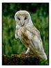
shire horse
Jan 9, 2020 15:26:18 #
I'm entering this shot in a Shire horse photo competition. Your thoughts would be welcome.

Jan 9, 2020 15:58:20 #
BigAl wrote:
I'm entering this shot in a Shire horse photo competition. Your thoughts would be welcome.
The double download is breathtaking in its detail Alan! I am always on board with your compositions and this one is prefect. If the judges don't choose this leggy youngster they need to find another line of work. Good luck my friend!
Jan 9, 2020 16:23:12 #
Jan 9, 2020 23:22:03 #

That is a great photograph. The composition is perfect. Good luck! (however, I don't think you'll need it)
Jan 10, 2020 06:07:52 #

Jan 10, 2020 07:48:06 #

Download is spectacular! I thought of darkening slightly also, but the more I look at it, I like it the way it is. This is a winner!
Jan 10, 2020 07:58:42 #

Jan 10, 2020 08:03:32 #
BigAl wrote:
I'm entering this shot in a Shire horse photo competition. Your thoughts would be welcome.
I absolutely love the picture! Composition is great! Besides, I'm a sucker for colts anytime.
Before sending in this photo for competition though, enlarge and have a good look at the cattle.
See the blue lines? (Not 100% certain, but I think it's called chromatic aberration).
See if you can somehow get rid of them.
Esther
Jan 10, 2020 08:33:36 #
Good looking colt.
If it was mine I'd consider cropping a bit more and bringing the color out just a tad to get more attention to the colt..
If it was mine I'd consider cropping a bit more and bringing the color out just a tad to get more attention to the colt..
Jan 10, 2020 11:16:52 #

The subdued colouring and the semi high key look are an interesting choice and effective. I'm left wondering if the old portrait trick of making the eyes and the area round the eyes more vivid would work. I think it could work despite the pastel look of the rest of the shot.
Jan 10, 2020 11:25:44 #

Jan 10, 2020 12:35:19 #


Jan 10, 2020 13:58:17 #

Hello, BigAl,
The colt is beautifully imaged, but I think the landscape...stretched out ... composition would be improved and the perspective significantly emphasized by moving the colt closer to the cattle in the BG.
Only one image per thread is permitted in this Section, so, if you like, I could send you an example of what I suggest by PM. Let me know if you would like to see it.
Holding off on posting it here unless permission is granted.
Dave
Jan 10, 2020 14:27:06 #
Really nice shot. Add an eye highlight maybe? Good luck, it should be a winner.
Jan 10, 2020 14:54:09 #
mi
I agree that on close inspection there is slight blue chromatic aberration not only on the cattle, but also on the colt’s rump. This is NOT perceptible at normal viewing distance (NVD) and should be ignored.
It is of significance only to those whose NVD is determined by the length of their noses.
Nothing wrong with pixel peeping during post processing, but when the fault has been rendered imperceptible at NVD, to all intents and purposes (with full meaning of that oft-misused phrase) they no longer exist.
Any show judge who has to inspect closer than NVD to find a fault in an image has no business being a judge.
I am reminded of having slipped into a group of art students being given a tour of Andrew Wyeth’s paintings in the Whitney in ‘66 or ‘67. The “prof” leading the tour was, by speech, obviously from Brooklyn, but he affected a phony French accent. He got up close to a portrait of the artist’s wife, whipped out a 6” hand lens, inspected the shadow regions, turned to the group, and pompously pronounced “Zees eel Sloppy brushwork”. With that he dismissed any further discussion on one of the truly great tempera portraits of our time and moved the group on to the next painting.
“Pixel peeping” didn’t really start with the digital age!
Dave
Morning Star wrote:
I absolutely love the picture! Composition is great! Besides, I'm a sucker for colts anytime.
Before sending in this photo for competition though, enlarge and have a good look at the cattle.
See the blue lines? (Not 100% certain, but I think it's called chromatic aberration).
See if you can somehow get rid of them.
Esther
Before sending in this photo for competition though, enlarge and have a good look at the cattle.
See the blue lines? (Not 100% certain, but I think it's called chromatic aberration).
See if you can somehow get rid of them.
Esther
I agree that on close inspection there is slight blue chromatic aberration not only on the cattle, but also on the colt’s rump. This is NOT perceptible at normal viewing distance (NVD) and should be ignored.
It is of significance only to those whose NVD is determined by the length of their noses.
Nothing wrong with pixel peeping during post processing, but when the fault has been rendered imperceptible at NVD, to all intents and purposes (with full meaning of that oft-misused phrase) they no longer exist.
Any show judge who has to inspect closer than NVD to find a fault in an image has no business being a judge.
I am reminded of having slipped into a group of art students being given a tour of Andrew Wyeth’s paintings in the Whitney in ‘66 or ‘67. The “prof” leading the tour was, by speech, obviously from Brooklyn, but he affected a phony French accent. He got up close to a portrait of the artist’s wife, whipped out a 6” hand lens, inspected the shadow regions, turned to the group, and pompously pronounced “Zees eel Sloppy brushwork”. With that he dismissed any further discussion on one of the truly great tempera portraits of our time and moved the group on to the next painting.
“Pixel peeping” didn’t really start with the digital age!
Dave
If you want to reply, then register here. Registration is free and your account is created instantly, so you can post right away.