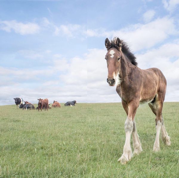
shire horse
Jan 10, 2020 15:05:17 #

Jan 10, 2020 15:35:55 #
Uuglypher wrote:
Hello, BigAl,
The colt is beautifully imaged, but I think the landscape...stretched out ... composition would be improved and the perspective significantly emphasized by moving the colt closer to the cattle in the BG.
Only one image per thread is permitted in this Section, so, if you like, I could send you an example of what I suggest by PM. Let me know if you would like to see it.
Holding off on posting it here unless permission is granted.
Dave
With Al’s permission, here is my suggested change.
Reducing the x-axis distance between the colt and the background cows narrows the image a bit, accentuates the depth of the image, and uses well the emphasized depth distortion of the foal that resulted from the short focal length lens setting used in capturing the image.
Dave
Jan 11, 2020 05:10:18 #

Uuglypher wrote:
With Al’s permission, here is my suggested change.
Reducing the x-axis distance between the colt and the background cows narrows the image a bit, accentuates the depth of the image, and uses well the emphasized depth distortion of the foal that resulted from the short focal length lens setting used in capturing the image.
Dave
Reducing the x-axis distance between the colt and the background cows narrows the image a bit, accentuates the depth of the image, and uses well the emphasized depth distortion of the foal that resulted from the short focal length lens setting used in capturing the image.
Dave
I prefer the original - which gives the colt a bit more room in the pic - showing the room he has to move about without crowding the cows. I have nothing against square pics - but it just doesn't work so well in your version (MHO).

Jan 11, 2020 11:10:01 #

Uuglypher wrote:
With Al’s permission, here is my suggested change.
Reducing the x-axis distance between the colt and the background cows narrows the image a bit, accentuates the depth of the image, and uses well the emphasized depth distortion of the foal that resulted from the short focal length lens setting used in capturing the image.
Dave
Reducing the x-axis distance between the colt and the background cows narrows the image a bit, accentuates the depth of the image, and uses well the emphasized depth distortion of the foal that resulted from the short focal length lens setting used in capturing the image.
Dave
I prefer the original as well.
You cropped off the left and right edges. The distance between the colt and the cows did not change.
Cropping only increases the apparent focal length. The perspective remains unchanged.
Jan 11, 2020 11:14:19 #
You can see a vertical line down the middle of the second one. Not good for a contest I would think.
Jan 11, 2020 11:20:20 #
Linda2 wrote:
You can see a vertical line down the middle of the second one. Not good for a contest I would think.
So the x-axis separation was changed. I didn't look closely enough.
Jan 11, 2020 11:35:45 #

Phil, this is great. I don't know how you ever got so many animals to cooperate so well!
Jan 11, 2020 14:31:21 #
Excellent! I don't see a need for the space left of the herd or so much right of the colt. I'd consider cropping these out which would bring more emphasis onto the colt (which is beautiful). I doubt you need to worry about "proper" dimensions of the final print. But if you do, you could lose a bit of sky, too. Thanks!
Jan 11, 2020 22:25:33 #
selmslie wrote:
I prefer the original as well.
You cropped off the left and right edges. The distance between the colt and the cows did not change.
Cropping only increases the apparent focal length. The perspective remains unchanged.
You cropped off the left and right edges. The distance between the colt and the cows did not change.
Cropping only increases the apparent focal length. The perspective remains unchanged.
Wrong on all counts, Scotty!
Jan 11, 2020 22:26:22 #
selmslie wrote:
So the x-axis separation was changed. I didn't look closely enough.
Ah ha! You now see the error of your ways!
Jan 12, 2020 02:16:48 #
Uuglypher wrote:
Ah ha! You now see the error of your ways!
The seam was a surprise. Your PP was not skillful.
You should have been able to see that the original is better.
Jan 12, 2020 03:12:13 #
Heather Iles
Loc: UK, Somerset
selmslie wrote:
The seam was a surprise. Your PP was not skillful.
You should have been able to see that the original is better.
You should have been able to see that the original is better.
Perhaps you will show us your version, but first you will have to ask the OP permission.
Jan 12, 2020 07:15:44 #
Heather Iles wrote:
Perhaps you will show us your version, but first you will have to ask the OP permission.
I like the original version. It is properly composed and impactful. I see no reason to mess it up.
Jan 12, 2020 07:57:55 #

selmslie wrote:
.......You should have been able to see that the original is better.
That is just an opinion and there are those who differ.
Jan 12, 2020 08:12:27 #
Heather Iles
Loc: UK, Somerset
selmslie wrote:
I like the original version. It is properly composed and impactful. I see no reason to mess it up.
Mess up is a harsh word.
The photo size may not be to everyone's liking, but the fact remains that the shire horse is sharper and we can see the lights in its eyes and lovely detail of the horse's hair. In my opinion, it makes for a better photo.
The OP can have whatever size he/she wants when he prints it for the competition.
If you want to reply, then register here. Registration is free and your account is created instantly, so you can post right away.