Your opinion, please.
Nov 26, 2019 05:57:47 #

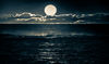
Each one is slightly lighter, but the blue of the water looks too artificial. Maybe if you could tone that down as the picture is nice. That is my opinion. 
Nov 26, 2019 06:11:37 #

Shel B wrote:
I'd like your opinion on these renditions of the same shot. I process to get deep color...not so much to produce a photo that looks "real" as to make an image that I like.
As you are still in "upcoming topics" I am attaching two alternatives. IMHO these two alternatives make for an acceptable, indeed a pleasant, picture. I have feeling that they would have been closer to your original picture. Food for thought?


Nov 26, 2019 06:12:13 #

dyximan wrote:
If you're doing it for you and if you like them that's all that matters, but Since you asked for an opinion I'll give you one I'm not a big fan of the deep blue water
I'll 2nd that, the water looks unnatural to me. Also a little bit of sky in top right. I also concur with the initial statement. Exactly what the Judge said to me when I entered my first competition.
Nov 26, 2019 06:25:01 #
uncldave
Loc: Mahopac, NY
I also did not like the blue water at first; but looking at it for a while I could see what you were doing and liked the pictures very much. Though hardly realistic color of the stream, I think it is a lot better than the whipped cream I see in many photos of moving water.
Nov 26, 2019 06:36:46 #
Shel B wrote:
I'd like your opinion on these renditions of the same shot. I process to get deep color...not so much to produce a photo that looks "real" as to make an image that I like.
Is there a fourth option??
Nov 26, 2019 07:16:44 #

Nov 26, 2019 07:34:17 #

I use Topaz Adjust AI to edit my Nikon images after I first edit with Nikon View NX2. When I use presets I always cut down the effect to make my images look as natural as possible. What I am saying is that I like and tend to prefer pastel colors using saturation only when I need to emphasize the colors like when photographing the fall season and even so I only add a touch of saturation.
If you like your images super saturated nothing wrong with that. For my photographic style none of those images are satisfactory to my taste.
If you like your images super saturated nothing wrong with that. For my photographic style none of those images are satisfactory to my taste.
Nov 26, 2019 07:45:13 #
bbrown5154
Loc: Baltimore, MD
If you like it and are happy with it thats all that counts.
Since you asked for opinions....Its waayyyy too over processed for me.
Since you asked for opinions....Its waayyyy too over processed for me.
Nov 26, 2019 08:26:33 #
PaulBrit
Loc: Merlin, Southern Oregon
ELNikkor wrote:
Looks too overdone to be attractive to me.
Same for me.
Nov 26, 2019 08:26:59 #

I like the overall effect, seems to look like a painting to me, I've shot seaside scenes that were gently criticized for being too blue but the blue sky day accentuated the water, that's how it looked and that is what I shot, do it your way.
Nov 26, 2019 08:27:32 #
Soul Dr. wrote:
You said you wanted to process to your liking, not to produce a photo that looks real. If you like the way these look, why would you want our opinion on them.
Since you asked, I don't like over processed images.
will
Since you asked, I don't like over processed images.
will

Nov 26, 2019 08:30:31 #

Delderby wrote:
There is no UHH section called "upcoming topics." That feature is only in the emailed digest and titles change every few minutes.As you are still in "upcoming topics" I am attaching two alternatives...
After you click an "upcoming" topic from the link in your digest you can look just above the topic title to see the section in which it's located. Just a friendly tip in case you want to follow that section's rules about editing someone else's photo without permission 🙄
Nov 26, 2019 08:40:25 #

You're producing images that you like and then asking for our opinion ... OK
I think the water looks wrong; but that's just an opinion.
I think the water looks wrong; but that's just an opinion.
Nov 26, 2019 08:53:27 #

I don't see a lot of difference in the three pics. In all 3, the water is too blue for my taste.
Nov 26, 2019 09:00:16 #
The first thing my eye is drawn to is the blue of the water being "wrong" to what my eye expects water to look like, so it distracts me from other elements and the composition that are quite nice. I'd bring the colors back into range and trust it to work without the gimmick.
If you want to reply, then register here. Registration is free and your account is created instantly, so you can post right away.