Your opinion, please.
Nov 25, 2019 23:18:09 #
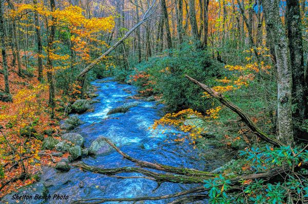
I'd like your opinion on these renditions of the same shot. I process to get deep color...not so much to produce a photo that looks "real" as to make an image that I like.


Nov 25, 2019 23:21:48 #
If you're doing it for you and if you like them that's all that matters, but Since you asked for an opinion I'll give you one I'm not a big fan of the deep blue water
Nov 25, 2019 23:28:27 #
tvhasben
Loc: Chattanooga, Tennessee
I don't see very much difference in the three pics. Nothing striking at all.
Nov 25, 2019 23:51:11 #

You said you wanted to process to your liking, not to produce a photo that looks real. If you like the way these look, why would you want our opinion on them.
Since you asked, I don't like over processed images.
will
Since you asked, I don't like over processed images.
will
Nov 26, 2019 00:01:39 #

As others have said, they look over-processed. If that’s what you like, that’s all that matters, I suppose.
Nov 26, 2019 00:43:15 #

Second verse same as the first. If the image is on a velvet pillow, then I'd go with #1.
Nov 26, 2019 01:11:53 #

I might be able to tell a difference between them if I could make the images bigger. In this small size, they look virtually the same to me. Consider clicking the download button the next time you post images.
Nov 26, 2019 01:37:31 #

I’m a fan of processing for pop .. metal prints .. and the like .., therefore #2 ... ..Good Luck ., it hasn’t been very Positive so far from the replies .., FYI .. post the download version when asking for photo comparisons .....
You can PM me the download version .., I’ll examine them in detail as well as offer PM post downloadable variations as examples with my reply ..
You can PM me the download version .., I’ll examine them in detail as well as offer PM post downloadable variations as examples with my reply ..
Nov 26, 2019 03:30:13 #
[quote=Dr.Nikon]I’m a fan of processing for pop .. metal prints .. and the like .., therefore #2 ... ..Good Luck ., it hasn’t been very Positive so far from the replies .., FYI .. post the download version when asking for photo comparisons .....
You can PM me the download version .., I’ll examine them in detail as well as offer PM post downloadable variations as examples with my reply ..[/q
Just an addition to my initial comment if your intent was to make what I consider an unrealistic contrast between the water and other aspects that was accomplished. But if your intent was to make the contrasts subtle and somewhat Realistic I wouldn't consider That accomplished here.
Nov 26, 2019 03:41:56 #

Shel B wrote:
I'd like your opinion on these renditions of the same shot. I process to get deep color...not so much to produce a photo that looks "real" as to make an image that I like.
It is hard to tell with out Download (Save Original) any of the detail. I can't tell what you did, just boost Color and Contrast or try to create an Oil Painting effect. I sometimes play with images using Topaz Impression II to create "paintings" out of photographs. But they are never a replacement for a well presented photograph for me. I sometimes go for wild software Solarization and Edge Effects. But usually I strive for traditional "film like" natural renditions of scenes. I am much more open to experimental images by other people than my own. From time to time I may make a highly processed image I like.
Yes, your three are not all that different from one another. I would like to see your image as an "oil painting" where I can see the "brush strokes".
Nov 26, 2019 05:01:24 #

Nov 26, 2019 05:26:21 #
Nov 26, 2019 05:51:36 #
for what it's worth, i'm coming down on the side of the first two responses .. just one guy's free opinion, and no doubt well worth the price
Nov 26, 2019 05:53:19 #

Nov 26, 2019 05:55:13 #

Shel B wrote:
I'd like your opinion on these renditions of the same shot. I process to get deep color...not so much to produce a photo that looks "real" as to make an image that I like.
Shel B, my opinion for what it is worth, I like the color depth you like along with the lightened areas of the woods. Like I said, my $.02.

Greg
If you want to reply, then register here. Registration is free and your account is created instantly, so you can post right away.