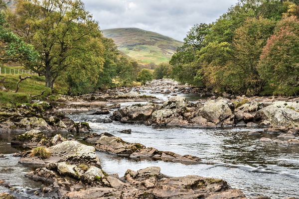
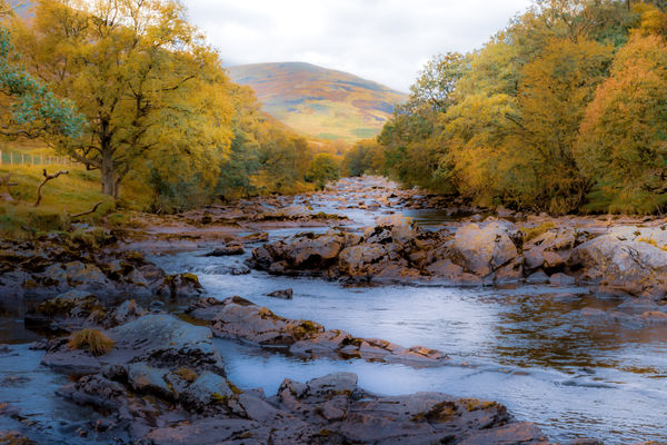
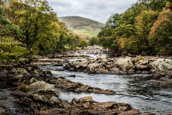
My Image Your Look: The River Esk.
Nov 5, 2019 11:44:33 #
Really enjoyed working on this image. I did two versions one b&w the other color. Thanks for the opportunity.

Nov 5, 2019 12:18:33 #

I'm having trouble uploading my versions. This is my third try. The site keeps kicking me out for some reason.
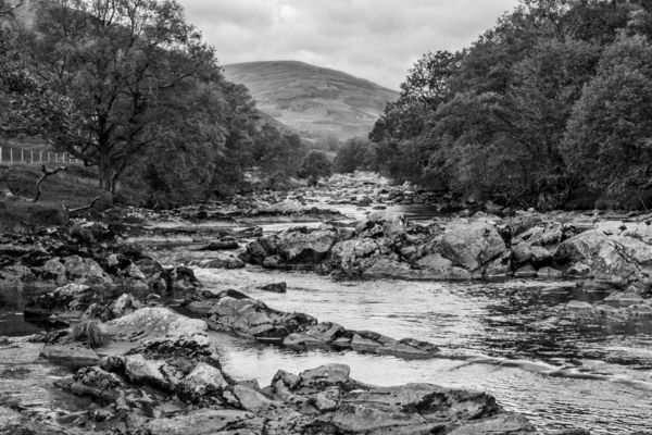
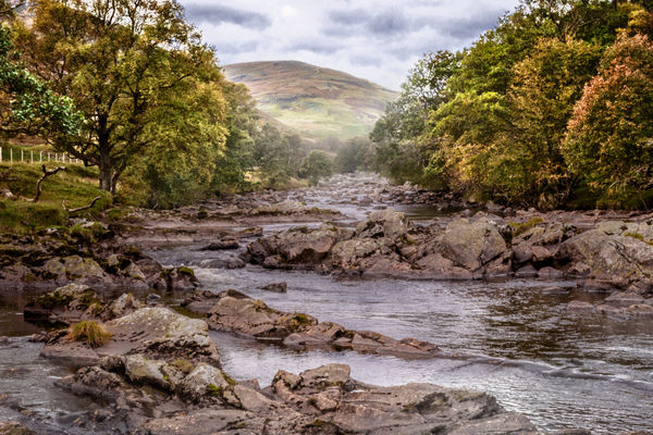
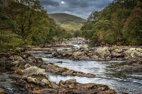
Anyway, I did two also - one colour, one B&W. The DNG file opened in ACR, so I used that instead of LR. For the colour one, I took the exposure down a couple of points and increased the contrast a bit. Clarity went up as well, as did vibrance a few points. In the HSL screen, I "greened up" the yellow tones just a bit and darkened the blues. That made the sky look a bit stormier. From that point, I converted to B&W with no further tweaks.
If I can't get these to upload, I'll simply forget it!
Nov 5, 2019 12:34:25 #

I played with the shadow/darks and believe this now has more depth. My 2nd entry
Nov 5, 2019 13:01:22 #

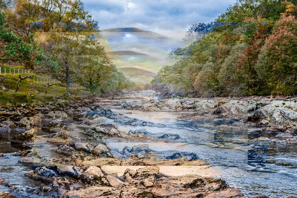
I played with some color adjustments and added a big softy vignette.
Nov 5, 2019 13:17:04 #

I went for a moody look. Darkened a tad, clipped off some distraction on the left, added a vignette, desaturated, and added a cold cast to the shadows.
Nov 5, 2019 13:17:55 #

Nov 5, 2019 15:16:11 #

R.G. wrote:
An interesting interpretation, very much like how I'd expect an illustration to look like.
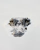
Thanks, E.G., that remark kicked off an inspiration for me. The photo was run through ACR to bring out certain elements I thought would be necessary for composition and color, then a trip through a few Photoshop filters, a bit of brushwork, some burning and dodging, and...an illustration!

Nov 5, 2019 19:19:04 #

Nov 5, 2019 21:44:04 #

OK. Since we get two shots at it, I just can't pass by a chance for a b&w.

Nov 6, 2019 09:50:10 #
I enjoy seeing others' ideas, both for themselves and as inspiration for me. Here's my second, prodded into life by previous posts here. An emphasis of the patterns of nature, imitating the Kodaliths of old.

Nov 6, 2019 15:36:41 #
A beautiful composition .. after a little experimentation I decided to try a painterly look, something I usually don't do. I hope you enjoy it...
Nov 7, 2019 02:39:56 #
Nice photo to play with. I focused on adding contrast back into the original image.
Nov 7, 2019 10:00:31 #

Nov 7, 2019 10:13:14 #
SalvageDiver wrote:
Nice photo to play with. I focused on adding contrast back into the original image.
Here's a second attempt. Tried to add a little more depth and emphasize some of the fall colors with a slight change of mood.

Nov 7, 2019 15:49:27 #

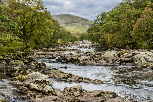
I am submitting two this time. A straight edit, and a fun edit. Well fun at least for me.  It was really a nice image to work on.
It was really a nice image to work on.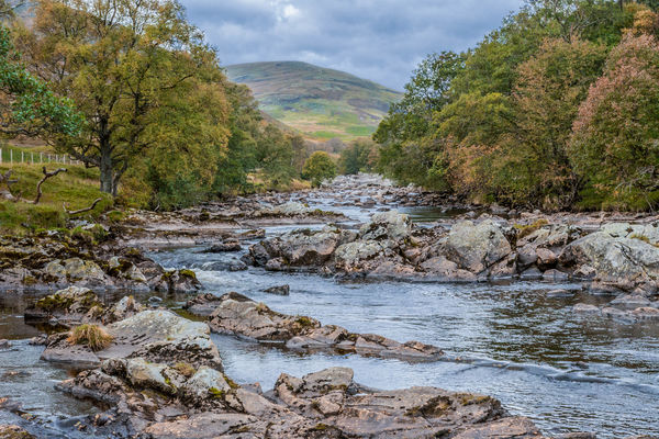
If you want to reply, then register here. Registration is free and your account is created instantly, so you can post right away.