Which do you like - and why?
Sep 6, 2019 12:51:55 #

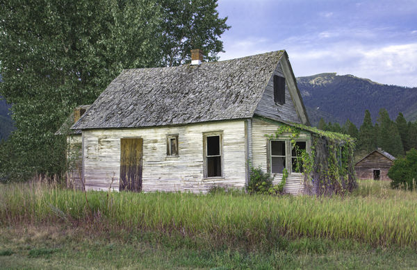
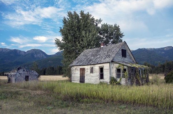
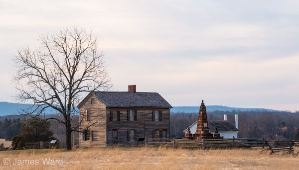
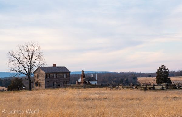
I am asking fellow Hoggers for your opinions - of these two images, which do you prefer? (If you don't like either of them, please be kind...  )
)
One is a more close-in version with a shed in the background - tried to emphasize the house with everything else secondary. The second is a more panoramic, inclusive shot with a different shed off to the left and the house being a bit less prominent. I would welcome any and all input as I am torn betwixt and between. Thanks!
)One is a more close-in version with a shed in the background - tried to emphasize the house with everything else secondary. The second is a more panoramic, inclusive shot with a different shed off to the left and the house being a bit less prominent. I would welcome any and all input as I am torn betwixt and between. Thanks!
Sep 6, 2019 12:54:53 #

I like the second one better. For the first one I would crop it slightly on the left, moving the house slighter off center and giving it more room at the front of the house.
Sep 6, 2019 13:00:31 #

Tommy, I like the first, but I'm assuming the house is the subject of the photograph. The second doesn't really feature the house, nor does it feature the surroundings. It's just sort of blah with neither being the subject.
That said, the first includes a bit more of the surroundings than need be there to feature just the house and its diminutive neighbor. I think a very judicious crop would put the house and its neighbor more to the fore and still retain the isolated surroundings.
--Bob
That said, the first includes a bit more of the surroundings than need be there to feature just the house and its diminutive neighbor. I think a very judicious crop would put the house and its neighbor more to the fore and still retain the isolated surroundings.
--Bob
tommystrat wrote:
I am asking fellow Hoggers for your opinions - of ... (show quote)
Sep 6, 2019 13:02:20 #

I like the second, but I'd like the second even more if the bush on the right side wasn't there and instead there was more space on the left between the far building and the edge of the frame.
Sep 6, 2019 13:02:32 #

SuperflyTNT wrote:
I like the second one better. For the first one I would crop it slightly on the left, moving the house slighter off center and giving it more room at the front of the house.
On the first I would have shot a bit more to the right to eliminate the space on the left and give the out building a bit more room.
Sep 6, 2019 13:02:34 #
I like them both equally. To me they express two different outlooks. In the first it is look at this old house. The second says look at this landscape with a house in it.
Sep 6, 2019 13:05:35 #
It kind of reminds me of some shots I took the first time I was out playing with my Panasonic G85. I liked them for different reasons, hard to pick my favorite.
Sep 6, 2019 13:09:01 #
rmalarz wrote:
Tommy, I like the first, but I'm assuming the hous... (show quote)
That's the crop I would have used.
Sep 6, 2019 13:29:52 #
hj
Loc: Florida
I much prefer the second. I feel the perspective identifies the location better and gives more interest rather than just the zoomed in house.
Sep 6, 2019 14:32:15 #

Sep 6, 2019 14:52:59 #
Anhanga Brasil
Loc: Cabo Frio - Brazil
CHG_CANON wrote:
I like the second, but I'd like the second even more if the bush on the right side wasn't there and instead there was more space on the left between the far building and the edge of the frame.
My thoughts exactly.Sep 6, 2019 14:54:03 #

Sep 6, 2019 18:10:50 #

Sep 6, 2019 21:16:57 #

tommystrat wrote:
I am asking fellow Hoggers for your opinions - of ... (show quote)
I prefer the first photograph. It is obvious that the dilapidated house is the subject of photograph. The scenery in the foreground or the background give it a position. As for the tree behind the house, it is nothing unique. I would crop the left of the photograph. As for the sky and the foreground that could be cropped somewhat. What intrigues me is the small window in the middle. Why is it there? What is going on with it?
If you want some effect, crank in Monochrome. This setting promotes the contrasts of the old house with the crisp greenery!
This is In My Humble Opinion.
Sep 7, 2019 06:25:24 #

If you want to reply, then register here. Registration is free and your account is created instantly, so you can post right away.