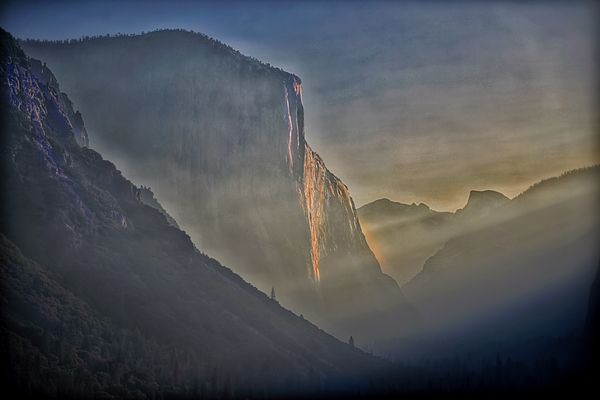
Tunnel View Sunrise
Aug 25, 2019 01:58:47 #
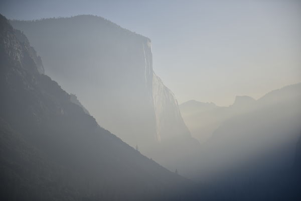
With smoke and haze , the Yosemite Sunrise was quite different than at any other time ...
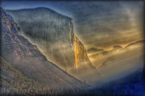
Posted is the straight out of the camera ..., and then my rendition for print on Kringle rice paper 24x32 framed ..
Posted is the straight out of the camera ..., and then my rendition for print on Kringle rice paper 24x32 framed ..
Aug 25, 2019 05:36:56 #
Aug 25, 2019 05:49:44 #
Aug 25, 2019 09:37:42 #
Aug 25, 2019 09:45:12 #

They are both quite attractive. I would like to see, as a juror, the original pushed just a little to bring out the subtle gradations of mist, color, and textures, and the edited version to be taken back somewhat, so it is less garish and more rich in color and imagination.
Others might well have different opinions, as seen here already. I suggested to my students in crits: listen to everything. Forget it for a day. When you next look at your work or are doing something new, pay attention to those crits that are strong in your mind. Ultimately, of course, you explore and decide.
Others might well have different opinions, as seen here already. I suggested to my students in crits: listen to everything. Forget it for a day. When you next look at your work or are doing something new, pay attention to those crits that are strong in your mind. Ultimately, of course, you explore and decide.
Aug 25, 2019 10:31:58 #
Aug 25, 2019 18:28:28 #
Well , as I said before .. the #2 is intended for printing on Kringle texture rice paper and framed so as to look almost like a Japanese Rice Paper hand painting .. with a frame ...
I muted it down some to reflect on the opinions of some , but it’s just for looks ... as the actual printing would be #2 ...
Thnx for the comments .., there is no reason to post unless positive critiques for and against were expressed ...
I muted it down some to reflect on the opinions of some , but it’s just for looks ... as the actual printing would be #2 ...
Thnx for the comments .., there is no reason to post unless positive critiques for and against were expressed ...
Aug 25, 2019 18:31:30 #
Dr.Nikon wrote:
With smoke and haze , the Yosemite Sunrise was quite different than at any other time ...
Posted is the straight out of the camera ..., and then my rendition for print on Kringle rice paper 24x32 framed ..
Posted is the straight out of the camera ..., and then my rendition for print on Kringle rice paper 24x32 framed ..
Wow...What a touch Dr. Nikon!
Aug 25, 2019 18:42:46 #
Dr.Nikon wrote:
Well , as I said before .. the #2 is intended for printing on Kringle texture rice paper and framed so as to look almost like a Japanese Rice Paper hand painting .. with a frame ...
I muted it down some to reflect on the opinions of some , but it’s just for looks ... as the actual printing would be #2 ...
Thnx for the comments .., there is no reason to post unless positive critiques for and against were expressed ...
I muted it down some to reflect on the opinions of some , but it’s just for looks ... as the actual printing would be #2 ...
Thnx for the comments .., there is no reason to post unless positive critiques for and against were expressed ...
All three versions have their qualities. #3 contains some of the best of the other two. I respect your probings and your results.
Aug 25, 2019 23:30:44 #
Aug 26, 2019 07:47:54 #

Aug 26, 2019 08:53:31 #
Aug 26, 2019 12:48:20 #
Aug 26, 2019 12:58:29 #
Dr.Nikon wrote:
Well , as I said before .. the #2 is intended for printing on Kringle texture rice paper and framed so as to look almost like a Japanese Rice Paper hand painting .. with a frame ...
I muted it down some to reflect on the opinions of some , but it’s just for looks ... as the actual printing would be #2 ...
Thnx for the comments .., there is no reason to post unless positive critiques for and against were expressed ...
I muted it down some to reflect on the opinions of some , but it’s just for looks ... as the actual printing would be #2 ...
Thnx for the comments .., there is no reason to post unless positive critiques for and against were expressed ...
I am amazed by the incredible vision you had for this shot. I appreciate all the images with #3 being my favorite. More importantly, you have shown what imagination is and how to let it flow! Thanks for sharing more than just a great shot!
Aug 26, 2019 13:22:13 #
If you want to reply, then register here. Registration is free and your account is created instantly, so you can post right away.