B&W Conversion
Aug 7, 2019 18:13:13 #

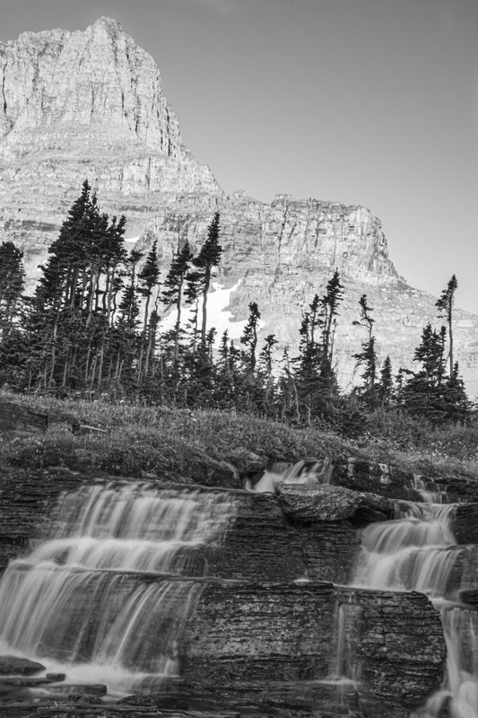
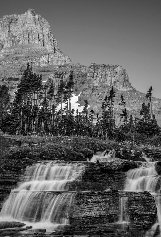
Hi everyone, playing with converting to b&w....I posted the b&w the other day in another forum and everyone suggested that I add contrast to the sky. So I did that and am wondering what else I can do to make the photo better?
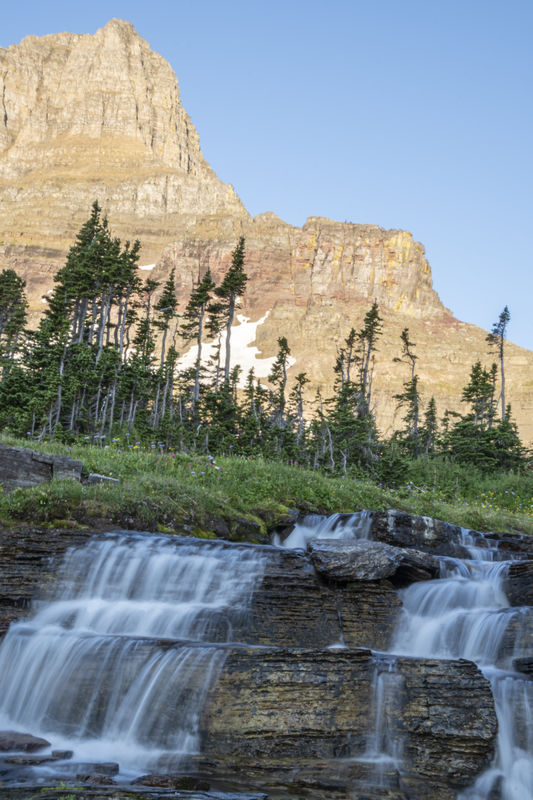
Is this a good candidate for b&w or should I leave it color? I used LR and the NIK collection for the conversion.
Thanks for the help everyone.
Is this a good candidate for b&w or should I leave it color? I used LR and the NIK collection for the conversion.
Thanks for the help everyone.
Aug 7, 2019 18:41:44 #
CindyHouk wrote:
Hi everyone, playing with converting to b&w....I posted the b&w the other day in another forum and everyone suggested that I add contrast to the sky. So I did that and am wondering what else I can do to make the photo better?
Is this a good candidate for b&w or should I leave it color? I used LR and the NIK collection for the conversion.
Thanks for the help everyone.
Is this a good candidate for b&w or should I leave it color? I used LR and the NIK collection for the conversion.
Thanks for the help everyone.
Your sky and the mountain are borderline blown out. In Lightroom, apply a graduated filter from the top right corner to just at about the tops of the trees. Turn down exposure 1½ stops and apply a bit of DeHaze. Then play around with a slight vignette (black) to draw the viewer into your image.
Great composition.
Aug 7, 2019 18:56:37 #

Cindy, it's quite a nice candidate for black and white. However, pay close attention to your tonalities.
--Bob
--Bob
CindyHouk wrote:
Hi everyone, playing with converting to b&w....I posted the b&w the other day in another forum and everyone suggested that I add contrast to the sky. So I did that and am wondering what else I can do to make the photo better?
Is this a good candidate for b&w or should I leave it color? I used LR and the NIK collection for the conversion.
Thanks for the help everyone.
Is this a good candidate for b&w or should I leave it color? I used LR and the NIK collection for the conversion.
Thanks for the help everyone.
Aug 7, 2019 19:00:52 #
kenievans
Loc: Dallas
Hi Cindy! I think it could be a good B&W but you have a big dynamic range in light between the mountain in the back ground with lots of light and the falls in the shadows. Your eyes are going to be drawn to the lightest part of the photo distracting from the falls.
I would darken and increase the contrast of the mountains in the back ground then sharpen the detail around the falls. If you would like I can post you an example of what I mean.
I would darken and increase the contrast of the mountains in the back ground then sharpen the detail around the falls. If you would like I can post you an example of what I mean.
Aug 7, 2019 23:10:21 #
rgrenaderphoto wrote:
Your sky and the mountain are borderline blown out. In Lightroom, apply a graduated filter from the top right corner to just at about the tops of the trees. Turn down exposure 1½ stops and apply a bit of DeHaze. Then play around with a slight vignette (black) to draw the viewer into your image.
Great composition.
Great composition.
Thanks....I will give your suggestions a try. I will repost when I have had a chance to play with your suggestions.
Aug 7, 2019 23:10:56 #
rmalarz wrote:
Cindy, it's quite a nice candidate for black and white. However, pay close attention to your tonalities.
--Bob
--Bob
Thanks.
Aug 7, 2019 23:11:45 #
kenievans wrote:
Hi Cindy! I think it could be a good B&W but you have a big dynamic range in light between the mountain in the back ground with lots of light and the falls in the shadows. Your eyes are going to be drawn to the lightest part of the photo distracting from the falls.
I would darken and increase the contrast of the mountains in the back ground then sharpen the detail around the falls. If you would like I can post you an example of what I mean.
I would darken and increase the contrast of the mountains in the back ground then sharpen the detail around the falls. If you would like I can post you an example of what I mean.
Thanks for replying and you are welcome to edit it and post it so I can see how you would change it.....it always helps!
Aug 8, 2019 07:52:34 #

rgrenaderphoto pointed out exposure problems... I take the safe way out in photographing areas like this using HDR.. set the camera to take multi exposures at +- setting. That is what Ansell Adams did with his Sony DSLR taking his famous photos. [smile ... tad of humor]
https://lifehacker.com/what-is-hdr-and-when-should-i-use-it-in-my-photos-5991508
My salvation, if this were my photo, would be to clone in the Florida clouds into the sky. Too often even here in Florida, we have boring clear skies. But also I would give a vertical reference by making the major trees vertical using the streighten tool common to all photo edit programs. I feel more comfortable knowing which way is up.
Aug 8, 2019 09:26:39 #

rmalarz wrote:
Cindy, it's quite a nice candidate for black and white. However, pay close attention to your tonalities.
--Bob
--Bob
Just how would you handle the tonalities?
Plus, I would also level the picture.
Aug 8, 2019 09:34:52 #
One problem here is that the picture looks drab because it lacks contrast, a/k/a tonal range. I would start with increasing clarity, changing the tone curve to medium contrast and increasing contrast. You can also darken the sky by decreasing the blue luminance. My opinion is that "contrast" equates to drama in monochrome.
The suggestion to use a dark linear gradient on the sky is good but I would decrease the luminance first. A slight negative vignette is another good idea but do not overdo it.
Good luck and share your next edit here.
The suggestion to use a dark linear gradient on the sky is good but I would decrease the luminance first. A slight negative vignette is another good idea but do not overdo it.
Good luck and share your next edit here.
Aug 8, 2019 10:36:22 #
kenievans
Loc: Dallas
CindyHouk wrote:
Thanks for replying and you are welcome to edit it and post it so I can see how you would change it.....it always helps!
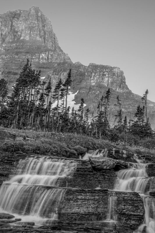
I didn't spend a whole lot of time on this but you can do this in LR. Similar to Roberts suggestion of applying a gradient filter to the top portion of your photo, I used the brush tool to selectively darken and increase the contrast of the mountains in the back ground. I also used the brush to increase the texture, clarity and sharpness in the water falls. Good luck and looking forward to seeing what you come up with.
Aug 8, 2019 10:59:44 #

CindyHouk wrote:
Thanks for replying and you are welcome to edit it and post it so I can see how you would change it.....it always helps!
I went with what keni said and had a go at it. All as Keni instructed and also a lot of dodging and burning to improve the contrast and to try and make the falls stand out.
I enjoyed this little challenge and thanks for letting us have a go at it Cindy.
Alan

Aug 8, 2019 11:11:11 #
Sorry Cindy, had size reduction on Lightroom when I exported.
Try this one.
Try this one.
Aug 8, 2019 11:28:38 #
Aug 8, 2019 13:07:37 #

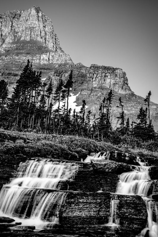
You have a fine photo to post process. The problems can be solved.
First problem: uneven light--sky and mountain are light-filled, foreground is in shadow.
Solution: select sky and mountain, make values (tones) as we would see them. I used "Curves" in Photoshop. Lightroom has many options.
Next step: Convert whole image to B&W. I like Photoshop because /Image/Adjustments/Black and White let me lighten just the red, which was too strong in the mountain after I adjusted the values in the step above.
2nd problem: foreground too dark (because of the uneven available light.
Solution: same as for sky/mountain.
3rd: whole photo okay now, but needed greater value contrast.
Solution: once again, Curves--adjusted until the shot appealed to my eye.
Final step: sharpened foreground
So, while the comments about the problems seemed accurate to me, the need for different equipment or camera settings seems unnecessary--postprocessing works just fine.
If you want to reply, then register here. Registration is free and your account is created instantly, so you can post right away.