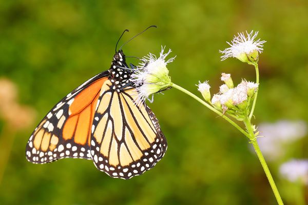
A Perfect Queen Butterfly
Aug 3, 2019 18:29:55 #
I would like some feedback on how this shot looks on your monitor in regard to light balance. I sometimes wonder if the contrast/brightness on my monitor is close to those of others.
Aug 3, 2019 18:35:40 #

Nice shot, Ron. It looks okay on my monitor, but might be very slightly bright. but this may be caused by a slightly over exposed shot (the white flowers), rather than a difference in monitors. 
Earl.
Earl.
Aug 3, 2019 18:38:07 #

A universal concern! Looks a little bright compared to the way my (few) Monarchs look on mine. The bulky portion of the tiny white flowers have a little highlight burnout out - the butterfly itself looks very good but a tiny bit light. Could be it is lighter colored than mine. Good luck with this one - unless it is the same monitor calibrated the same, and even then?!
Aug 3, 2019 19:24:19 #

Looks good on my monitor. The white flowers my be a bit blown out. Otherwise, it's fine.
Aug 3, 2019 19:39:00 #

I am viewing this on an IPAD, so i am not sure my comments would count. Overall it looks good to me. The white flowers may be a bit blown out. But not something that can’t be corrected.
Aug 3, 2019 20:20:11 #

DOOK wrote:
Nice shot, Ron. It looks okay on my monitor, but might be very slightly bright. but this may be caused by a slightly over exposed shot (the white flowers), rather than a difference in monitors.
Earl.
Earl.
I totally agree - or a difference in processing preferences.
.
Aug 3, 2019 20:23:09 #
Aug 3, 2019 20:25:24 #
Here's one I pp'd after increasing the monitor brightness a wee bit. Taken with my great Sony 18-135mm SAM on the A65. Kinda 3D effect looks nice.
Aug 3, 2019 20:33:41 #
Much better, not as washed out. A brighter butterfly would have helped but still a nice shot. 
Aug 4, 2019 01:12:36 #

DOOK wrote:
Nice shot, Ron. It looks okay on my monitor, but might be very slightly bright. but this may be caused by a slightly over exposed shot (the white flowers), rather than a difference in monitors.
Earl.
Earl.
A perfect Queen it is, Ron, and I agree with Earl about the exposure.
Aug 4, 2019 03:46:21 #

Aug 4, 2019 08:54:28 #
Jerry Green
Loc: Huntsville, AL
Nice shot. This looks like a Monarch Butterfly. Do you have a shot of it with it wings opened?
Aug 4, 2019 08:58:15 #
No I don't. I'm sure that Donna would have corrected me if it was a Monarch. She keeps me honest.
Aug 4, 2019 09:28:12 #
Streets wrote:
Here's one I pp'd after increasing the monitor brightness a wee bit. Taken with my great Sony 18-135mm SAM on the A65. Kinda 3D effect looks nice.
Aug 4, 2019 10:59:59 #

Streets wrote:
I would like some feedback on how this shot looks on your monitor in regard to light balance. I sometimes wonder if the contrast/brightness on my monitor is close to those of others.
I go with Monarch.
Compair hind wing and very dark line along veins.
This is a female.
Bill
If you want to reply, then register here. Registration is free and your account is created instantly, so you can post right away.