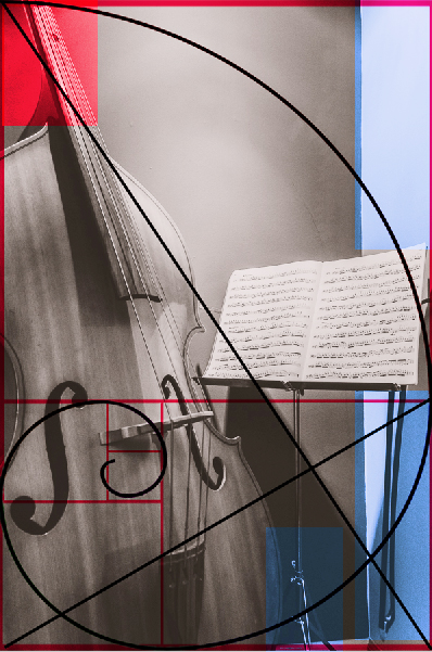
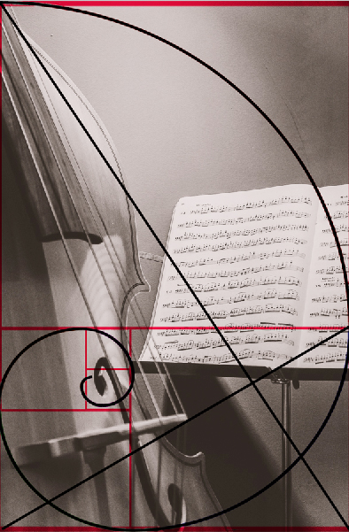
Do you like either of these?
May 19, 2019 13:11:56 #
I like #1 better as well. Same reasons as the others... shows more of the instrument and the music book is not chopped off either.
May 19, 2019 13:16:29 #

May 19, 2019 13:45:42 #

I'm going to throw in my opinion Ben and go against the grain. I like the 2nd image better. It's simple and cleaner (I'm all for less is more in an image). You've directed my eye immediately to where you want it to go, the music and the instrument. It doesn't have the distracting shadow arcs on the wall like at the top of the 1st one. It doesn't have the corner wall line, the base of the music stand or the cable which is hanging from the music stand. All those lines direct me out of the picture and I feel don't add to your story. You have a nice image which made me smile as I went to the symphony last night and enjoyed the music. Bev
May 19, 2019 13:52:44 #

#1. The corner to corner diagonal element in #2 is hard to work with, compositionally. The kinds of shapes
within the frame in #1 is more varied and interesting, as well.
within the frame in #1 is more varied and interesting, as well.
May 19, 2019 13:58:51 #
If I were to show them in a gallery I would use both, the 1st would appeal to the general public probably and the second to a musician. His instrument becomes an old friend after all those hours of practice and playing. the second relates that intimacy and that is what he sees just before he picks up the bow to play. make any sense?
May 19, 2019 14:19:20 #

Rab-Eye wrote:
If so, which do you prefer and if you have time, why?
Thanks!
Thanks!
I like both. I like the composition of #1 better, but #2 has a bit of abstraction, and a closer view of the sheet music is preferable to me. Nicely done! >Alan
May 19, 2019 15:02:51 #

I like #1. I am lover of wood and can see the wood grain of the bass as well as seeing it as a source of music. Nothing in #2 appeals to me.
May 19, 2019 15:10:57 #

May 19, 2019 15:35:03 #
May 19, 2019 15:47:21 #
May 19, 2019 16:32:26 #

Rab-Eye wrote:
If so, which do you prefer and if you have time, why?
Thanks!
Thanks!
I would like #1 better without the music and #2 if the Bass fiddle were in sharp focus
May 19, 2019 16:41:26 #

I like both, but prefer the detail and up close feel of the second. Good job!
May 19, 2019 16:52:19 #

Rab-Eye wrote:
If so, which do you prefer and if you have time, why?
Thanks!
Thanks!
My preference goes to #2, because #2 eliminates the (IMHO) distracting elements colored blue, and truncates the bass at a more eye pleasing point. #2 also fits better into the Fibbonaci Spiral aesthetic, and (again IMHO) is overall more pleasing to the eye. I'm just saying.
See attachments for reference.
May 19, 2019 17:12:11 #

Ben, I like the first one, but wonder why the banding of the light on the wall. The second one doesn't have the banding.
--Bob
--Bob
Rab-Eye wrote:
If so, which do you prefer and if you have time, why?
Thanks!
Thanks!
May 19, 2019 17:15:29 #

I like #1. I would probably try lowering the music stand a little so it does not cut the photo in half. Love the subject.
If you want to reply, then register here. Registration is free and your account is created instantly, so you can post right away.