Do you like either of these?
May 19, 2019 08:44:09 #
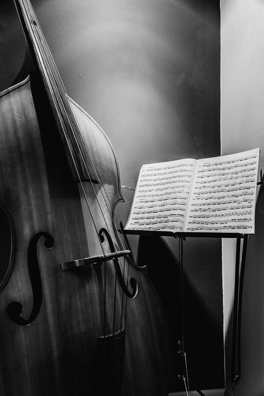
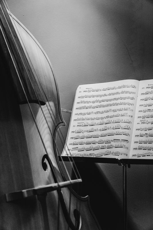
I like SkyKing’s crop. It removes some of the odd shadowing at the top and the distracting vertical line on the right side. Of the two original images, I choose bass 1
May 19, 2019 08:52:59 #

jaydoc wrote:
I like SkyKing’s crop. It removes some of the odd shadowing at the top and the distracting vertical line on the right side. Of the two original images, I choose bass 1
I agree on #1, It's a whole picture..
and #2, puts my eyes on the music sheet... reduces my feeling of a whole picture
Don't care for SkyKing' crop, as the line is not a line, it's a corner...
It's too much like #2
May 19, 2019 09:29:59 #
May 19, 2019 09:39:33 #
May 19, 2019 09:43:18 #

Huey Driver wrote:
I like the first one. Shows more of the bass and I doubt few if anybody will be trying to read the notes on the song book anyway.
#2 gets my vote. It carries more emotion by showing the complexity of beautiful music.
May 19, 2019 10:06:38 #

May 19, 2019 10:11:04 #

I prefer the first one. There is not enough of the second to tell the story so to speak.
May 19, 2019 10:20:23 #
the second one , but if you would crop out 1/4 of the top of number 1 it would be it .the weird light on the wall bug me , cropping it would be gone .
May 19, 2019 11:04:31 #

Definitely don't like the second at all, to much clipping on both the instrument and the sheet music as if neither are important to the image and the sheet music looks just to be in the way, no positioning, ugly angle on the clipping by the edge of the image. The first image I like much better, not distracted by the sheet music and clipping nearly as much, I wonder if the image would not be better yet if you could capture the entire instrument and experiment a bit more with your lighting.
May 19, 2019 11:19:28 #
Wuligal
Loc: Slippery Rock, Pa.
My preference is #2. It's more intimate, doesn't hit you between the eyes with "subject matter", and allows room for imagination and interpretation. But Ansel Adams I ain't - it's just my opinion.
May 19, 2019 11:32:19 #
StevenG
Loc: Long Island, NY
Rab-Eye wrote:
If so, which do you prefer and if you have time, why?
Thanks!
Thanks!
Clearly #1. The first draws my eye to the bass, and stimulates one to imagine a number of stories. The second has no subject.
Steve
May 19, 2019 12:40:09 #
Darker would have suited my style. Using the shadows and not focusing on anything in particular. I would have angled the main light source towards the wall of right in the corner. then use a mirror or alternative to redirect the light into areas of the images.
May 19, 2019 13:04:39 #
May 19, 2019 13:08:24 #
Anhanga Brasil
Loc: Cabo Frio - Brazil
Bokehen wrote:
Darker would have suited my style. Using the shadows and not focusing on anything in particular. I would have angled the main light source towards the wall of right in the corner. then use a mirror or alternative to redirect the light into areas of the images.
 Just replied and those were my thoughts as well. A tad more contrast, indeed.
But, as the OP told us to choose, I did not mention what would be my "view".
May 19, 2019 13:08:28 #
SAVH
Loc: La Jolla, CA
Rab-eye, I prefer #1. Unless you are trying to emphasize the music specifically, #2 does not seem to have a real center of interest besides the details of the music. Actually, I would prefer #1 even more if more of the music was in focus - maybe greater depth of field - but that's just me. I think it works well in B&W.
Scotty
Scotty
If you want to reply, then register here. Registration is free and your account is created instantly, so you can post right away.