what to change in protrait redo
May 18, 2019 13:06:40 #

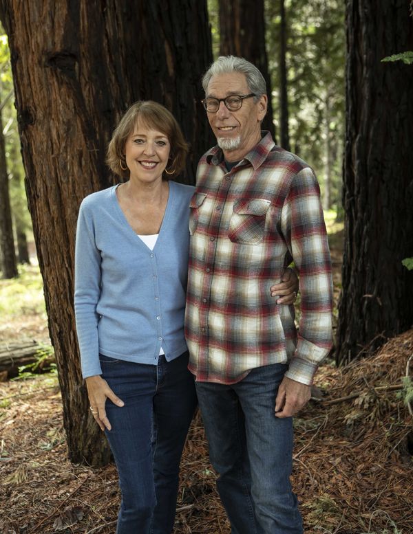
I photographed this couple yesterday, and it was the first portrait they had done in 31 years of marriage. They are happy with the shot; however there are things I would like to change.
If you were to redo this shot what would you change?
My main change would be his shirt.
My second change would be to add a prop. i.e. a set of wine glasses.
Looking for suggestions.
I haven't spoken to them yet. We have pouring rain today, and i'm not sure i could do it today or not.
If you were to redo this shot what would you change?
My main change would be his shirt.
My second change would be to add a prop. i.e. a set of wine glasses.
Looking for suggestions.
I haven't spoken to them yet. We have pouring rain today, and i'm not sure i could do it today or not.
May 18, 2019 13:17:09 #

He needs a cowboy hat!  But seriously, your idea of adding a prop is a good one, I am not sure that wine would be the best idea.
But seriously, your idea of adding a prop is a good one, I am not sure that wine would be the best idea.May 18, 2019 13:27:04 #

May 18, 2019 13:28:21 #
philo wrote:
I photographed this couple yesterday, and it was the first portrait they had done in 31 years of marriage. They are happy with the shot; however there are things I would like to change.
If you were to redo this shot what would you change?
My main change would be his shirt.
My second change would be to add a prop. i.e. a set of wine glasses.
Looking for suggestions.
I haven't spoken to them yet. We have pouring rain today, and i'm not sure i could do it today or not.
If you were to redo this shot what would you change?
My main change would be his shirt.
My second change would be to add a prop. i.e. a set of wine glasses.
Looking for suggestions.
I haven't spoken to them yet. We have pouring rain today, and i'm not sure i could do it today or not.
I wouldn't change his shirt, he is who he is.
I have no opinion on a prop.
The one thing I would do is overexpose a little to bring out more detail in the trees.
May 18, 2019 13:37:26 #
Mac wrote:
I wouldn't change his shirt, he is who he is.
I have no opinion on a prop.
The one thing I would do is overexpose a little to bring out more detail in the trees.
I have no opinion on a prop.
The one thing I would do is overexpose a little to bring out more detail in the trees.
I think the shirt is a little bright and my eye goes right to it.
The idea of the wine is because they are here in the valley for a wine fest...so it would be a tie in.
I have a few cowboy hats (about 30 of them) and rejected that idea. cast too many shadows
May 18, 2019 13:41:31 #
Philo - If the shirt is one he normally wears and felt comfortable enough to wear when he knew you were coming, I would not change it. Adding a prop would require re-shooting and the subjects might be less comfortable, more self-conscious, I would not do it. You might consider adding sun rays filtering through the trees or a small sun star in Photoshop. Just my suggestions.
May 18, 2019 14:12:18 #
flashgordonbrown
Loc: Silverdale, WA
Any thoughts that I would ecpress would fall under the 'nit-picking' catagory. However, I do have a couple of thoughts: first, in printing, I would crop differently. Either go full figure(showing the feet, or crop tighter(just below the waist). The current crop is slightly awkward. Second, I would turn the bodies at more of an angle to the camera-especially the wife. Having the body square to the camera is a bit 'snapshot-ish'. These suggestions come from a number of years of shooting family portraits on a volume basis(25-30 sittings per day, 5 days a week 40-45 weeks per year)! I didn't always follow the advise above, but I tried!
May 18, 2019 14:24:17 #
Her left hand... I always think it looks weird for unattached hands to show up growing out of sides or shoulders. And I would have shifted slightly right to use the large tree as their background versus current light streak coming down into his head. (Of course that could be filled in PP as well as lightening overall pic a little).
Wine glasses would probably not be good prop considering his shirt and location, unless they were actually toasting their 30th anniversary.
Wine glasses would probably not be good prop considering his shirt and location, unless they were actually toasting their 30th anniversary.
May 18, 2019 14:28:36 #

Your portrait looks a bit subded to me. I think adding a bit of lightness and vibrance in Photoshop gives this shot a more lively and 3D appearance.
philo wrote:
I photographed this couple yesterday, and it was the first portrait they had done in 31 years of marriage. They are happy with the shot; however there are things I would like to change.
If you were to redo this shot what would you change?
My main change would be his shirt.
My second change would be to add a prop. i.e. a set of wine glasses.
Looking for suggestions.
I haven't spoken to them yet. We have pouring rain today, and i'm not sure i could do it today or not.
If you were to redo this shot what would you change?
My main change would be his shirt.
My second change would be to add a prop. i.e. a set of wine glasses.
Looking for suggestions.
I haven't spoken to them yet. We have pouring rain today, and i'm not sure i could do it today or not.

May 18, 2019 14:38:59 #
philo wrote:
My main change would be his shirt.
Unless this was a spur-of-the-moment grab shot assume (1) she approved the shirt, or (b) after 31 years she has given up on clothing suggestions. Doubt you would be anymore successful.My main change would be his shirt.
May 18, 2019 14:54:08 #

His shirt is fine, it's her t-shirt under the blue top that draws my eye to her chest and waist where it sticks out. Then I would change the background, at least make it all the same exposure. Look for an area that is All in the shadows, not part in or part out....and make sure if using trees as background they are at least straight up and down.
May 18, 2019 15:29:19 #
I'm not an expert and certainly not a portrait expert but I like it just the way it is! I kind of like the lightness and vibrance example. But I don't really think I would go to the trouble.
May 18, 2019 17:15:55 #
Retired CPO wrote:
I'm not an expert and certainly not a portrait expert but I like it just the way it is! I kind of like the lightness and vibrance example. But I don't really think I would go to the trouble.
Only took about two minutes. But I process everything I take. Always looking to add a little sizzle.
May 18, 2019 18:45:00 #
It seems like the space above their heads is given greater importance than their feet, which is odd as there isn't really anything interesting along the top... it's just a continuation of the trunk and foliage. I'd recommend to either crop a little tighter above their heads or shoot to include the subjects' feet within the composition.
May 18, 2019 19:13:13 #
If you want to reply, then register here. Registration is free and your account is created instantly, so you can post right away.