Creating Visual Tension
Mar 3, 2024 14:26:39 #

This week's flickr group theme: tension. One definition:
"Visual tension is a compositional technique where the elements within the frame are arranged in such a way as to create a sense of unease, anticipation, or emotional resonance. This challenges the viewer's expectations or perceptions" From here.
Learned there are many ways to accomplish - and many ways to fail, ha!
Your assessments of the following would be appreciated!
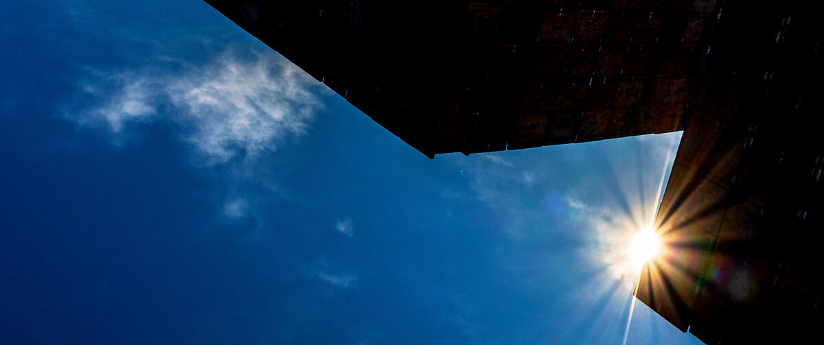
 Sun by Linda Shorey, on Flickr
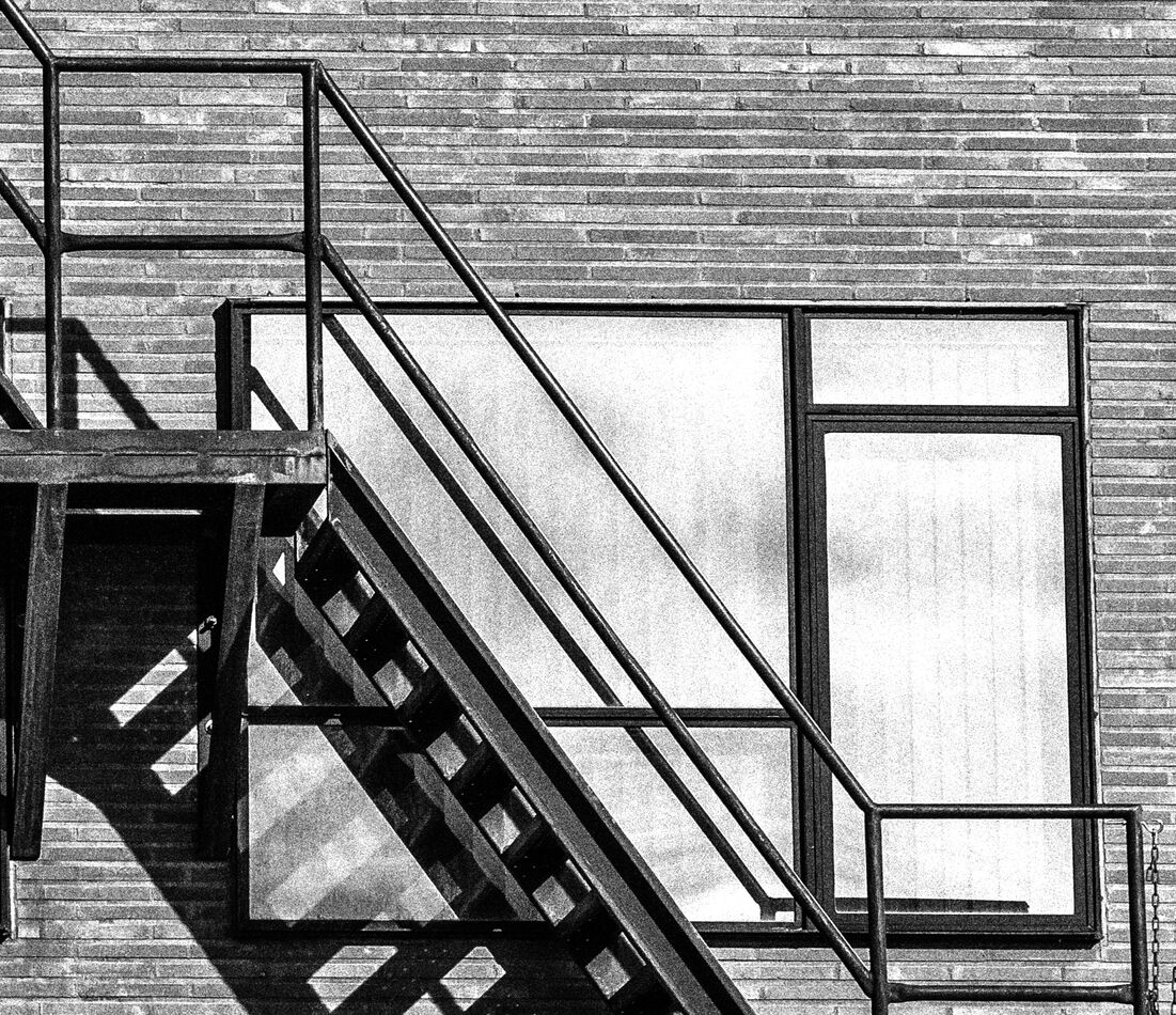
 Which way? by Linda Shorey, on Flickr
 Disorientation by Linda Shorey, on Flickr
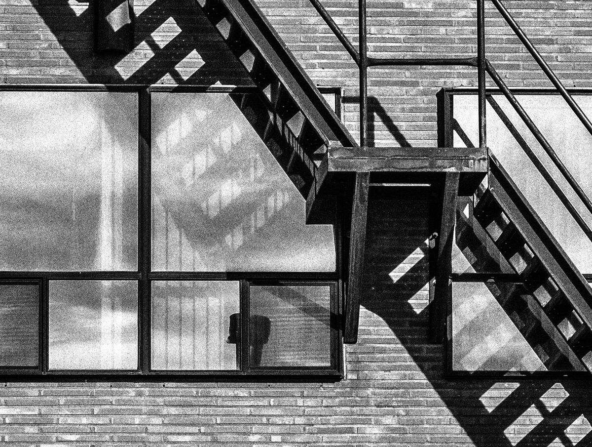
 Tangled by Linda Shorey, on Flickr
.
"Visual tension is a compositional technique where the elements within the frame are arranged in such a way as to create a sense of unease, anticipation, or emotional resonance. This challenges the viewer's expectations or perceptions" From here.
Learned there are many ways to accomplish - and many ways to fail, ha!
Your assessments of the following would be appreciated!
Sun by Linda Shorey, on FlickrWhich way? by Linda Shorey, on FlickrDisorientation by Linda Shorey, on FlickrTangled by Linda Shorey, on Flickr.
Mar 3, 2024 15:11:13 #


Mar 3, 2024 15:40:28 #
Mar 3, 2024 15:59:22 #

Mar 3, 2024 16:47:07 #
R.G. wrote:
Thanks, R.G.#1 seems to fit the bill. The busier ones not so much.
#2 is supposed to feel unbalanced, but maybe I used the negative space too well
 Also unresolved due to no start or end to the fire escape stairs. How about the one at this link? https://flic.kr/p/2pBmV4f
More successful, or not? Am thinking disorienting as to what's real, what's reflection.
#3 is supposed to be an example of "complexity" where there is no starting point or path through the elements. How does it compare against this older one: https://flic.kr/p/2p5Jx5t
If you have any thoughts on these specific points, I'd appreciate your input.
One last request: if you were to further crop the below in search of best way to express visual tension, how would you crop? Or is it a hopeless task?

Mar 3, 2024 17:40:25 #
Linda From Maine wrote:
Thanks, R.G. br br #2 is supposed to feel unbalan... (show quote)
I think your original #2 would work well with the staircase on its own entering at the mid-top and exiting at the mid-right. The windows and bricks keep the eye too busy to notice the imbalance.
#3 is so busy it looks like an intentional pattern. I think what you're looking for is stark, deliberate composition no-nos. Something like minimalist deliberate imbalance would be one obvious way to achieve that.
Mar 4, 2024 06:55:21 #
R.G. wrote:
Many thanks for your input, R.G.!I think your original #2 would work well with the staircase on its own entering at the mid-top and exiting at the mid-right. The windows and bricks keep the eye too busy to notice the imbalance.
#3 is so busy it looks like an intentional pattern. I think what you're looking for is stark, deliberate composition no-nos. Something like minimalist deliberate imbalance would be one obvious way to achieve that.
#3 is so busy it looks like an intentional pattern. I think what you're looking for is stark, deliberate composition no-nos. Something like minimalist deliberate imbalance would be one obvious way to achieve that.
Mar 4, 2024 08:06:48 #

All are great photos, any suggestions below are nitpicking trivial comments. [Except #1 comment}
#1 The left half has a daylight-dark message, the right half adds nothing to the statement.
#2, I agree to cropping but not as was done in the crop image. Too much bottom, crop at 7 blocks below the window. This is a cause/consequence... action/reaction... type of photo... light and shadow. Great image.
#3 The Chaotic world of wires, it is the world we live in. Of course, I like this one since I did a similar one at the TBCClub. While the image was not liked by the audience, coupled with the title it got high points from the Judges.
#4 is the stuff nightmares are made of. Framed with a black matte, this one is a quiet foreboding image.
A WOW
Mar 4, 2024 08:31:31 #
dpullum wrote:
Your detailed feedback is much appreciated, Don!All are great photos, any suggestions below are ni... (show quote)
I very much like your crop of #2. Can't tell you how many different crops I've tried, both of this shot and a couple of other fire escape views. Not sure when last time was I found so many stories in the same original photo
To keep us all confused I cropped #4 and the newest shows in opening post because I replaced in flickr. Note to self: stop using flickr links for UHH!!
If you have a little more time, please see what I posted to Black and White Forum this a.m.
I tried your suggestion for the sun shot and then changed to the below. The other is, I believe, your crop suggestion.
Thanks again!
Mar 4, 2024 10:46:37 #
Mar 4, 2024 13:53:33 #

I think you hit them all right on the head. Visual tension is a very interesting theme.
Mar 4, 2024 13:57:06 #
NikonGal wrote:
Thanks so much, Bev. If you have experience, please tell me more! A pm with examples, or public - whichever you desire. With this theme, I dove into the deep end without a life jacket I think you hit them all right on the head. Visual tension is a very interesting theme.
Mar 4, 2024 14:06:39 #
lnl
Loc: SWFL
You sure have some great comments from UHHers, Linda. I’m certainly not in their league but commenting nonetheless. I like #3 for the title and image, both the wires and lights. it is disorienting me enough to fit the topic.
Mar 4, 2024 14:45:04 #
lnl wrote:
Your comments are always thoughtful and interesting, Ellen!You sure have some great comments from UHHers, Linda. I’m certainly not in their league but commenting nonetheless. I like #3 for the title and image, both the wires and lights. it is disorienting me enough to fit the topic.
I put another shot in Black and White Forum here. I didn't explain what I was going for, so the replies are quite enlightening
I was reminded of two techniques for creating visual tension that I sometimes find more annoying than engaging: Dutch Angle and odd cropping, especially with people.
Mar 4, 2024 17:04:26 #

Linda, I love shots like these: Normal things at an abstract level, emphasizing the beauty of their structure 🥇🥇🥇🥇
If you want to reply, then register here. Registration is free and your account is created instantly, so you can post right away.