I need suggestions on this one
Feb 18, 2024 08:54:07 #
AzPicLady wrote:
Yes, I do mostly global edits. I've never been successful at layers, but occasionally I do masks in LR. They aren't very successful...
What version of LR are you using? The newer (subscription) versions have newer capabilities for producing masks that make targeted edits easier. Not exactly like using layers in Photoshop but a good approximation.
Feb 18, 2024 09:55:59 #

UTMike wrote:
Beautiful result, Kathy. The comments might be helpful, but I like it.
Thanks, Mike.
Feb 18, 2024 09:56:54 #
Feb 18, 2024 10:00:06 #
R.G. wrote:
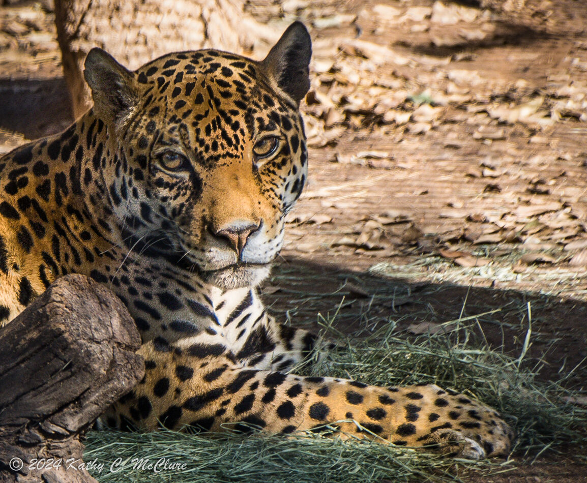
The jaguar might benefit from some lightening, eve... (show quote)
Thanks for the detailed response. I'll try to figure out how to do all that.
Feb 18, 2024 10:00:58 #
R.G. wrote:
The white fur round his mouth and nose and chest has a noticeable blue tint which you can get rid of using the HSL tool. There's no other blue bits in the frame to worry about so just do what you have to do to get rid of it.
Thank you. I hadn't noticed that. Thanks for pointing it out!
Feb 18, 2024 10:02:01 #
Julian wrote:
A sad look in the eyes… captivity certainly breaks the spirit!
That is so true. I've watched this jaguar for years, and he is definitely getting tired of captivity.
Feb 18, 2024 10:04:32 #
tcthome wrote:
LR6.14= If you feel something is too crunchy you might try some local brush work on them. Anything from reducing sharpness or clarity or both. Don't feel the outcome helped, just delete the brush. Plus could always do a virtual copy before moving forward with any additional editing. Have fun & nice photo.
Thanks. I always think there's a fine line between sharpness and crunchiness. I ran this through Topaz and it definitely came out crunchy, so I deleted that step. That's why I'm asking if it still looks crunchy.
Feb 18, 2024 10:05:21 #
Linda From Maine wrote:
"Success" in this case is just practice, practice, practice  But I know you're not that into editing, Kathy, and much prefer to being out with your camera than sitting at a computer.
Without a commitment to learning more about processing (and updating your software, lol) there will be occasions when you may have to settle for a less than perfect result.
But I know you're not that into editing, Kathy, and much prefer to being out with your camera than sitting at a computer.Without a commitment to learning more about processing (and updating your software, lol) there will be occasions when you may have to settle for a less than perfect result.
Thanks, Linda.
Feb 18, 2024 10:06:45 #
Bultaco wrote:
I like what you've done, that's one cat I'd love to see in the wild.
Thanks. I would also, but he wouldn't survive. I don't remember now how he came to be in the zoo, but it was something that precluded him living in the wild.
Feb 18, 2024 10:08:05 #
DirtFarmer wrote:
What version of LR are you using? The newer (subscription) versions have newer capabilities for producing masks that make targeted edits easier. Not exactly like using layers in Photoshop but a good approximation.
I'm aware of the improved versions of LR. My budget simply doesn't allow for another $10 expenditure every month for the rest of my life. So I have to make do with what I have.
Feb 18, 2024 10:12:17 #
AzPicLady wrote:
I'm aware of the improved versions of LR. My budget simply doesn't allow for another $10 expenditure every month for the rest of my life. So I have to make do with what I have.
Well, that means I can't make much in the way of suggestions. It's been a long time since I used LR6 (or before) and my memory isn't getting any better.
I suspect it means you have to play with the brushes a bit and maybe do a lot of trial and error.
Feb 18, 2024 10:14:07 #
DirtFarmer wrote:
Well, that means I can't make much in the way of suggestions. It's been a long time since I used LR6 (or before) and my memory isn't getting any better.
That's OK. RG gave some specific suggestions as to things to change. I'm going to work on them.
Feb 19, 2024 17:55:07 #
I tried to figure out all the changes folks wanted me to do and how to do them and I started over. In LR I masked the kitty a few times and darkened him, sharpened him, applied a little clarity and a little yellow. (This was to the RAW file, so it wasn't as orangey as the jpeg.) Then I masked the background and took the highlights down. In PS, I chose the white and tried to move it toward less blue. I don't know that actually did anything. I tried cloning out the shadow and the tree right above his head and one person suggested, but it didn't seem to want to work correctly. I also tried to take out the fringing that was noted, and that didn't seem to do anything either. Not sure why.
So, if anyone is still listening, is this any better? Or just different? Did I go the wrong way on my adjustments?
So, if anyone is still listening, is this any better? Or just different? Did I go the wrong way on my adjustments?
Feb 19, 2024 18:01:08 #

AzPicLady wrote:
I tried to figure out all the changes folks wanted... (show quote)
I think if you like what you do or did, the key is not to listen to all the naysayers. I have never seen anything you posted that looked like it was lacking or in need of work 🏆
Feb 19, 2024 18:02:59 #
joecichjr wrote:
I think if you like what you do or did, the key is not to listen to all the naysayers. I have never seen anything you posted that looked like it was lacking or in need of work 🏆
Oh, Joe, you're such a dear soul! Thank you!
If you want to reply, then register here. Registration is free and your account is created instantly, so you can post right away.