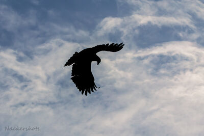
Does the white of the pier distract from the composition?
Feb 17, 2024 19:27:26 #
Feb 17, 2024 22:40:01 #
Feb 17, 2024 22:52:48 #
I too, like it just the way you have it. I like your choice of f/5.6 for the shot a lot!
Others have offered good ideas if you feel you want to tone down the deck in LR.
Nice shot!
Rob
Others have offered good ideas if you feel you want to tone down the deck in LR.
Nice shot!
Rob
Feb 17, 2024 23:05:04 #
Feb 18, 2024 10:44:34 #

utakirchlechner wrote:
Can I still edit to „store original after posting?“
Just resubmit.
Feb 18, 2024 11:21:40 #
Rick from NY
Loc: Sarasota FL
Yes, for my taste it’s too bright and distracting. Easy to tone it down in PS or other editing software.
And I agree that the white balance is off, rendering the bird too blue.
Incidentally, for those of you with access to PS, there is a beta version available that is testing a new function which allows you to click on the brush tool and just paint over an area you want to adjust without needing to go through masking and/or layers. Played with it a bit and it was pretty amazing.
Feb 18, 2024 11:37:13 #
Very helpful-I will have to try to use that. I am not too familiar with PS
Feb 18, 2024 13:50:07 #
utakirchlechner wrote:
Very helpful-I will have to try to use that. I am not too familiar with PS
He refers to the beta version's beta Adjustment Brush. It looks like it may have possibilities.
You can choose from six settings, Brightness/Contrast, Exposure, Vibrance, Hue/Sat, Black & White, or Photo Filter (simulated Wratten filters.) When you click the brush it automatically creates an adjustment layer with a mask, and the control sliders also come up. When you paint, you are actually just painting on the mask with black (conceals) or white (reveals.) You can then adjust the sliders to get the level of adjustment you want. You say you are not too familiar with Photoshop, but you should know how to use layers, layer masks, and adjustment layers to work with this tool. Also, remember that you are painting with a brush, so the accuracy of your mask will depend on how well you wield the brush. In most cases, I prefer Photoshop's more accurate selections and that is why I don't do a lot of that in Camera Raw.
It is only available currently in the public beta version which is available for download from your Creative Cloud desktop app if you don't already have it.
Feb 18, 2024 15:10:19 #
BurghByrd
Loc: Pittsburgh
It's a nice shot as is but you could try some optional crops; perhaps balancing the negative space at the top with the pier Ultimately it's how it stikes you, after all Van Gough went mad trying to sell his pictures not that I wish that on you.
Feb 18, 2024 17:55:19 #
Feb 18, 2024 19:22:27 #
These are great suggestions for me to try. Thank you all.
Today was not a photo Sunday-it has been raining now for the second day.
Today was not a photo Sunday-it has been raining now for the second day.
Feb 19, 2024 00:52:43 #
utakirchlechner wrote:
I seems to not like the white pier, but have no idea how to improve the photo.
Any suggestions greatly appreciated-including your edits.
Any suggestions greatly appreciated-including your edits.
White base would be excellent on a white background where it fades into the paper.
The pier has a washed out look when the edge is defined (like the yellow surround here), and would look better with a faint tonality overall. You said original pic was darker; does that version of the pier look better? Combine the two versions of the photo in Photoshop using the best of each.
Boris
Feb 21, 2024 16:20:50 #

I like it. maybe tone the white down a bit, but there is nothing wrong with it.
Feb 21, 2024 16:37:14 #
If you want to reply, then register here. Registration is free and your account is created instantly, so you can post right away.