Playing in Post
Nov 4, 2023 19:41:20 #
Reuss Griffiths
Loc: Ravenna, Ohio
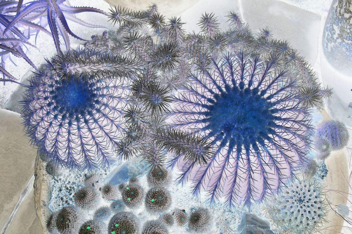
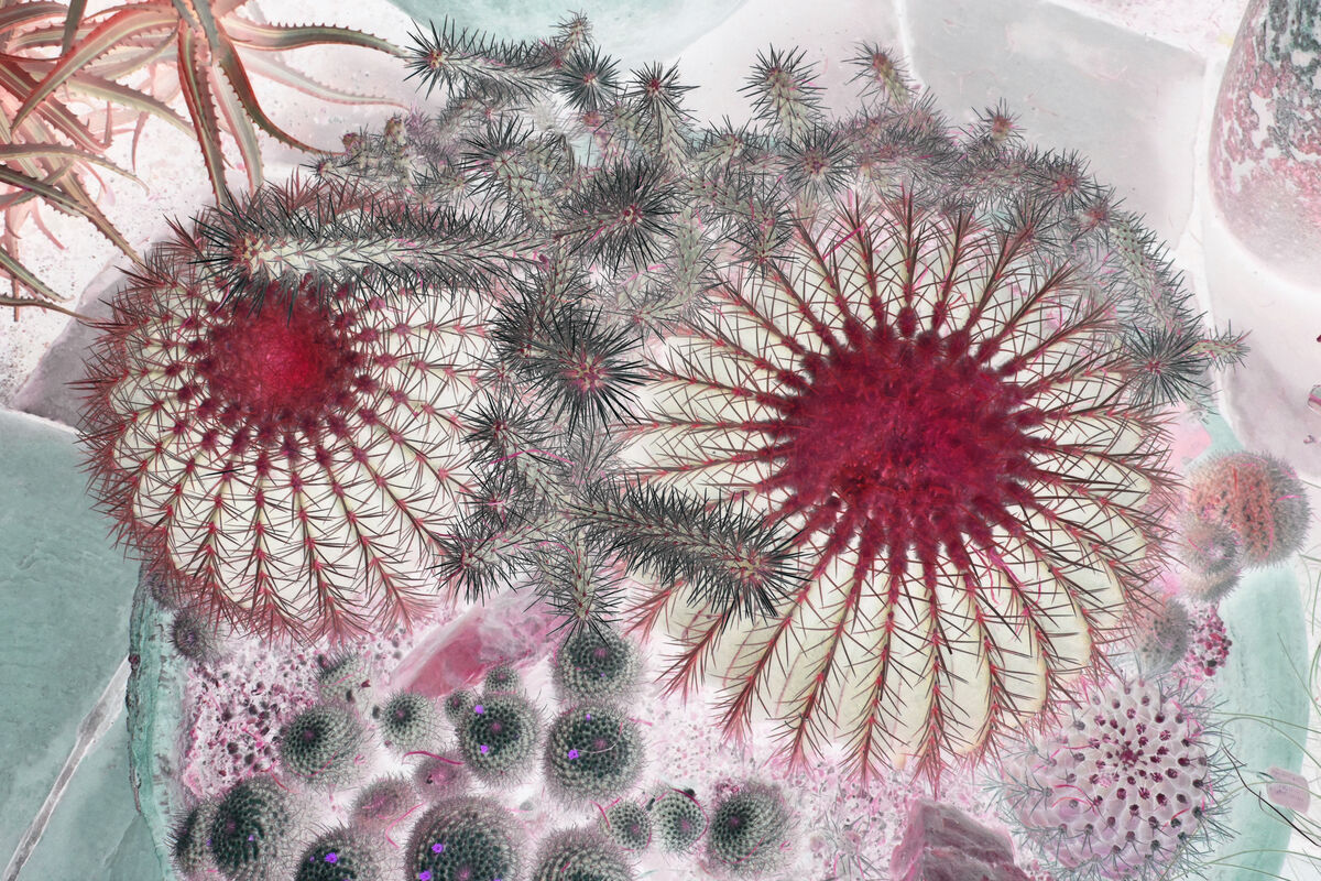
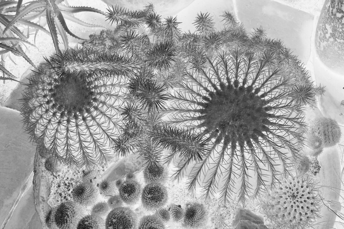
I enjoy taking an image that I find interesting for various reasons and playing with it in post just to see what emerges. The following three images are examples of this. Which one's appeal to you? Be interested in hearing which and why.
Nov 4, 2023 20:05:42 #
I suppose that if I said that none of these appeal to me, I would be considered too critical and judgmental, but I am not particularly a fan of the abstract. Not that I haven't tried on the weird myself from time to time, I'd just rather look at well-executed straight photography.
Carry on...
Carry on...
Nov 4, 2023 20:18:15 #
I like the blue one...because I like Blue!! And I like the symmetrical/asymmetrical sort of thing going on there!
Nov 4, 2023 20:47:50 #
Reuss Griffiths
Loc: Ravenna, Ohio
terryMc wrote:
I suppose that if I said that none of these appeal to me, I would be considered too critical and judgmental, but I am not particularly a fan of the abstract. Not that I haven't tried on the weird myself from time to time, I'd just rather look at well-executed straight photography.
Carry on...
Carry on...
Thanks for looking in and your honest comment. Not your cup of tea. Would be an awful dull world if we all thought the same.
Nov 4, 2023 21:08:59 #

Nov 4, 2023 21:32:40 #
Reuss Griffiths wrote:
Thanks for looking in and your honest comment. Not your cup of tea. Would be an awful dull world if we all thought the same.

Nov 4, 2023 21:35:21 #
Reuss Griffiths
Loc: Ravenna, Ohio
UTMike wrote:
Imaginative, Reuss!
Thanks for looking in Mike. Do any of them appeal to you. Know what they are????
Nov 4, 2023 21:38:03 #
Reuss Griffiths
Loc: Ravenna, Ohio
Retired CPO wrote:
I like the blue one...because I like Blue!! And I like the symmetrical/asymmetrical sort of thing going on there!
Thanks Chief, I'm thinking of having one of these converted into a metal print for my daughter. I like the blue one too but am looking for input to see if that's really the one that catches the eye.
Nov 4, 2023 22:14:21 #
I've never done metal prints, but I've seen some beautiful ones! I would bet that one of these would be incredible on metal!
Nov 4, 2023 22:48:59 #
Blue one appeals to me, but it seems too much is going on. What did the original look like?
Nov 4, 2023 22:59:18 #
Reuss Griffiths wrote:
Thanks for looking in Mike. Do any of them appeal to you. Know what they are????
They look like flowers. I like the last one.
Nov 5, 2023 00:56:23 #
What are they? I'm not sure but the look like cacti to me. I like the in your face red one. You should post this one in the Photo Critique Section too.
Nov 5, 2023 05:52:06 #

Nov 5, 2023 06:29:49 #
Nov 5, 2023 06:33:09 #
As you know, Reuss, I like to mess around in PP work myself. I'm usually driven by colors. For that reason, I'm not attracted to the B&W version.
The red and the blue are both attractive to me....kind of a mood situation. Do them both on metal and let your daughter display the one that best reflects her feelings that day.
In general, I stay away from mixing symmetrical and asymmetrical elements. But, of course, that's just my opinion. Others, I'm sure, will feel differently about that.
If you want to reply, then register here. Registration is free and your account is created instantly, so you can post right away.