Is this image too dark
Jan 17, 2023 09:06:26 #
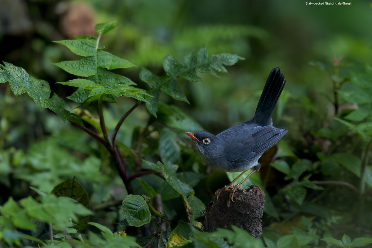
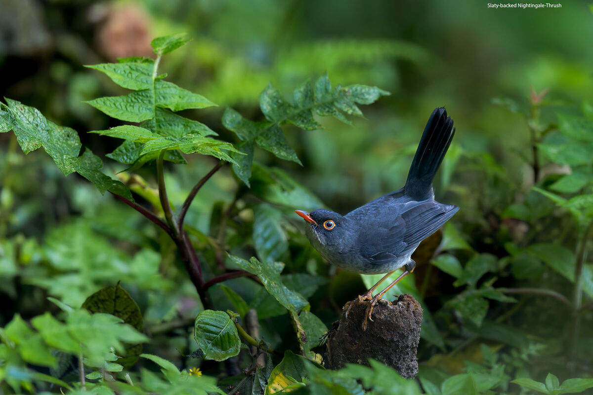
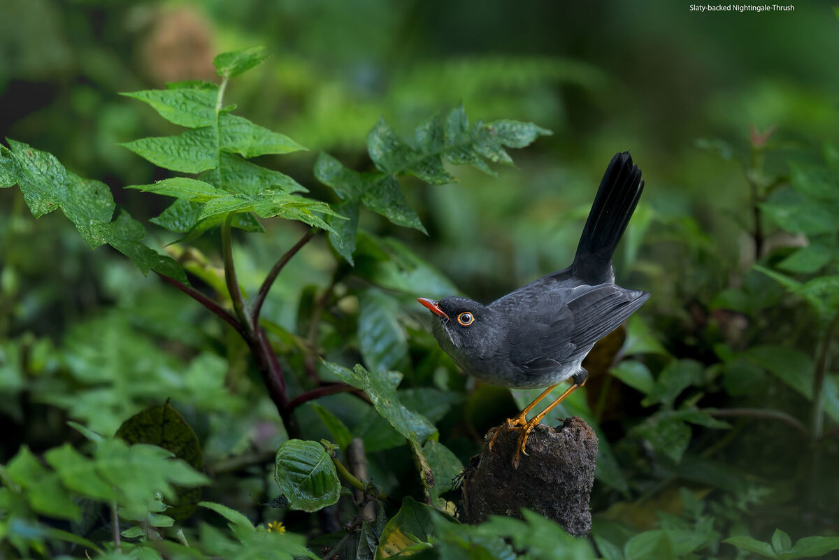
My usual "technique" is to brighten the bird and darken the BG. I use a number of methods to obtain that result. However, watching Steve Perry's video yesterday made me wonder about the opposite approach-darken the bird and brighten the BG. Unfortunately most of my images do not lend themselves to that approach as I often am fighting low light levels to start with. In this image of a Slaty-backed Nightingale-Thrush, in ACR, I brought down the BG and brought up the bird. I had to balance keeping the bird "black" with increasing the brightness. Shot with ISO of 2000 on Canon R5.
My question is: is the overall image too dark? Any other suggestions?
My question is: is the overall image too dark? Any other suggestions?
Jan 17, 2023 09:16:22 #
Processing is a big part of making the image yours. I would imagine you will get many different approaches, however for me, I think you're pretty close as is. I would possibly darken the top right corner more, the edges as well. I would maybe lighten the top of the stump a touch and maybe, though I would have to see it, the crown of the bird's head a bit more. Overall, I think you have done about as much as you can considering the bird's color and the background. It's a nice image and tweaking it too much might make it look too fake. IMHO.
Mike
Mike
Jan 17, 2023 09:19:13 #

This works for me once downloaded but the bird somewhat "points" to the in-focus leaves and they compete as the photo's subject. Personally, I find over brightened images too harsh so I like this. A non-professional assessment, mind you.
Jan 17, 2023 09:23:41 #
BobPeterson
Loc: Massachusetts
The bird is a little lost in the dark. I would try select subject and either bring the exposure up a bit (1/3 stop or less) or raise the shadows (about +25).
I would also burn the brightest greens with a soft brush.
I would also burn the brightest greens with a soft brush.
Jan 17, 2023 09:38:20 #

Jan 17, 2023 09:45:31 #
ksmmike wrote:
Processing is a big part of making the image yours... (show quote)
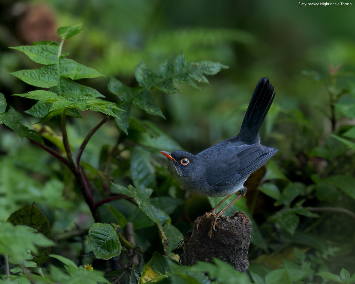
Thank you. My wife pointed out that the leaves between the bird's legs are too bright. I went back and brought those down.
Jan 17, 2023 09:46:18 #
fourlocks wrote:
This works for me once downloaded but the bird somewhat "points" to the in-focus leaves and they compete as the photo's subject. Personally, I find over brightened images too harsh so I like this. A non-professional assessment, mind you.
I can see your point. I may go back and put a radial gradient on these and either blur them slightly or reduce texture/clarity slightly.
Jan 17, 2023 09:47:39 #
BobPeterson wrote:
The bird is a little lost in the dark. I would try select subject and either bring the exposure up a bit (1/3 stop or less) or raise the shadows (about +25).
I would also burn the brightest greens with a soft brush.
I would also burn the brightest greens with a soft brush.
Thank you. I am finding that if I try to bring up the bird too much, it becomes gray rather than black. This bird is not "jet black" in real life, but none the less, more black than gray.
Jan 17, 2023 09:48:04 #
sippyjug104 wrote:
I believe it is a job well done.
Thank you. Appreciate your thoughts.
Jan 17, 2023 10:22:36 #
bajadreamer wrote:
My usual "technique" is to brighten the ... (show quote)
Based on the histogram, image is underexposed to the extent that I when trying to process in Photoshop, I don't seem to be able to recover any information in the dark areas. But, on the other hand, dark my be appealing considering this bird my like rummaging around under the bushes. I brought it up a bit for my personal taste. So, technically, yes, its underexposed, but still IMO, a nice image.
Jan 17, 2023 10:49:04 #
Nalu wrote:
Based on the histogram, image is underexposed to the extent that I when trying to process in Photoshop, I don't seem to be able to recover any information in the dark areas. But, on the other hand, dark my be appealing considering this bird my like rummaging around under the bushes. I brought it up a bit for my personal taste. So, technically, yes, its underexposed, but still IMO, a nice image.
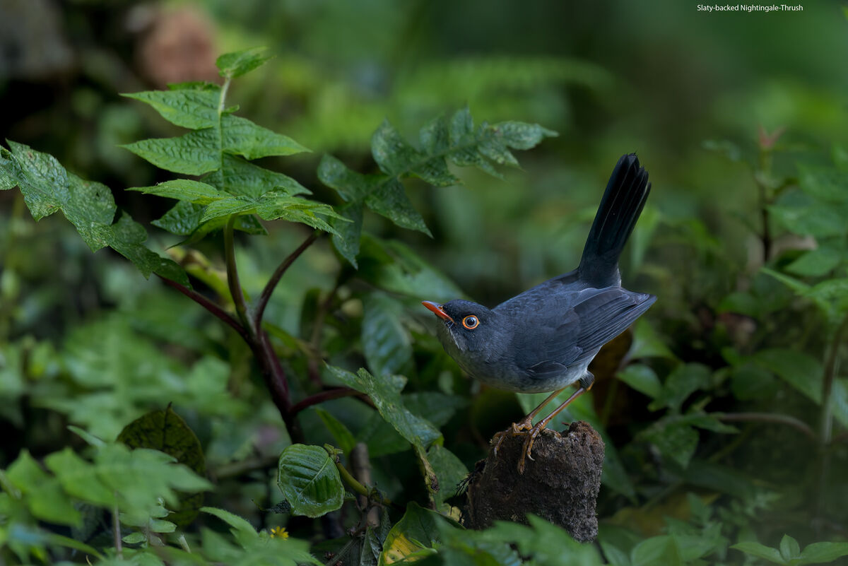
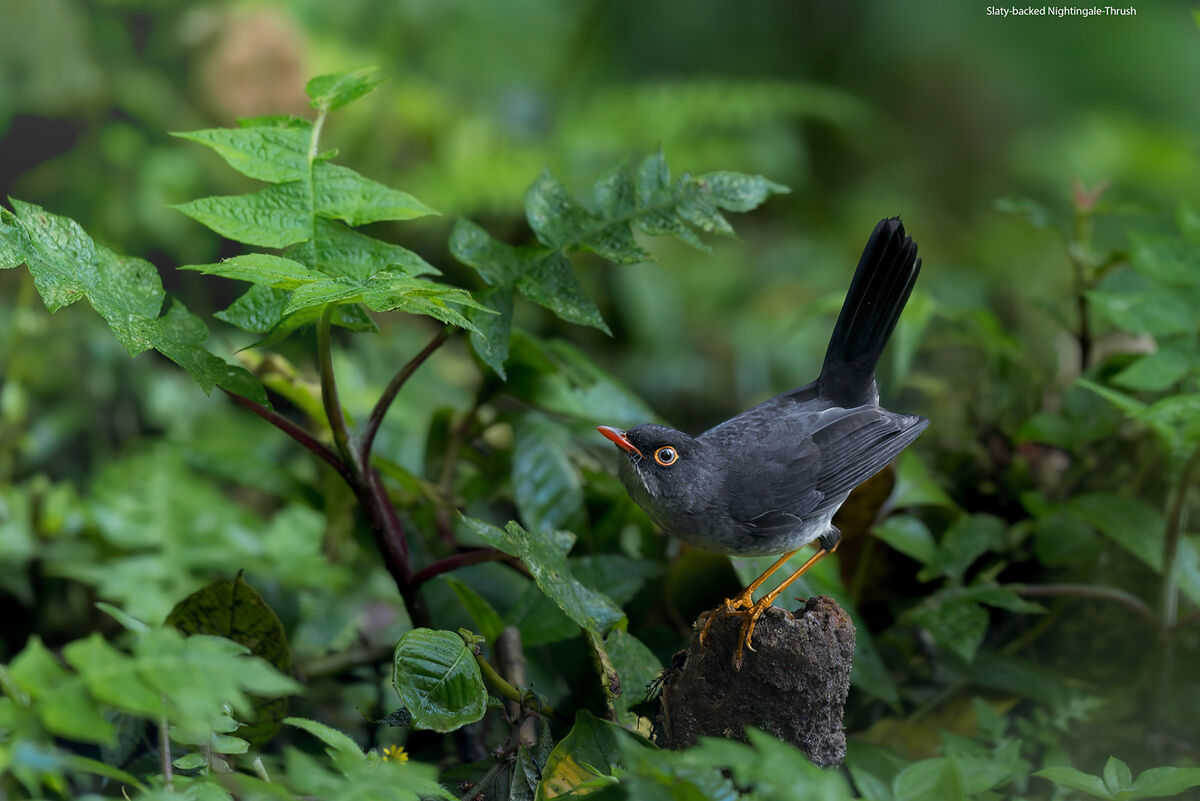
Thank you. I am reposting a recrop of the image. My goal was to minimize the very dark areas in the upper L of the original. Not sure it makes a lot of difference and I did sacrifice a little composition (rule of thirds) but it did remove some of the dark "feel" of the image.
Jan 17, 2023 13:10:09 #
bajadreamer wrote:
My usual "technique" is to brighten the ... (show quote)
I agree with the prior responder. You really need to look at download to appreciate. That said . This is a beautiful picture. I do not think it is too dark but I do think I would have cropped a little more so the focus is really on the bird and his eye and bill. I am not a professional so take it for what its worth. I would have cropped pretty evenly around all four sides. (but not exactly I would adjust so focus is on eye and bill)
Jan 17, 2023 14:31:34 #

One of the main issues is your intent. Was it a dark scene and do you want to be faithful to reality? If not, it could do with some overall brightening. The underside of the bird is indistinct because it's not well differentiated from the background - do you want the bird to stand out from the background or do you want to represent its elusive nature by having it indistinct from the background? The usual way to process this would be to have the bird prominent and distinct, but that may not be your intention.
Whatever your intention is, processing this shot will get you thinking about the viewers' attention and how it can be directed. The main things that draw our attention are brightness, contrast, sharpness, colour strength, action (even if it's frozen as in a picture) and the principal components of any storytelling that the shot conveys. The first four are primarily to do with the PP adjustments that we may consider using.
The subject of your shot doesn't lend itself to being brightened but it seems to be a good candidate for added contrast, sharpening and saturation. It would also make sense to do the reverse to the background, or at least to avoid adding much in the way of contrast, sharpness and colour strength. Normally you wouldn't want to avoid those adjustments altogether because it would leave the background bland, but this case is an exception - assuming that you do want the bird to stand out.
I think brightening the bird as much as possible without it looking off is the right approach, and the background should be brightened as much as is determined by your preference. Removing bright spots from the background was also a good move. The other adjustments will differentiate the bird from its background.
Jan 17, 2023 15:21:35 #

bajadreamer wrote:
Thank you. I am reposting a recrop of the image. My goal was to minimize the very dark areas in the upper L of the original. Not sure it makes a lot of difference and I did sacrifice a little composition (rule of thirds) but it did remove some of the dark "feel" of the image.
Your main subject is a real stunner 🖤🖤🔥🖤🖤
Jan 17, 2023 15:48:02 #
bajadreamer wrote:
...My question is: is the overall image too dark? Any other suggestions?
I don't feel the image is too dark, but there is a lack of separation between the bird and it's background. There are a number of ways to create separation, i.e. brightness, contrast, color, hue, blur, etc. In this image, I didn't feel increasing bird brightness relative to the background was the best approach. However, increasing bird contrast did seem to work better, IMO. I also saw that there was a strong blue color cast in the bird which isn't characteristic of this species. Feather colors are different shades of gray, no blue. Additionally, the normal color of the legs are a bright orange, similar to the color of the beak and ring around eyes.
Personally, I liked the original crop more than the last crop. For this image, I prefer the environmental composition more than a portrait. The darks in the dark spot can be easily lightened to better match the rest of the background. I also feel that a light vignette helps further guide the viewer's focus to the bird. I also agree with your wife, that bright spot between the bird's legs had to go.
If you want to reply, then register here. Registration is free and your account is created instantly, so you can post right away.