What would you do?
May 2, 2022 06:56:05 #

TheShoe wrote:
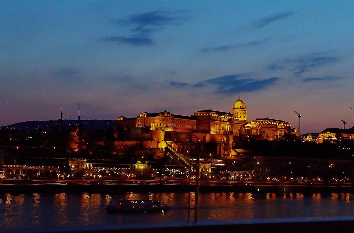
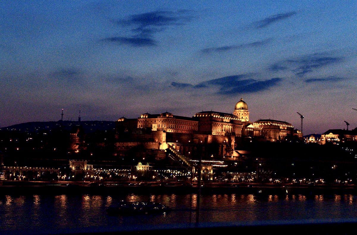
This image is essentially straight from, the camera with only the DxO PL5 optical corrections applied. What can be done in PP to improve it?
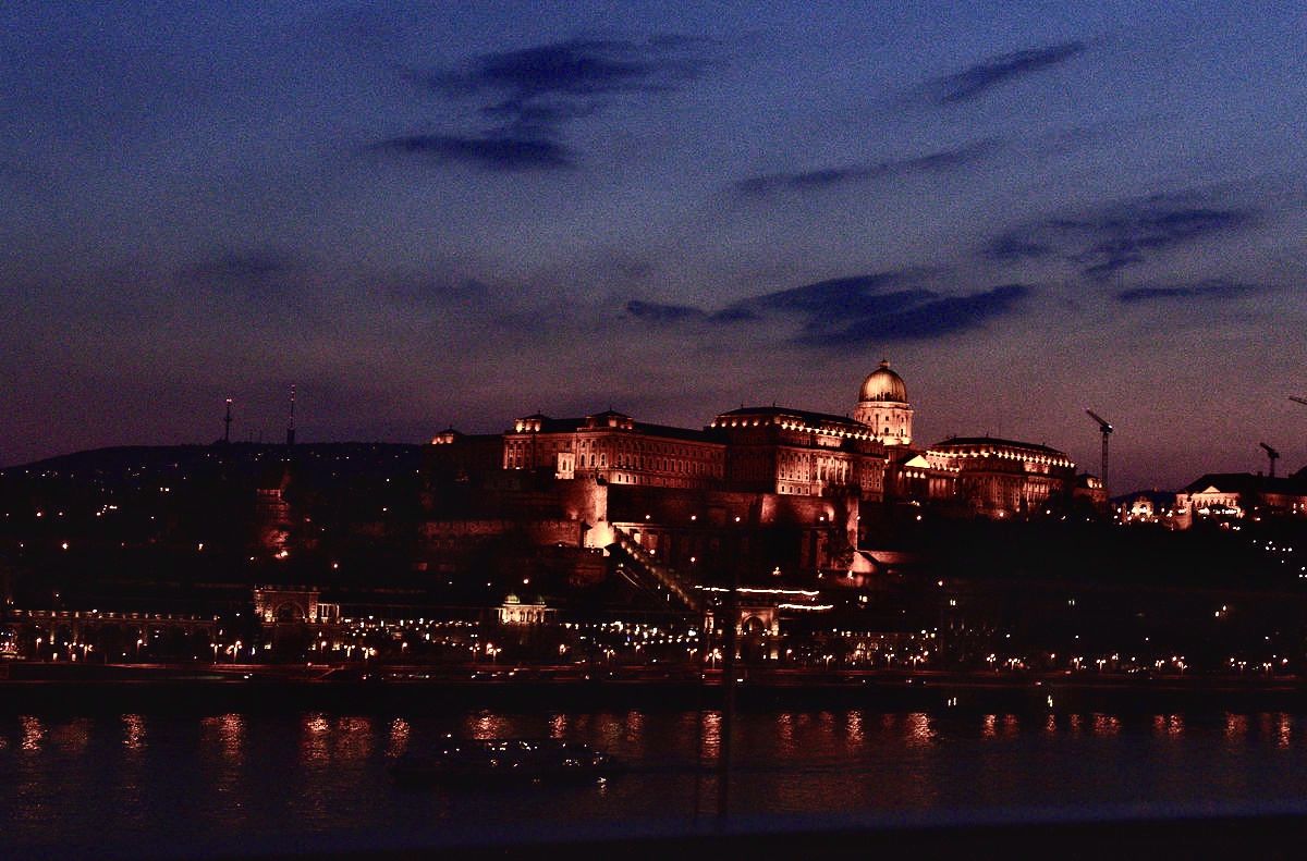
Affinity - lightened shadow and brightened. Then EP unblur and EP denoise.
May 2, 2022 08:30:16 #

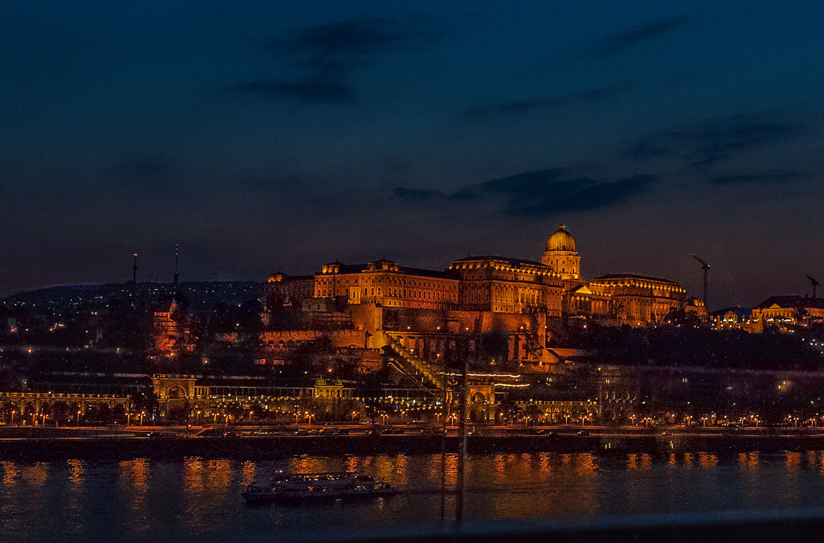
The buildings are tilted to the right, I like the first photo, but the human brain needs a horizontal and/or vertical reference. That is why we have straightening tools in our kit bag.
May 2, 2022 11:19:06 #

I don't see the overall darkness as being a problem, but the darkest shadows are a bit too impenetrable. If they were smaller it probably wouldn't be a problem. There's not much detail in the shadows and brightening them brings out lots of noise, but they can be made less extreme and given some extra adjustments once selected, like extra denoise and a moderate amount of negative sharpening.
Perhaps you're happy with the oranges being as red-orange as they are, but in the interests of normalising things a bit I nudged them towards yellow-orange a bit and subdued the saturation a bit. You may prefer a ramped up look but I prefer my edits to stay looking like photos.
Noise is more noticeable in smooth areas that don't have much in the way of small detail, and in this case the sky was looking a tad grainy, so I selected it and applied extra denoise and a touch of negative Clarity. I could have brightened the sky but like it a bit on the dark side.
I made much use of Lightroom's masking feature in the Sharpen tool and also applied quite a lot of colour denoise (but not too much since it didn't go well with the negative sharpening that I applied. It was causing excessive smudging, more so than negative sharpening on its own was causing).
Some split toning helped the colouring to be a bit stronger without getting the overcooked look that extra saturation would have given it. I added blue to the shadows and yellow-orange to the highlights. That, plus some HSL tweaking, various selections and straightening is all the editing I gave it.
.
May 2, 2022 11:23:24 #
TheShoe
Loc: Lacey, WA
Tjohn wrote:
I like this the best. Less grain.
I wouldn't change the color.
I wouldn't change the color.
Thanks for the comment. Changing color just wasn't appropriate for the scene.
May 2, 2022 15:25:45 #
TheShoe
Loc: Lacey, WA
dpullum wrote:
The buildings are tilted to the right, I like the first photo, but the human brain needs a horizontal and/or vertical reference. That is why we have straightening tools in our kit bag.
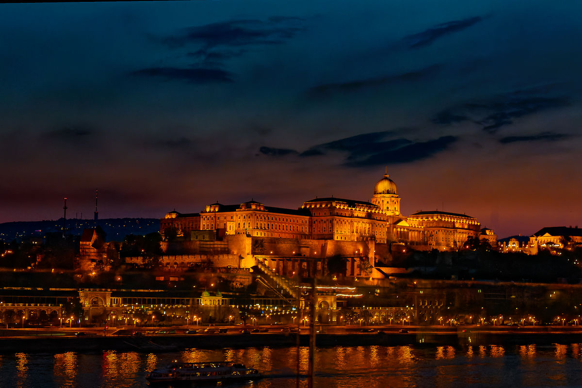
Dpullem:
Good eye. The lean was so slight that DxO Viewpoint's autocorrect did not fix it. Manual adjustment was required. Here it is with the perspective adjustment.
Others:
In addition, I have lightened the darkest corners and cropped to eliminate the rail in the lower right area. As for the suggestion to brighten the sky, do not be fooled by the timestamp because the camera was still on PDT. It was not 10:10 AM. The sky was only dimly lit.
May 2, 2022 20:01:21 #
May 4, 2022 18:40:09 #
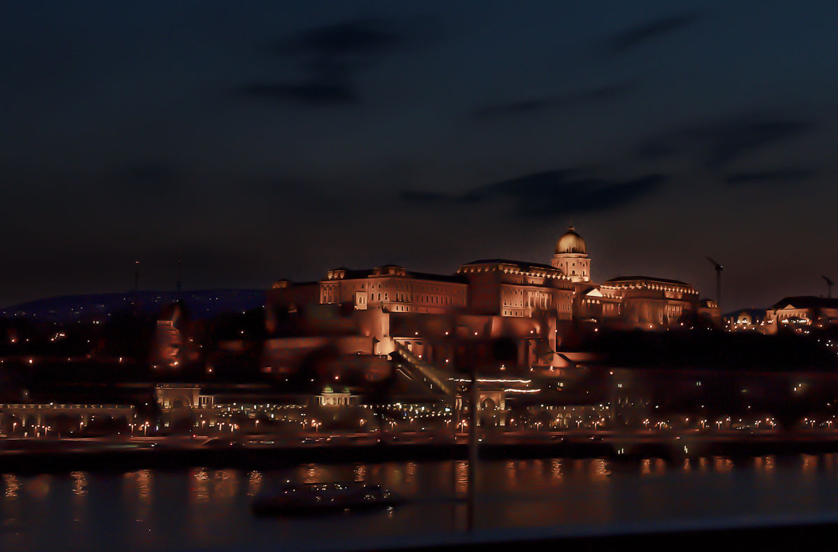
My first reaction was it's too red. I had a hard time believing the lights were casting such a strong red color. I opened your original image in PS. Adjusted the white balance to bring down the red cast also reduced vibrance & saturation. Opened shadows a bit and exposure, doing this caused a lot of noise so reduced that with noise sliders. Next I selected the sky and made a curve adjustment. Now made another selection of the whole picture minus the sky and added another curve layer adjusting bright and dark areas of the buildings. With the last adjustments I saw more noise so used Noiseless pro to reduce more noise. Doing this I started loosing detail so made a High pass layer bringing back detail. I was all done at this time and went back to read all the comments and saw that you felt the red was needed so I added a vibrance layer increasing the color.
May 8, 2022 00:57:07 #
TheShoe wrote:
This image is essentially straight from, the camera with only the DxO PL5 optical corrections applied. What can be done in PP to improve it?
Almost any slider you push wull improve the photo. With a PC tou can do almost anything you want. The pix below are edited using only a phone.
May 8, 2022 02:07:18 #
Still just sliding sliders. Using my phone every change is edge to edge, no ability to select an area or an object. Just try it.
May 8, 2022 08:00:35 #
May 8, 2022 15:30:05 #
TheShoe
Loc: Lacey, WA
User ID wrote:
Almost any slider you push wull improve the photo. With a PC tou can do almost anything you want. The pix below are edited using only a phone.
I fail to see any improvement in those edits, which disproves your initial statement.
May 8, 2022 15:40:26 #
TheShoe
Loc: Lacey, WA
User ID wrote:
Still just sliding sliders. Using my phone every change is edge to edge, no ability to select an area or an object. Just try it.
Since the lights were heavy on the yellow, making the red bricks appear orange, that conversion to white lights simply does not work as an attempted improvement.
Am I wrong? Isn't the stated purpose of this thread to get or give helpful criticism?
If you want to reply, then register here. Registration is free and your account is created instantly, so you can post right away.