Ansel's Moonrise,_Hernandez,_New_Mexico
May 1, 2022 11:13:29 #
topcat wrote:
I think that it is a great B&W photo. I had th... (show quote)
Inneressing that "BW Photo" is today a genre with a name. Its a simple reversal over passing time. "Color Photo" once held that extinction.
Try to imagine if your fave vintage BW masterpiece was not so very old at all, and had been made in color by someone masterful in the current tech.
Sticking with the thread theme of things that bias our seeing, heres an old-ish snapshot. It was always just a snapshot. But now its "a photograph" and possible candidate for critique just cuz its a BW in 2022. If it were somehow magically updated to Kodak color, it would still be just a casual snapshot, nothing more.
The medium is the message. Today, BW biases the viewer to see a "real photograph, by real photographer".
.

May 1, 2022 18:44:03 #
camerapapi wrote:
I hope the majority of you know that this image wa... (show quote)
I had not viewed the image in quite a while but when I looked at it now my first thought was I wish the moon was farther to the right.
May 1, 2022 22:45:24 #
User ID wrote:
Inneressing that "BW Photo" is today a g... (show quote)
I somewhat agree with what you are saying. But you are addressing only part of the reason why B&W may be getting special consideration. Another is that, in at least some photos, B&W provides a further "abstraction" of reality that eliminates the distraction of color and concentrates on the essence of the subject. That's not the appeal of "Moonrise" of course. That, I think, has more to do with the beautiful tonalities which can be said to be the subject?
I know you don't like to talk about your photos. But what, putting aside the color/B&W issue, should have been different in the shot to elevate it from snapshot to "photograph"?
May 2, 2022 00:55:37 #
srt101fan wrote:
I somewhat agree with what you are saying. But yo... (show quote)
What tags it as a snapshot is its casual, almost haphazard, feeling. It shows no signs of being a "well considered work". Altho it appears to be relatively flawless, as snapshots go, the viewer can easily put that down to luck. Thus it is very "snapshot looking".
There is solid reason *why* it lacks the typical visually annoying flaws of most snapshots. The photo was made by a skilled professional with well honed work instincts. But viewers wouldnt know that.
May 2, 2022 01:28:32 #
RodeoMan
Loc: St Joseph, Missouri
User ID wrote:
What tags it as a snapshot is its casual, almost h... (show quote)
Actually the snapshot works because the two subjects are familar with you, view you with affection, are totally at ease with you and could give a rat's ass about your being "a skilled professional with well honed work instincts" but acoarst thaz just my opinion. I agree with most of the rest of what you said about black & white images being held at a higher regard right out of the gate simply because they are b&w.
May 2, 2022 01:52:52 #
RodeoMan wrote:
Actually the snapshot works because the two subjects are familar with you, view you with affection, are totally at ease with you and could give a rat's ass about your being "a skilled professional with well honed work instincts" but acoarst thaz just my opinion. I agree with most of the rest of what you said about black & white images being held at a higher regard right out of the gate simply because they are b&w.
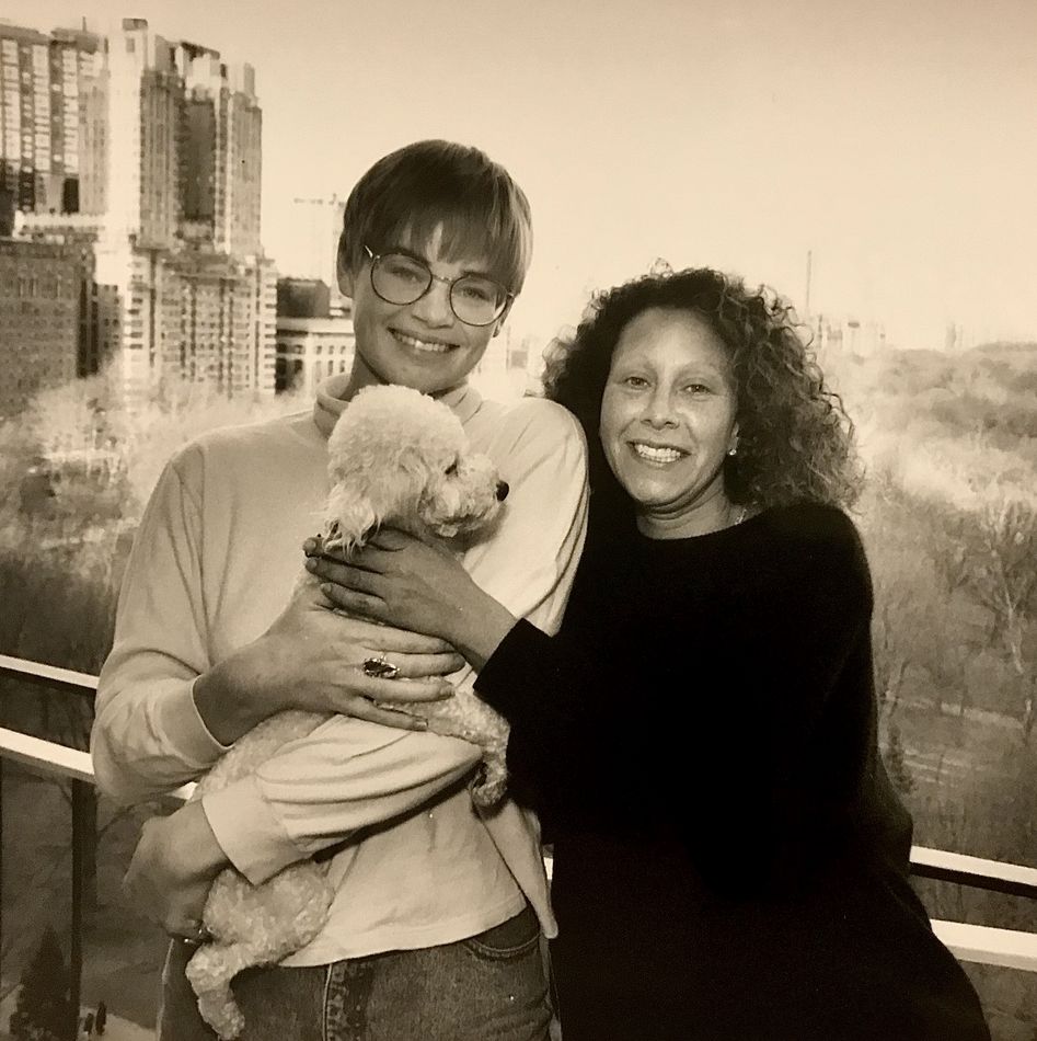
Your take is a pretty close view of the situation. Actually, one woman knows me verrrrry well. She is an art collector and takes for granted that she will receive a quality result. The other woman happens to be unknown but seems to be having fun in the moment.
(Download)
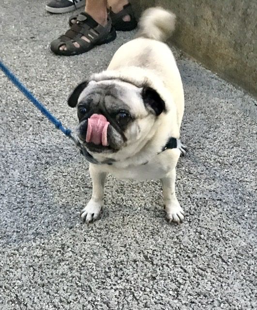
That little poodle was very old. The collector has now "upgraded" to a pug who certainly does not view me "with affection", as clearly illustrated here !
(Download)
May 2, 2022 07:42:04 #
larryepage
Loc: North Texas area
User ID wrote:
Inneressing that "BW Photo" is today a g... (show quote)
I have never really liked sepia toned images. I consider it a sort of cheap technical trick to render flesh tones into monochrome images. My only other real criticism of this image is the framing...I'd like it better if it was tighter, with less space at the top and maybe some consideration given to where the lower edge falls.
And I really don't care what you choose to call it. It's a nice image. It is also an effective depiction and remembrance of all three of the subjects.
May 2, 2022 12:18:20 #
NickGee
Loc: Pacific Northwest
larryepage wrote:
I have never really liked sepia toned images. I consider it a sort of cheap technical trick to render flesh tones into monochrome images. My only other real criticism of this image is the framing...I'd like it better if it was tighter, with less space at the top and maybe some consideration given to where the lower edge falls.
And I really don't care what you choose to call it. It's a nice image. It is also an effective depiction and remembrance of all three of the subjects.
And I really don't care what you choose to call it. It's a nice image. It is also an effective depiction and remembrance of all three of the subjects.
Actually, it's a very ordinary image (a "snapshot," as was said), and it's unremarkable both in color and black & white. And honestly, where in the world did the notion come about that B&W photos have inherent gravitas simply on the basis of their being black & white? The notion is utterly ridiculous. It's composition and execution that makes a photo remarkable (or not). There is no intrinsic value imparted to a photo simply by the format in which it's presented. That's nuts.
May 2, 2022 12:44:19 #
NickGee wrote:
Actually, it's a very ordinary image (a "snap... (show quote)
Not sure which "snapshot" you are referring to. I see a toned B&W image but no color.
About B&W having "inherent gravitas": That claim may certainly be exagerated but I think you dismiss it too readily. I've seen many B&W photos that, for me, would not work as well in color. In the movie world, do you really think "The Third Man" could have been shot just as well in color?...
I totally disagree with your comment that "It's composition and execution that makes a photo remarkable". You left out the most important: Content!
May 2, 2022 12:59:42 #
NickGee
Loc: Pacific Northwest
srt101fan wrote:
Not sure which "snapshot" you are referr... (show quote)
Sorry to be unclear. I was referring to the B&W photo of the two women and dog. I did not mean to suggest that format (B/W vs. color) is not an important judgment, but simply that one is not inherently more "arty" than the other. And I consider content to be a component of composition (semantics perhaps).
May 2, 2022 13:39:46 #
larryepage
Loc: North Texas area
NickGee wrote:
Sorry to be unclear. I was referring to the B&W photo of the two women and dog. I did not mean to suggest that format (B/W vs. color) is not an important judgment, but simply that one is not inherently more "arty" than the other. And I consider content to be a component of composition (semantics perhaps).
The issue here is a typical one on this site..that something is absolutely one thing or the other. It is difficult to detect any mental acuity recognizing any sort of a scale. It is certainly possible for an image to be more than a snapshot while perhaps falling short of being "high art."
The photograph in question is clearly more than a simple snapshot, with obvious care taken with setup, poses, and background. It reveals quite a lot about the photographer, who has otherwise taken great lengths to keep himself anonymous.
So no. In no way is it just a casual snapshot.
May 2, 2022 14:29:00 #
srt101fan wrote:
Not sure which "snapshot" you are referr... (show quote)
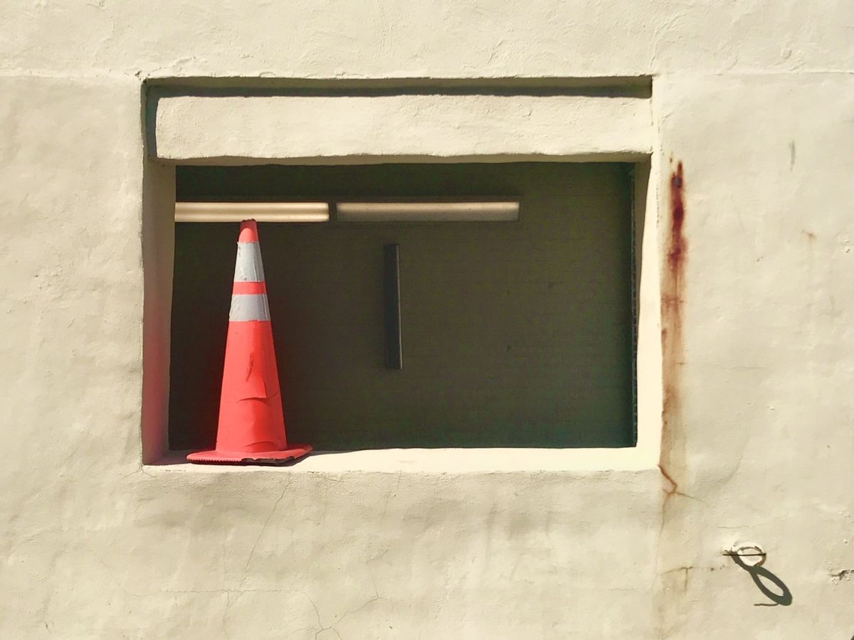
While content is an obviously important concern, the photo below garnered very high praise (declared a "wall hanger") from one hogster, yet its all composition, texture, lighting, etc but very weak on content. Theres just nothing especially appealing or interesting about a traffic cone and a wall.
Despite being a realistic image, perhaps its truly abstract, being all composition and color, lacking content. If it has a subject at all, that would be "orange".
.
May 2, 2022 14:51:49 #
CaptainPhoto wrote:
I think that where you placed the moon is a much better photo. If the moon is the main actor in this photo having it mostly in the center does not do it justice. Just MHO
Despite the title, the moon is not the main actor. Its just a clock in a scene.
Acoarst in a forum where members frequently ask what lens is needed to shoot a full moon (no scene, all moon, thus all results alike) its no sooprize if someone locks onto a tiny moon in an expansive scene.
With dogs its "Squirrel ! Get him !"
But with hogs its "Moon ! Get him !"
May 2, 2022 15:03:44 #
larryepage
Loc: North Texas area
User ID wrote:
While content is an obviously important concern, the photo below garnered very high praise (declared a "wall hanger") from one hogster, yet its all composition, texture, lighting, etc but very weak on content. Theres just nothing especially appealing or interesting about a traffic cone and a wall.
Despite being a realistic image, perhaps its truly abstract, being all composition and color, lacking content. If it has a subject at all, that would be "orange".
.
Despite being a realistic image, perhaps its truly abstract, being all composition and color, lacking content. If it has a subject at all, that would be "orange".
.
But see, we've gotten pretty jaded about finding reasons to say that sonething is not interesting. I'm more a realist than a fan of the abstract, but there is a lot here of interest to me...
The "floating" slab at the top of the window.
The metal loop with the incongrous loop in the lower right-hand corner.
The Morse Code "N" on the top of the traffic cone (It's a traffic safety standard).
The subtle color in the adobe walls.
Are they adobe walls?
Get the idea? Some of the responsibility is on the viewer if the communication is to work. Today's viewers have to quit being so lazy. Otherwise they don't deserve to have artists make art for them. That includes reviewers and judges.
May 2, 2022 23:01:02 #
NickGee wrote:
Sorry to be unclear. I was referring to the B&W photo of the two women and dog. I did not mean to suggest that format (B/W vs. color) is not an important judgment, but simply that one is not inherently more "arty" than the other. And I consider content to be a component of composition (semantics perhaps).
Thanks for clarifying your use of the word "composition". I don't see it that way but I think there are many who use it the same way you do.
If you want to reply, then register here. Registration is free and your account is created instantly, so you can post right away.