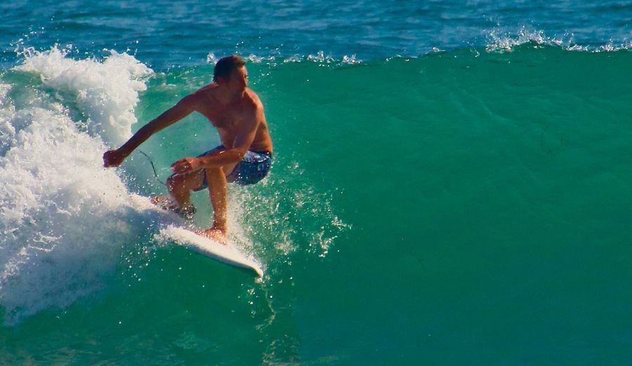
Surfer - does this crop work?
Oct 10, 2021 08:48:17 #
zug55
Loc: Naivasha, Kenya, and Austin, Texas
R.G. wrote:
That advice is too simplistic. Yes, cropping in d... (show quote)
I think that R. G.'s advice is very good. I would focus more on the negative space on the right--it makes this a more effective photograph. I would move the crop to give the surfer more empty space to travel into. If you have the option you may try to crop even less, using the same proportions. When I am not sure how to crop I make multiple copies of a photograph and then try different crops until I find the one that works for me.
Oct 10, 2021 09:54:38 #

This composition reflects the Fibonacci curve and employs the Rule of Thirds, for visual balance. It could tighten slightly by a diagonal crop from the lower-right corner.
zug55 wrote:
I think that R. G.'s advice is very good. I would focus more on the negative space on the right--it makes this a more effective photograph. I would move the crop to give the surfer more empty space to travel into. If you have the option you may try to crop even less, using the same proportions. When I am not sure how to crop I make multiple copies of a photograph and then try different crops until I find the one that works for me.
Oct 10, 2021 10:31:24 #

To me, the crop is insignificant to the large, distracting blown out areas within the photograph.
--Bob
--Bob
Craigdca wrote:
Ken Rockwell says to crop into the subject as much as possible to remove distractions and to make the subject larger. The challenge with this photo is that normally I would want the surfer moving into the frame more than heading out, but I want to include more whitewater than blue.
Oct 10, 2021 17:19:24 #

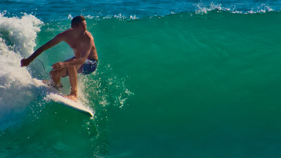
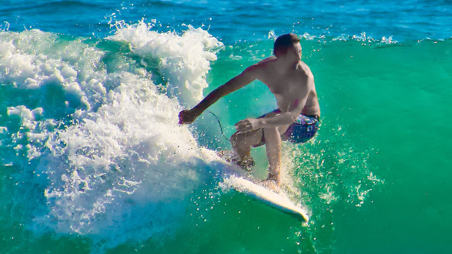
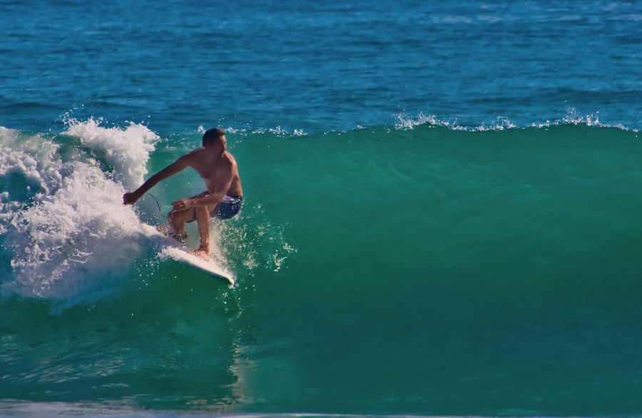
Hi Everyone, thank you for your responses here. I implemented your ideas in this new version of the 16x9 crop. Lowering the highlights reduced the blown out whites although I should try using a polarized filter next time, and desaturating the reds improved the skin tones dramatically. I also reduced the noise further and brought up the shadows. The idea to tighten up the crop from the bottom right seemed to help, and shifted the surfer to the left to take out more of the bright white water that pulled attention away from the surfer.
I'm only disappointed that there wasn't enough detail in the shadows when I snapped the camera. I'm also disappointed that I couldn't zoom in enough to fill the frame as you can see in the full image. I really appreciate that you took the time to share your knowledge that I can apply going forward.
In the meantime, here's the new cropped version and the full image for reference.
Oct 10, 2021 17:33:47 #
anotherview wrote:
Picture works as is compositionally. It captures a dynamic moment. Note the three graphic masses: white water, surfer, and green water to his left. This arrangement compels the eye.
KR has it right as a rule, as a guideline.
KR has it right as a rule, as a guideline.
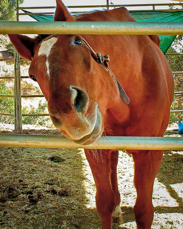
Thanks for your feedback on how I successfully composed it for a tight crop. His article was about winning contests by boldly emphasizing the subject. I like the concept for this stationary horse that had enough context immediately around it, but not sure if it worked for this surfer which is why I asked for UHH advice. The final answer seems to be: It depends on how it will be used. But with better tone and color.
Oct 10, 2021 17:52:10 #
Craig, the composition is much improved, as the surfer is "heading" towards the center of the photograph. A classical approach. The highlights are stilll a bit "hot", but overall a definite improvement.
--Bob
--Bob
Craigdca wrote:
Hi Everyone, thank you for your responses here. I ... (show quote)
Oct 10, 2021 19:35:45 #
rmalarz wrote:
Craig, the composition is much improved, as the surfer is "heading" towards the center of the photograph. A classical approach. The highlights are stilll a bit "hot", but overall a definite improvement.
--Bob
--Bob
Thanks for the follow up, Bob. It helps knowing I’m on the right track. I agree about the bright highlights and hopefully can get a better exposure without losing the shadows too much. The polarized filter might just do the job next time

Oct 10, 2021 19:40:19 #
From my experience with a polarized filter, I found this filter unfriendly to human skin tones.
Craigdca wrote:
Thanks for the follow up, Bob. It helps knowing I’m on the right track. I agree about the bright highlights and hopefully can get a better exposure without losing the shadows too much. The polarized filter might just do the job next time
Oct 10, 2021 19:52:45 #
anotherview wrote:
From my experience with a polarized filter, I found this filter unfriendly to human skin tones.
You just saved me a wasted day. Should I also remove the UV filter? I don’t want weird reflections or sun flares.
Oct 10, 2021 21:13:12 #
Here we have the interesting subject of a surfer suspended between the contrast of the chaotic water and the smooth water. For their weight and mass, they balance each other.
Explosive white water appears to propel the surfer and his board to the right
The board edge, his right arm up to his head, and then down his back form a triangle that perception completes.
Another triangle forms along his right arm to his head and then along his left arm and hand, also completed by perception.
These implied geometric shapes produce their own compelling element within the frame.
The viewer, even if not a surfer, must sense the human shape in tension.
The act of motion serves as its own subject in this photograph.
Overall, the photograph nicely presents the spectacle of a lone man perched on a board by which he rides an ocean wave.
Craigdca wrote:
Hi Everyone, thank you for your responses here. I ... (show quote)
San Clemente Surfer -- edited
Oct 10, 2021 21:26:16 #
anotherview wrote:
Here we have the interesting subject of a surfer s... (show quote)
YES!!!
This is a powerful version of what I saw and felt! I see the triangles now that you’ve pointed them out and will look for these and other points and shapes when composing my shots. It will take patience that will be rewarded in the results.
Even though it breaks the classic guidelines of moving into the frame, I think it all works as it seemed to in the original square crop.
I’m open to seeing other ideas in this practical discussion.

Oct 10, 2021 21:41:04 #

anotherview wrote:
Here we have the interesting subject of a surfer s... (show quote)
This is the best framing of the shot I have seen.
…Cam
Oct 10, 2021 22:01:41 #
CamB wrote:
This is the best framing of the shot I have seen.
…Cam
…Cam
Thanks for confirming, Cam. I’d add that it’s also the best lighting.
Oct 10, 2021 23:21:35 #
The UV filter supposedly filters the slight blue hue from an exposure outdoors. I keep one on all my cameras to protect the face of the lens. Your question may trigger some come comments.
Craigdca wrote:
You just saved me a wasted day. Should I also remove the UV filter? I don’t want weird reflections or sun flares.
Oct 10, 2021 23:22:04 #
zug55
Loc: Naivasha, Kenya, and Austin, Texas
Craigdca wrote:
Hi Everyone, thank you for your responses here. I ... (show quote)
Thanks for sharing the original file. Based on that I would suggest a crop that is not as tight. I think that the negative space on the right is quite dramatic.
If you want to reply, then register here. Registration is free and your account is created instantly, so you can post right away.