Elevator
Aug 24, 2021 11:50:29 #
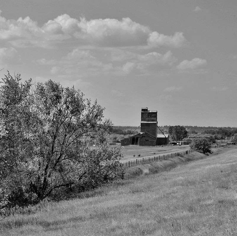
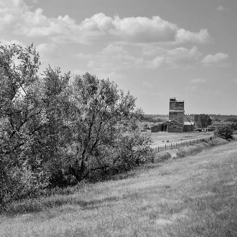
Some ideas on what you could with this image...
Make local adjustments to the dark wooden sides of the elevator, some combination of increase exposure/lighten, boost clarity/structure/contrast. Giving it more detail should draw more attention.
There is a bright patch of grass along the lower right edge that may draw attention. You could crop off the right just inside that patch.
Also, you could slightly darken/vignette the upper and lower right corners. Not too much, maybe just 1/3 of a stop. Along with this, you could make local adjustments to lighten the grass in front of the elevator and down to the middle foreground. Again, not too much. Be subtle.
Finally you could crop the left side to taste to get a pleasing aspect ratio or to emphasize the vanishing point lines of the trees towards the elevator. A square crop seems like it might work well.
Aug 24, 2021 11:57:41 #
Gauss wrote:
Some ideas on what you could with this image... br... (show quote)
Many thanks for taking the time to send a detailed and specific set of suggestions. I greatly appreciate your input, and within the limited spectrum of of my post processing skills, will try some of your ideas.
Aug 25, 2021 10:15:51 #
Gauss wrote:
Some ideas on what you could with this image... br... (show quote)
Incorporating some suggestions.
Aug 25, 2021 14:28:05 #
quixdraw wrote:
... and within the limited spectrum of of my post processing skills, will try some of your ideas.
I meant to ask you this the other day. What software do you use the post process your images?
Aug 25, 2021 14:41:56 #
It varies, I only do very simple quick adjustments, often, none at all. Depending on the task at hand, it can be Windows Live Gallery, Photoshop Elements 14, Nikon View nx i, or a program that came with my Canon printer.
Aug 25, 2021 22:50:57 #
Your crop does a nice job of bringing the elevator closer. When I was playing around with the image, I cropped a bit off the right side and kept more of the trees; I do like the trees. :-) It seems like your edits made the overall image a little darker with a little less contrast. The vignetting I did is limited to small areas in the upper and lower right edge, so the sky and foreground are mostly as light as the original. The idea was to slightly increase the contrast along the right side of the image to help guide the eye to the elevator. I guess the premise of vignetting is that the eye is pushed away from the darker areas. Don't know how easy that kind of thing is in PE 14. It has layers and masking doesn't it? Though you may avoid that stuff. I enjoy post processing, but I know that's not everyone's cup of tea.
Aug 26, 2021 11:06:29 #
Gauss wrote:
Your crop does a nice job of bringing the elevator... (show quote)
You are welcome to post your version, this being the critique section. I'd be interested in seeing it since you did all that work. I'm sure some others will be curious as well.
Aug 26, 2021 14:33:52 #
quixdraw wrote:
You are welcome to post your version, ...
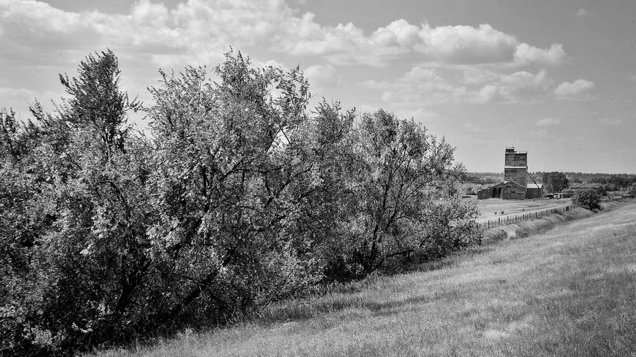
OK. My edits are based on the idea from the thread that the elevator is an important subject in the image. So I tried to make adjustments that guide the eye directly or indirectly to it. The first image is the original size with adjustments, and the second image is a square crop made from the first image.
The original image has some nice lines that converge towards the right side of the image. The light is coming from the upper left so it works with the lines in a left to right flow. Someone mentioned that the trees do a good job of leading the eye to the elevator, and I agree. As I mentioned above, I like the trees and think the original image frame is fine. Even though the trees are a large portion of the image, adjustments can be made to help the elevator grab more attention. My thought is the main reason for a crop is either to make us feel closer to the elevator or essentially make it a larger portion of the image. One thing to consider too is your other photos of this site. If you've got other images with close views, this may be a perfect far away view to fill out the collection. Even something considerably farther away might also make sense in the context of all your images.
On to my adjustments. I lightened and boosted clarity of the elevator's siding. With more detail, I think it will draw and hold attention better than a dark, featureless building. Since the light comes from the upper left, I boosted the highlights in the clouds a little to add some contrast in the sky. A vignette was applied to the upper and lower right corners; the idea being that will push the eye away from the right side toward the elevator. I increased texture and contrast in the middle from the foreground to the base of the building. I think that sort of creates a path between the trees and the vignetted right side to lead to the elevator. Finally, since I thought that bright patch of grass was a potential distraction - and I noticed you cloned it out with a patch from the foreground - I decided to tone it down a bit by reducing its contrast and brightness. Hope all that makes sense and isn't too much. :-) Don't know if it works.
For the cropped version, I did a 1X1 aspect ratio and positioned it just inside where the bright patch of grass is on the right edge. The adjustments were just inherited from the first images.
I think it's a nice original image, and I hope I didn't do it any injustice.
Aug 26, 2021 15:04:34 #
Gauss wrote:
OK. My edits are based on the idea from the thread... (show quote)
Thanks very much appreciate having you exercise your skills on my behalf. Your images are brighter than mine, and different in areas discussed. Will do some closer examination. Again thank you!
If you want to reply, then register here. Registration is free and your account is created instantly, so you can post right away.