The Master In You: Topic for August - Less Than Pristine.
Jul 31, 2021 16:15:31 #
The Master in You is an evolution of the monthly Master's Critique. Here we will give you a "topic" each month with some themes to consider. Shoot some images with the topic in mind and then post them in this thread and tell us about them. Where did you shoot the image? What are your concerns and challenges with the image? How much, if any, consideration did you give to gear to get the image you wanted? You might also wish to address the themes that are mentioned along with the topic.
General guidelines: This is an open thread where you are encouraged to post your original works and discuss them. Please post only your own work. Do not post edits of another member's work unless you have asked that member for permission to edit. Remember that some people do not want their work edited by anyone. Please respect that. The topics will be active for one month at a time. You will have the entire month to ponder and work on the subject. Feel free to post at any time during the month. You can post more than one image. If you shoot more than one image on any given topic, you may make several submissions. That way we might be able to stimulate some conversations that act as inspiration or, at least, incentive for others to go out and try the topic themselves.
The original purpose of FYC was to be a "cafe" atmosphere where people gather to discuss topics pertaining to photography. It is hoped that this thread will encourage members to get out and shoot images that pertain to the topic and then enter into a discussion about your posts and the posts of others. This monthly topic is not about : "That is really nice" or "two thumbs up". While these are certainly legitimate responses, the aim of this topical thread is to throw a wider net. It is hoped that we will discuss what works and what does not work so well. If someone's work does not appeal to you, feel free to say so in a way that acknowledges that we all have different ideas about what appeals to us.
The Moderators
Topic Of The Month , August 2021: "Less Than Pristine "
Theme 1 How do you approach this topic Mechanical decay, industrial, urban decay, or rural buildings falling apart? What do you look for?
Theme 2 Processing: When do you say "too much"? Do you visualize post processing, or let it come to you?
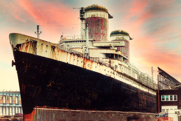
For some time now, I've wanted to shoot the SS United States. This is the fastest Ocean Liner to cross the Atlantic. Her last voyage was in 1969, and she is presently docked in Philadelphia while a conservancy group is trying to invent a future for this once proud ship. The dock area is closed to the public. So, I had to photograph her from the street on the far side of a chain link fence. I wanted the photo to remind the viewer of a bygone era in travel, so I tried to make it look like an old photograph. I should have shot in film; but I did not on this occasion. (Maybe in the future). I did use "film" presets in NIK. I also cloned out the lines that keep the ship from floating away from the dock.
I thought this might be a good example of: "Less Than Pristine". Of course we are interested in discussing this photo; but we also want to see your examples of "Less Than Pristine". From your archives or shot recently, the choice is yours. This topic will remain active for the month of August.
Moderators,
General guidelines: This is an open thread where you are encouraged to post your original works and discuss them. Please post only your own work. Do not post edits of another member's work unless you have asked that member for permission to edit. Remember that some people do not want their work edited by anyone. Please respect that. The topics will be active for one month at a time. You will have the entire month to ponder and work on the subject. Feel free to post at any time during the month. You can post more than one image. If you shoot more than one image on any given topic, you may make several submissions. That way we might be able to stimulate some conversations that act as inspiration or, at least, incentive for others to go out and try the topic themselves.
The original purpose of FYC was to be a "cafe" atmosphere where people gather to discuss topics pertaining to photography. It is hoped that this thread will encourage members to get out and shoot images that pertain to the topic and then enter into a discussion about your posts and the posts of others. This monthly topic is not about : "That is really nice" or "two thumbs up". While these are certainly legitimate responses, the aim of this topical thread is to throw a wider net. It is hoped that we will discuss what works and what does not work so well. If someone's work does not appeal to you, feel free to say so in a way that acknowledges that we all have different ideas about what appeals to us.
The Moderators
Topic Of The Month , August 2021: "Less Than Pristine "
Theme 1 How do you approach this topic Mechanical decay, industrial, urban decay, or rural buildings falling apart? What do you look for?
Theme 2 Processing: When do you say "too much"? Do you visualize post processing, or let it come to you?
For some time now, I've wanted to shoot the SS United States. This is the fastest Ocean Liner to cross the Atlantic. Her last voyage was in 1969, and she is presently docked in Philadelphia while a conservancy group is trying to invent a future for this once proud ship. The dock area is closed to the public. So, I had to photograph her from the street on the far side of a chain link fence. I wanted the photo to remind the viewer of a bygone era in travel, so I tried to make it look like an old photograph. I should have shot in film; but I did not on this occasion. (Maybe in the future). I did use "film" presets in NIK. I also cloned out the lines that keep the ship from floating away from the dock.
I thought this might be a good example of: "Less Than Pristine". Of course we are interested in discussing this photo; but we also want to see your examples of "Less Than Pristine". From your archives or shot recently, the choice is yours. This topic will remain active for the month of August.
Moderators,
Jul 31, 2021 16:44:18 #

Erich, I love your photo! Given that you had few choices, the angle at which you shot is very effective IMO. The ship looks massive and imposing. The contrast of its condition with the colorful sky and colors of the ship itself add to the impact. Is the sky original? 
Jul 31, 2021 16:52:40 #
Photographed in 2020, this is Yakima's Old Cascade Lumber Mill, which closed in 2006.
I loved that there were so many tumbleweeds pressed against the fence and that the fence was damaged. I probably didn't need to keep the dead-end sign in color; does it seem I tried too hard for what should be easily noticed, even in b&w? I was definitely glad for the typical gray January weather, which made the desolate mood easier to convey.
As for visualizing processing, often I kind of stumble upon results. But for this shot, I pretty much knew how I wanted to end up.

abandoned mill, on Flickr
I loved that there were so many tumbleweeds pressed against the fence and that the fence was damaged. I probably didn't need to keep the dead-end sign in color; does it seem I tried too hard for what should be easily noticed, even in b&w? I was definitely glad for the typical gray January weather, which made the desolate mood easier to convey.
As for visualizing processing, often I kind of stumble upon results. But for this shot, I pretty much knew how I wanted to end up.
abandoned mill, on Flickr
Jul 31, 2021 16:58:26 #
A stumble-upon scene in my apartment complex a couple of months ago. I was drawn to the light and shadows of early morning, and posted to Exploration of Digital Artistry in color. Jim-Pops suggested black and white, which - as often is the case - resulted in a very different image. I'm hoping folks will think about all the stories these work boots could tell if we listen 
(edit - just now am thinking a crop from the bottom might improve. Or do the hanging laces add interest?)

work boots, on Flickr
(edit - just now am thinking a crop from the bottom might improve. Or do the hanging laces add interest?)
work boots, on Flickr
Jul 31, 2021 17:26:37 #
Linda From Maine wrote:
Erich, I love your photo! Given that you had few choices, the angle at which you shot is very effective IMO. The ship looks massive and imposing. The contrast of its condition with the colorful sky and colors of the ship itself add to the impact. Is the sky original?
Thank you for your comments concerning the photo. The sky is not original. I used a sky replacement from PS. It seemed to fit quite well, so I replaced the plain white sky that was in the original photo. The ship is massive; and I did have some difficulty getting the shot. I had to put my lens (125mm) right up against the fence so that you would not see the links. That worked fairly well. Then I took away all the lines to give it a less cluttered look.
Erich
Jul 31, 2021 17:29:25 #
Linda From Maine wrote:
Photographed in 2020, this is Yakima's Old Cascade... (show quote)
This is really nice. I would definitely keep the color in the sign. I'm not always a fan of selective color; but it works here. You are right about the weather. Your processing seems to be very stark. Is that a look that you were aiming for; or did it just work out that way?
Erich
Jul 31, 2021 17:33:20 #
Linda From Maine wrote:
A stumble-upon scene in my apartment complex a cou... (show quote)
I was thinking of calling the monthly topic "rusty gold"'; but, after talking to R.G. about it, we decided that rusty gold might be too constraining and people would only post rusty wrecks. "Less than Pristine" conjures the same frame of mind; but is less restrictive and these work boots are perfect for the topic.
Erich
Jul 31, 2021 17:37:30 #
ebrunner wrote:
Yes, I definitely wanted a feeling of despair and hopelessness - especially after seeing the damaged fence and dead end sign. I often can't make up my mind about how to edit a photo, but this one was easy ... Your processing seems to be very stark. Is that a look that you were aiming for; or did it just work out that way?
Thanks Erich!
Jul 31, 2021 21:13:50 #
WOW, Linda the boot photo is extremely strong with unknown history, we can only imagine. The B&W conversion is one of the best I've seen. Blacks 👍, Midtones👍, Highlights just right, the three important areas that make up a great B&W. I am interested what people think about adding noise when making a digital B&W. Your example is noise free and I like it but it's also a sure indication of a digital image, if that should really mater?
Jim
Jim
Aug 1, 2021 06:27:12 #
Jim-Pops wrote:
Many thanks, Jim. I haven't experimented with adding film grain for a long time. WOW, Linda the boot photo is extremely strong with unknown history, we can only imagine. The B&W conversion is one of the best I've seen. Blacks 👍, Midtones👍, Highlights just right, the three important areas that make up a great B&W. I am interested what people think about adding noise when making a digital B&W. Your example is noise free and I like it but it's also a sure indication of a digital image, if that should really mater?
Jim
Jim
I know there's an option in Nik Silver Efex, but I don't have that software at the moment since it wouldn't play nice with Affinity on my M1 Mac. Do you have a go-to preference? There is an "add noise" filter in Affinity itself. Thanks again.
Aug 1, 2021 08:01:55 #
Jim-Pops wrote:
WOW, Linda the boot photo is extremely strong with unknown history, we can only imagine. The B&W conversion is one of the best I've seen. Blacks 👍, Midtones👍, Highlights just right, the three important areas that make up a great B&W. I am interested what people think about adding noise when making a digital B&W. Your example is noise free and I like it but it's also a sure indication of a digital image, if that should really mater?
Jim
Jim
I don't know about Linda; but I never add noise to a black and white conversion. Sometimes, when I'm using film, I will reduce the grain by running a de-noise protocol; but I never actually add noise or "grain".
Erich
Aug 1, 2021 09:08:41 #
Guyserman
Loc: Benton, AR
Linda From Maine wrote:
Yes, I definitely wanted a feeling of despair and hopelessness - especially after seeing the damaged fence and dead end sign. I often can't make up my mind about how to edit a photo, but this one was easy
Thanks Erich!
Thanks Erich!
One more small edit to make it perfect imo: some rust streaking down the sign.
Aug 1, 2021 09:43:25 #

Linda From Maine wrote:
Photographed in 2020, this is Yakima's Old Cascade... (show quote)
I sometimes wonder about myself, since I don't seem to respond as others do; but the color in the sign seems to cheer the scene up to my eyes. It definitely dominates the image. I've always heard that text in an image immediately draws the eye, so the color might be enhancing even further this element. I'm wondering what it would look like without selective colorization. My guess is that the message would come through strongly and that the eye would register the sign quickly enough without the added emphasis.
That said, I like the image: it's so much like many of the locales of my youth.
Aug 1, 2021 10:28:33 #
Guyserman wrote:
An interesting thought; thank you!One more small edit to make it perfect imo: some rust streaking down the sign.
Aug 1, 2021 10:30:47 #
jburlinson wrote:
Thanks so much for your feedback. I have always enjoyed varying viewpoints when given in a thoughtful and constructive manner. Now I must find my original and try removing the color. Also, there have been negative responses to the heavy vignette (I posted the pic in Exploration of Digital Artistry too), so it's definitely time to try a new look.I sometimes wonder about myself, since I don't see... (show quote)
Much appreciated!
If you want to reply, then register here. Registration is free and your account is created instantly, so you can post right away.