Pacific Coast of Washington State
Apr 12, 2021 14:58:33 #

Apr 12, 2021 16:45:54 #

Apr 12, 2021 20:31:32 #

Cwilson341 wrote:
I relaxed just looking at this set. Very well done bird shots and the seascapes are gorgeous.
So glad you enjoyed these! It was and will always be a relaxing/Zen kind of place for me.
I grew up just an hour east of these beautiful beaches and spent so much time camping with grandparents and parents!
I appreciate your gracious comments as always!
Rob
Apr 12, 2021 20:34:29 #
UTMike wrote:
They are all good, Rob, but #5 is very appealing to me.
Thanks so much Mike, your kind words are always appreciated and I'm so glad you had a favorite to enjoy!
Rob
Apr 12, 2021 20:54:35 #
weberwest wrote:
Great set Rob, I really like #s 1,2,3, 8 & 9, #10 is nice and mellow, but I wonder how it would present itself with a bit more contrast. Overall #9 is my favorite - real power in there! I would work on # 6 & 7 to eliminate the pano-induced white areas at the top or bottom.
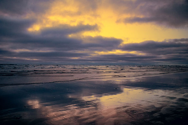
Thanks Joe!! I am embarrassed to have left those white borders and will get them tidied up. Here's what #10 can be with a little more contrast.
I don't know that I did it much justice with your suggestion....That said, I really appreciate your suggestions and advice, I do like to improve where possible.
I also attached another surf image that didn't make the first cut but maybe even sharper and more "powerful".
Feel free to do your magic on 10 if you want.
Rob
Apr 12, 2021 20:55:13 #
Apr 12, 2021 21:21:15 #
Ratskinner wrote:
These pictures are great and also very familiar to me, I live here. Not near here but exactly here. This set shows
the area as it really is albeit subject to change at any minute. Beautiful, wonderful and somehow able to spiritually
awaken one. I came here first as a boy just after WWII and came back 50 years later and never left.
the area as it really is albeit subject to change at any minute. Beautiful, wonderful and somehow able to spiritually
awaken one. I came here first as a boy just after WWII and came back 50 years later and never left.
I cannot think of higher praise for these pictures than what you have already said! I too, feel a certain connection with the beaches from Ocean Shores to Moclips.
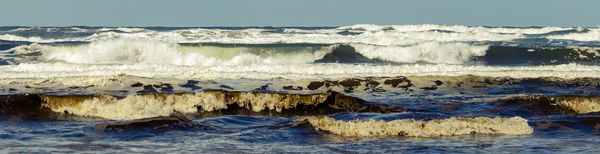
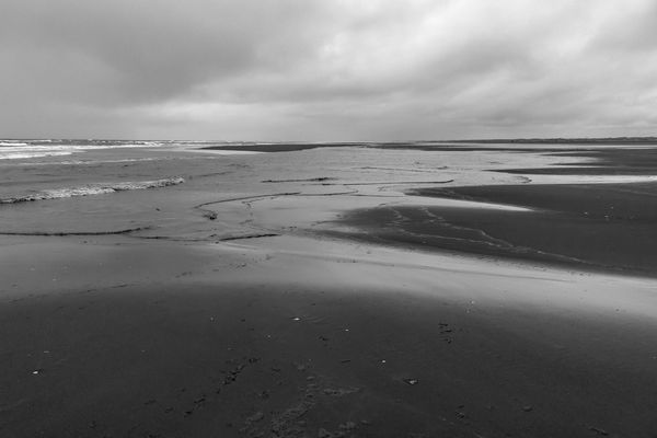
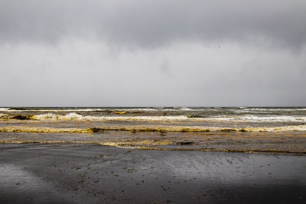
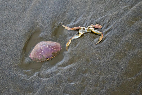
My grandparents and parents brought me here often, growing up. Razor clam digs, spring breaks, or just to get out of Olympia for the weekend! This coast brings peace to my heart and soul and inspires me in a different way every time I get to spend time here! Wednesday during our stay was wet, windy and wonderful, just not overly photogenic. I included a few you might appreciate.
Thanks so much!
Rob
Apr 12, 2021 22:05:02 #
tommystrat wrote:
#3 is a beautifully composed and captured image - best of the bunch, IMHO! 
Thanks for the vote for #3, very much appreciated!
Rob
Apr 12, 2021 22:05:52 #

Apr 12, 2021 22:06:52 #
joecichjr wrote:
What a group of remarkable shots🌼🌼🌼🌼🌼❤️
Thanks so much for your generous compliment!!
Rob
Apr 12, 2021 22:07:21 #
Apr 12, 2021 22:08:05 #
Sylvias wrote:
Fine set Rob especially enjoyed the last one. 
Thanks so much, glad you enjoyed!
Rob
Apr 12, 2021 22:08:57 #
Moondoggie wrote:
The last two are my favorite. Nice work.
Thanks for taking a look and your kind comment!
Rob
Apr 12, 2021 23:31:44 #
Apr 13, 2021 13:46:55 #
Vault wrote:
Love your set. Looks like you caught a ships light on #10
It’s better to be lucky than good sometimes....

Thanks for your kind comment!
Rob
If you want to reply, then register here. Registration is free and your account is created instantly, so you can post right away.