Rule of Thirds
Oct 31, 2020 09:15:32 #
Oct 31, 2020 09:34:30 #
zug55
Loc: Naivasha, Kenya, and Austin, Texas
R.G. wrote:
I don't have a problem with #1. If I did, a sligh... (show quote)
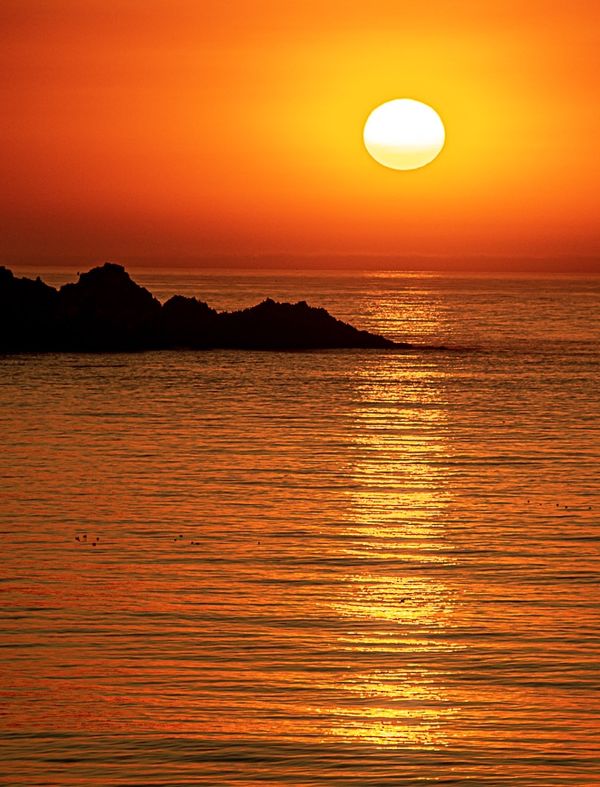
I agree. To me having the sun and its reflection on the thirds line on the right makes sense since you have the rock formation on the left balancing out. The reflection is the main interest here.
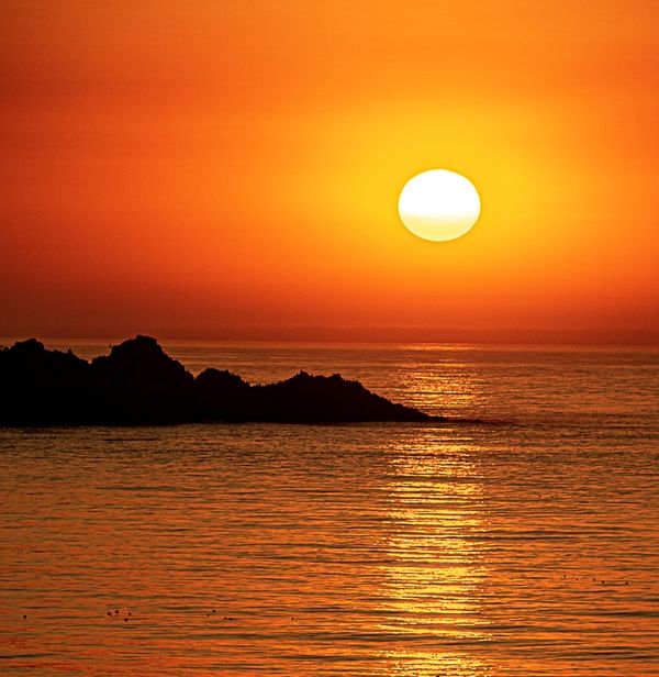
I too would crop the top to move the vertical thirds line closer to the horizon. I am attaching my proposed crop.

Oct 31, 2020 09:36:40 #
Oct 31, 2020 09:46:08 #
andypop wrote:
Sun or Horizon?
Number one, hands down. As for the rule of thirds, the sun is in the top third of a very nice photo.
Oct 31, 2020 10:39:59 #
Ava'sPapa wrote:
Number one, hands down. As for the rule of thirds, the sun is in the top third of a very nice photo.
It’s also in the right third
Chuck
Oct 31, 2020 11:16:34 #
Oct 31, 2020 12:39:57 #
twowindsbear wrote:
Fix the tilted horizon.
It's not the horizon. . . it's level. It's the photographer that's tilted!

Oct 31, 2020 12:45:37 #
zug55 wrote:
I agree. To me having the sun and its reflection on the thirds line on the right makes sense since you have the rock formation on the left balancing out. The reflection is the main interest here.
I too would crop the top to move the vertical thirds line closer to the horizon. I am attaching my proposed crop.
I too would crop the top to move the vertical thirds line closer to the horizon. I am attaching my proposed crop.
Nice! Thanks.
Oct 31, 2020 16:22:17 #
luvmypets wrote:
Number 2 is the one I prefer. I would rather see the water than the sky. The nice long reflection works better to lead the eye into the frame.
Dodie
Dodie


Nov 11, 2020 05:03:25 #
The first one seems the most balanced to me. The second one seems to have too much empty space to the right of the sun.
Nov 19, 2020 19:49:00 #
I prefer #3. The image is darker and has a stronger 'evening' feel. I prefer the muted colours in the sky to more water. I feel the sun being closer to the bottom of the frame gives a more intimate image as the sun seems closer. #3 is a 'wall hanger' while the other two are studies in composition. However, having said all that, this discussion belongs in the "For Your Consideration" or the "Photo Analysis". It is in clear violation of Rule #2 (see the very first post in this section).
Dec 7, 2020 20:37:48 #
Feb 15, 2021 12:14:24 #
Orphoto
Loc: Oregon
Do not feel compelled to treat the "rule of thirds" as a rule at all. At best it is a guideline or consideration. In this case more is happening in the water than the sky. So portray it that way. Unless you make an artistic decision not to.
Feb 15, 2021 13:19:01 #
Rule of Thirds is the topic, and we have here a wonderful pic and posts by several Hoggers, all with different tastes. So - I thought I'd apply the rule to the pic (which I don't think anyone else has done). I think the result has improved the pic, and at the same time has produced a square format ideal for framing.
Apr 1, 2021 18:58:56 #
If you want to reply, then register here. Registration is free and your account is created instantly, so you can post right away.


