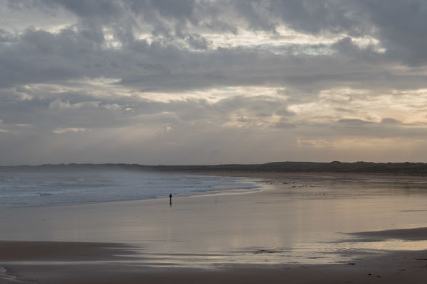
An autumn day at the beach.
Oct 21, 2020 12:53:47 #

 .
.
Oct 21, 2020 13:00:36 #
Beautiful rendering of a serene beach scene. Very nicely done. Good eye. Please stay well and keep on sharing.
Oct 21, 2020 13:14:18 #

Oct 21, 2020 13:15:20 #
Ourspolair wrote:
Beautiful rendering of a serene beach scene. Very nicely done. Good eye. Please stay well and keep on sharing.
Thank you Ourspolair.
Oct 21, 2020 13:15:51 #
 ).
).Oct 21, 2020 13:28:57 #

The scene looks so serene until you look closer and see the wind-blow waves! The undisturbed large area of beach compliments the walker, and the dark area along bottom of frame helps us stay within the image. Beautifully seen and composed.
Oct 21, 2020 13:36:49 #
Linda From Maine wrote:
The scene looks so serene until you look closer and see the wind-blow waves! The undisturbed large area of beach compliments the walker, and the dark area along bottom of frame helps us stay within the image. Beautifully seen and composed.
Thank you Linda. The waves have quite a dense blanket of spray and mist above them because of the wind. It's a naturally wide stretch of beach so it lends itself to an airy look. (PS - It's another capture by my ZS100).
Oct 21, 2020 13:37:47 #
R.G. wrote:
Oh, that's cool to know, thanks!...(PS - It's another capture by my ZS100).
.
Oct 21, 2020 14:38:37 #

This is a very pleasant and soothing photo that I have become more intrigued with the longer I study it.
I usually don't like the horizon in the middle of the scene and as I scrolled the scene up and down to see where I would set the horizon I found that I couldn't find a position that worked for me. I will classify this as one of the photos that does work best with the horizon on center.
At first I considered the dark dryer sand at the bottom a little distracting but then decided it helps to shape the part of the reflection that leads you to the person which then leads you to the curve of the wave leading toward the hills. Cropping out the majority of the reflection would eliminate the element that brings you into the scene.
The next area I focused on was the sky trying to see if eliminating one or both brighter areas would benefit the photo but I didn't like the dreariness that it brought to the scene. Since there are (approximately) 3 levels of dark areas to three levels of light there is a balance that would be lost if framed differently.
The only change that I would make to this photo would be to see if I could change the yellow cast on the right side of the photo to a very slight pink or peach for the strictly personal reason that I just don't like yellow. If those colors did not produce the desired effect I would then try a shift toward blue. Since my post processing skills leave a lot to be desired I probably wouldn't be able to accomplish this to a satisfactory conclusion.
When I view a photo I allow myself an initial opinion and then proceed to analyze it's pros and cons and will try to see what I would do differently. My initial reaction was that this photo was dull with no definitive main subject. My conclusion is that the photo is drawn together to whole by the many layers that work off of and with each other to create this serene moment in time which makes the entire scene the main subject.
Very nicely done!! I really like it!!!
Dodie
Oct 21, 2020 15:01:17 #
luvmypets wrote:
This is a very pleasant and soothing photo that I ... (show quote)
Thank you for your detailed comments, Dodie. One of the main intentions behind it was to capture the feeling of openness and airiness, so cropping was something I did the minimum of. I also liked having the diminutive solitary walker in the midst of all that openness. I didn't deliberately place the horizon at the centre - I was more concerned with keeping the large amounts of sky since it added to the spacey feeling.
I have already tint-shifted yellow towards orange. In my experience, small shifts can work well and seamlessly whereas large shifts can result in a pleasant shade of pink but it looks unnatural. I also lightened yellow which helps to keep it from becoming too heavy and solid. Rather than end up with something non-yellow but unnatural I've taught myself to accept a certain degree of yellowness. It's how it was in reality and most other people don't have a problem with it. When all else fails there's always desaturation
 .
.Oct 22, 2020 00:35:26 #
R.G. wrote:
Thank you for your detailed comments, Dodie. One ... (show quote)
Thank you for explaining your intentions and processing. You have definitely conveyed openness and airiness.
My laptop is 6 years old and I have never calibrated the monitor so it has rendered the yellow color rather than the shift toward orange so my apologies for that. I agree the shift should be ever so slight and natural. It is a very nice photo!!
Dodie
Oct 22, 2020 06:10:38 #

Lovely shot, surprised you managed to find a moment without rain. Scotland seems perpetually blue at the moment.
I'd like to have got rid of the Wind Turbines - and the grese spot about the pair of beachwalkers in the distance (but I'm being pernickity).
I'd like to have got rid of the Wind Turbines - and the grese spot about the pair of beachwalkers in the distance (but I'm being pernickity).
Oct 22, 2020 08:28:35 #

This is a very enjoyable image. Rich in all the subtlety of all the elements, it grows on you more and more as you look at it. The overall composition is terrific. It's always nice to see a photo like this that doesn't need to rely on enthusiastic processing. There is a big difference between a shot that clobbers you over the head, and one that draws you in. At least thats how I respond.
Oct 22, 2020 09:04:15 #
John N wrote:
Lovely shot, surprised you managed to find a moment without rain. Scotland seems perpetually blue at the moment.
I'd like to have got rid of the Wind Turbines - and the grese spot about the pair of beachwalkers in the distance (but I'm being pernickity).
I'd like to have got rid of the Wind Turbines - and the grese spot about the pair of beachwalkers in the distance (but I'm being pernickity).
That was quite prophetic. Lots of local flooding this morning. I had to drive through a lake to get to work.
I've already got rid of two turbines. The smaller ones aren't too eye-catching and they do say "wind" so I left them. As for any defects, if it doesn't jump out at me when I'm viewing full screen I tend to not care too much. What you see is probably spray on the lens.
Oct 22, 2020 09:10:22 #
fergmark wrote:
This is a very enjoyable image. Rich in all the subtlety of all the elements, it grows on you more and more as you look at it. The overall composition is terrific. It's always nice to see a photo like this that doesn't need to rely on enthusiastic processing. There is a big difference between a shot that clobbers you over the head, and one that draws you in. At least thats how I respond.
Thank you Mark. Glad you enjoyed. I try to curtail my clobbering. Are we living in an era where soft processing has a novelty value?
If you want to reply, then register here. Registration is free and your account is created instantly, so you can post right away.