What do you think?
Sep 24, 2012 22:43:18 #


Sep 25, 2012 02:00:20 #

Sep 25, 2012 05:54:51 #
Sep 25, 2012 08:16:00 #
Sep 25, 2012 11:40:29 #

Erv wrote:
First two have a lot of glare on the face. The rest are great!
Erv
Erv
Maybe a reflector on the left would have provided the correct amount of light and shadow?
Sep 25, 2012 12:54:28 #
Sep 25, 2012 16:06:04 #
Agree with Erv - too much glare on the face on the first two shots. I'll bet if you PP'd the rest and brought out the green a bit more the photos might pop a bit more. Just a suggestion.
Sep 25, 2012 16:43:34 #
CaptJimmy wrote:
Agree with Erv - too much glare on the face on the first two shots. I'll bet if you PP'd the rest and brought out the green a bit more the photos might pop a bit more. Just a suggestion.
same here. Over all a nice job. It's obvious that he's a big city boy :-D
Sep 25, 2012 17:16:23 #
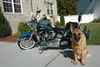
Thanks for all your comments and suggestions. I realize there is too much glare on first pictures, but I like his pose. The dog is his pet and he loves her. He likes farms, although we do not live on one.
Sep 25, 2012 17:30:01 #

pixie wrote:
Thanks for all your comments and suggestions. I realize there is too much glare on first pictures, but I like his pose. The dog is his pet and he loves her. He likes farms, although we do not live on one.
I got this advice MANY year ago: If you see an error in an image, if you have to make an excuse for an image, or if you have to explain an image, DO NOT show it. To anyone, Ever.
I can see why you would like #1 and #2, but that blown out area is something I would keep to myself :-)
However, the rest of the image are VERY, nice. You might consider cropping the dog images a bit tighter to cut out the featureless sky.
Sep 25, 2012 18:14:15 #
Well CaptainC...as usual you hit the nail on the head. You ever consider writing a book on photography...you always have some gems! I love that piece of advice as I have, in the past, done just that...but NO MORE! :) :) :)
Sep 26, 2012 02:38:22 #

Oct 10, 2012 04:39:08 #

CaptainC wrote:
quote=pixie Thanks for all your comments and sugg... (show quote)
:thumbup: :thumbup: i agree the blown out areas really distract from the image.
Oct 10, 2012 21:03:27 #
Thanks for the advice! I'll remember that for the future.
CaptainC wrote:
quote=pixie Thanks for all your comments and sugg... (show quote)
Oct 14, 2012 17:38:31 #

If you want to reply, then register here. Registration is free and your account is created instantly, so you can post right away.