Help With Leading Lines and Holding The Viewers Attention
Aug 6, 2020 08:04:39 #

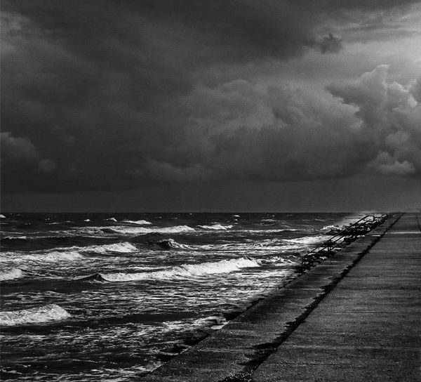
As has been said, the eyes go to the bright side. Because of that, your first version sweeps me out of the photo while the second keeps me there. For me, then, your swapped sides in the second photo makes for better viewing.
Aug 6, 2020 08:24:19 #

The sky and surf are the subject - so here landscape format is not important. There is really no need for leading lines when the subject is the whole picture. Attached is my suggestion. 
Aug 6, 2020 10:22:18 #

The sea wall is a dominant element, and unfortunately draws the eye out of the image. The light in the waves is nice, but I don't see that as a leading line. I think trying for several leading lines is too hard. One works well. More than one can be confusing. BTW, I like the sea and the rocks and the clouds.
Aug 6, 2020 11:00:10 #
kenievans
Loc: Dallas
Tjohn wrote:
I sure would like to see what is on the other side of the seawall.
Unfortunately it is just a four lane road then hotels, restaurants and tourist shops. There is no boardwalk like many of the North Eastern beaches and no rugged coastlines like the West coast.

Aug 6, 2020 11:03:14 #
kenievans
Loc: Dallas
jaymatt wrote:
As has been said, the eyes go to the bright side. Because of that, your first version sweeps me out of the photo while the second keeps me there. For me, then, your swapped sides in the second photo makes for better viewing.
Thank you Jaymatt. I appreciate you giving me your opinion.
Aug 6, 2020 11:05:21 #
kenievans
Loc: Dallas
Delderby wrote:
The sky and surf are the subject - so here landscape format is not important. There is really no need for leading lines when the subject is the whole picture. Attached is my suggestion.
Changing it from the landscape format certainly does change the impact. I like your crop. Thanks!
Aug 6, 2020 11:06:44 #
kenievans
Loc: Dallas
AzPicLady wrote:
The sea wall is a dominant element, and unfortunately draws the eye out of the image. The light in the waves is nice, but I don't see that as a leading line. I think trying for several leading lines is too hard. One works well. More than one can be confusing. BTW, I like the sea and the rocks and the clouds.
Thank you. I could be trying to do too much. It wouldn't be the first time. I like a big view.

Aug 6, 2020 11:22:38 #

Aug 6, 2020 13:23:00 #
Wow, I'm way in over my head here. My personal favorite is the first shot. The last one seems to me to accomplish what you are trying to convey.
Aug 6, 2020 14:06:14 #
kenievans wrote:
Thank you. I could be trying to do too much. It wouldn't be the first time. I like a big view.
The difference is that when we read in English we go left to right and it spills over into everything else visual.
The one image thus leads our eye right to the edge of the image and we "fall off the world".
The flipped image does the same on the left side but we don't perceive it that way.
Long ago I took photo classes and the one professor was a PhD with a minor in psych and he often discussed photos in psych terms. One example was that a photo of a couple together at the breakfast table done for a coffee ad. The wife is pouring a cup of coffee for the husband. He had two versions - one for US publication and one for Europe. The US version the couple are further apart and Europeans thought "They are fighting?" The European version she is so close she leans over his shoulder to pour the coffee and Americans instantly think "He's going to be late to work today."
Aug 7, 2020 18:12:23 #

kenievans wrote:
One of the goals for creating a good photo is to h... (show quote)
Hi, Kenie,
Just because there is no formally agreed-upon answer doesn’t mean it’s not an excellent question!
IMO the wonderful aspect or your leading lines is that the inertial directional effect of the waves is perpendicular to the lines and each contributes to attention shifts to the other!
A complex effect that keeps the eye moving and engaged!
IMO the direction of nascent inertia of obviously moving compositional elements, just like the directions of gazes.., can be compositional components fully as significant and effective as actual visible lines.
An example I have used in class are the differences in directions of gazes and hand directions in da Vinci’s two versions of “Madonna of the Rocks” ... to my mind a fascinating comparison of two very different - albeit superficially similar - compositions. I had occasion to be able to view both within a span of 48 hours some years ago and was profoundly struck by their profoundly different effects!
Dave
Aug 10, 2020 09:37:04 #
Paul Diamond
Loc: Atlanta, GA, USA
Pictures serve different purposes. If you want to 'live' with a picture, such as putting it on a wall for months or years, it needs to be an image that beckons you to want to return to it again and again. That is in addition to the basic subject of the composition being strong enough to attract your eyes for more than a few seconds and hold your attention.
If the picture is for viewing on a website or in a magazine, they are often not as 'lasting' an image, even if they are enjoyable or memorable. This is where people glance at one picture after another or see many images on a webpage all at once. Many images are pleasant to enjoy for a few seconds. But they don't attract the attention of the viewer to return to them or want to explore the image further for a longer period of time.
They serve different purposes.
That said, your photo #1 has a wonderful sky and surf. The sun peeping out of the clouds and the white surf in row after row make my eyes want to explore and see more of the detail of the image. The seawall is manmade, uniform in shape, doesn't really lead my eyes anywhere. And, I wouldn't miss it if you cropped it our, cloned it our or shot from a different viewing angle. That might be something to consider when composing. Is the image/picture better or worse with this or that element? Does it add to the image, mood, impact? Or does it distract?
Or, come to your own conclusion. Make a print and put it on the wall. Is it a "live with it" image? Do others respond to this image as you do?
If you want to reply, then register here. Registration is free and your account is created instantly, so you can post right away.