Help With Leading Lines and Holding The Viewers Attention
Aug 5, 2020 11:39:55 #
kenievans
Loc: Dallas
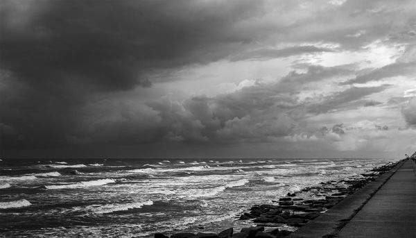
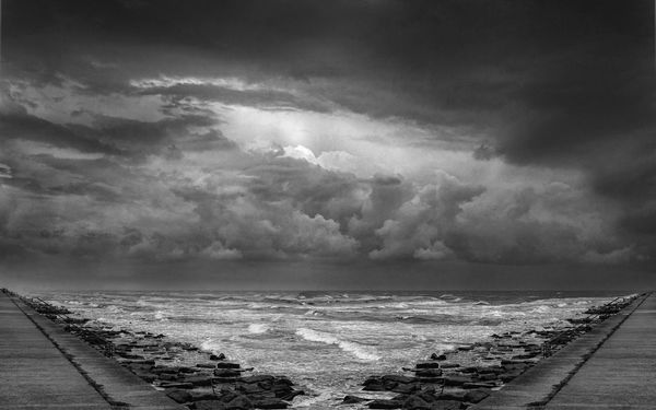
One of the goals for creating a good photo is to hold the viewers attention with leading lines that keep the eyes moving through the photo and to the subject, or so I understand. This is a photo that I shot and processed specifically with leading lines in mind. I wanted to use the seawall, waves and the rocks as leading lines. The subject to me is the storm clouds. In the first one I have lines going left to right towards the lightest part of the photo but I am concerned it leads you out of the photo rather than directing you to the clouds. The strong line of the seawall is taking you to the very edge of the photo.
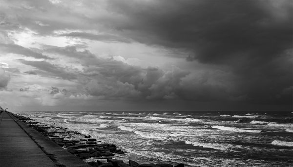
I thought I could fix it by flipping it. There are now lines in the clouds that direct your eyes through the clouds to the right. I am thinking that the seawall and wave lines then take you back to the light in the clouds in a circular pattern or do they lead you out of the photo from left to right? Am I over thinking this? I think it's giving me headache.
I thought I could fix it by flipping it. There are now lines in the clouds that direct your eyes through the clouds to the right. I am thinking that the seawall and wave lines then take you back to the light in the clouds in a circular pattern or do they lead you out of the photo from left to right? Am I over thinking this? I think it's giving me headache.
Aug 5, 2020 12:14:17 #

When I look at photographs I my eye tends to be drawn first to the lighter parts of the scene. As you point out the sea wall also leads the eye there. What I find most appealing about the image is the way the bright waves and sky show rising parallel lines with the dark tones of the rain cloud and seawall balancing each other and keep me looking at the rest of the scene.
Aug 5, 2020 15:38:44 #

In both shots, the seawall, shoreline and the lines in the clouds all direct the eye towards the side of the shot. With that sort of composition, the one thing the shots will never be is balanced. You may decide that that's something you can live with, especially if you have an exploring eye that tends to find its own way around a shot. But I suspect that for the majority the tendency will be to gravitate towards the bright side and lose interest fairly quickly after that.
A better composition might have been to stand closer to the surf and have that more central to the composition. As you said yourself, ideally leading lines lead the eye into the shot and towards the area/s of most interest. In that sense your seawall is more of a hindrance than a help. I would say that is likely to apply to any composition where the leading lines lead away from the centre rather than towards it.
A better composition might have been to stand closer to the surf and have that more central to the composition. As you said yourself, ideally leading lines lead the eye into the shot and towards the area/s of most interest. In that sense your seawall is more of a hindrance than a help. I would say that is likely to apply to any composition where the leading lines lead away from the centre rather than towards it.
Aug 5, 2020 15:45:27 #

For me the sea is the subject. Because it has more contrast and sharpness than the clouds, it's what grabs my attention.
I'm more comfortable with the composition of #1 because my eye moves in the direction of the wave action (left to right) and the seawall marks the end of the frame for me. This feeling is also supported by the clouds going from darker to lighter.
I don't see the line of the seawall as a compositional tool, because of what R.G. said, and because there's not enough of it and it's right up against the edge of the frame.
Aug 5, 2020 15:54:35 #
Look here for a variety of tutorials on leading lines: https://www.google.com/search?q=use+of+leading+line+in+photography&rlz=1C1CHBF_enUS912US912&oq=use+of+leading+line+in+photography&aqs=chrome..69i57j33.8430j0j7&sourceid=chrome&ie=UTF-8
Aug 5, 2020 16:34:48 #
kenievans
Loc: Dallas
pquiggle wrote:
When I look at photographs I my eye tends to be drawn first to the lighter parts of the scene. As you point out the sea wall also leads the eye there. What I find most appealing about the image is the way the bright waves and sky show rising parallel lines with the dark tones of the rain cloud and seawall balancing each other and keep me looking at the rest of the scene.
Thank you for your comments.

Aug 5, 2020 17:09:27 #
kenievans
Loc: Dallas
R.G. wrote:
In both shots, the seawall, shoreline and the line... (show quote)
Maybe the best thing would be to shoot a shore line that is not as boring and flat.

So, flipping it didn't help with what I was trying to do. Getting closer to the surf probably would have helped create a better foreground. I think the best thing for this one then would be to recrop it. The problem with that is it is boring. Ok I will try again another day, another way. Thank you as always R.G. for your very helpful comments.
Aug 5, 2020 17:17:03 #
kenievans
Loc: Dallas
Linda From Maine wrote:
For me the sea is the subject. Because it has more... (show quote)
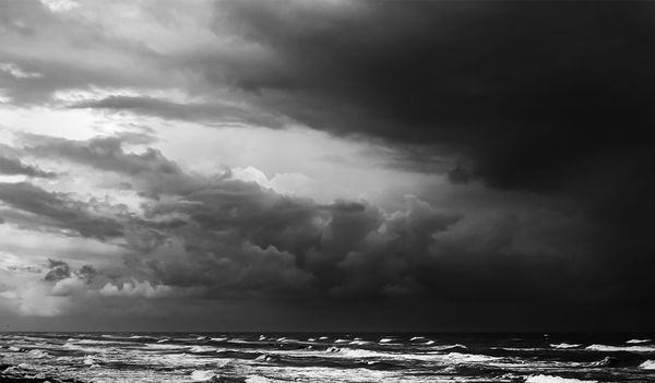
Linda if you saw the sea as the subject then I wasn't doing my job or I did it incorrectly. I did bump up the contrast and sharpness in the recrop I posted and "cut out the distractions" to make the sky the subject. In the end its a photo with pretty good tonality but not much more. Nothing to really give it the impact I wanted. I will learn this stuff some day.
Aug 5, 2020 17:19:16 #
kenievans
Loc: Dallas
robertjerl wrote:
Look here for a variety of tutorials on leading lines: https://www.google.com/search?q=use+of+leading+line+in+photography&rlz=1C1CHBF_enUS912US912&oq=use+of+leading+line+in+photography&aqs=chrome..69i57j33.8430j0j7&sourceid=chrome&ie=UTF-8
Thank you Robert. I love a good tutorial. I just recently started a Landscape Masterclass.
Aug 5, 2020 17:33:58 #
kenievans wrote:
Besides the contrast and clarity, I was seeing the sea as taking up nearly as much room in the frame as the sky. Your crop takes away any confusion as to what is the subject Linda if you saw the sea as the subject then I wasn't doing my job or I did it incorrectly. I did bump up the contrast and sharpness in the recrop I posted and "cut out the distractions" to make the sky the subject. In the end its a photo with pretty good tonality but not much more. Nothing to really give it the impact I wanted. I will learn this stuff some day.
I probably have more "kitchen sink" (no strong single subject) landscapes than most people. Is there any color in the image? I'm curious if color would help your original intent re composition and subject.
Aug 5, 2020 18:06:42 #
kenievans
Loc: Dallas
Linda From Maine wrote:
Besides the contrast and clarity, I was seeing the sea as taking up nearly as much room in the frame as the sky. Your crop takes away any confusion as to what is the subject
I probably have more "kitchen sink" (no strong single subject) landscapes than most people. Is there any color in the image? I'm curious if color would help your original intent re composition and subject.
I probably have more "kitchen sink" (no strong single subject) landscapes than most people. Is there any color in the image? I'm curious if color would help your original intent re composition and subject.
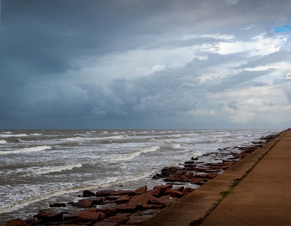
Linda there was some color but I thought they were ugly together. That's why I went to B&W. I admit it. Galveston has a boring coastline and the water looks like mud. No pretty blue water here.
Aug 5, 2020 18:49:31 #
kenievans wrote:
😁 😁Linda there was some color but I thought they were ugly together. That's why I went to B&W. I admit it. Galveston has a boring coastline and the water looks like mud. No pretty blue water here.
Aug 5, 2020 19:38:09 #
Aug 5, 2020 19:45:42 #
kenievans wrote:
Composition is perfect!
Glad you enjoyed, Keni 😇 Composition is perfect!
It started from simply wanting to change the sky. I placed a second layer of the entire scene, then flipped it, and proceeded to mask out what I didn't want. Then I thought hmmmm, I wonder... 🤔
I de-saturated the red and added saturation to the blue prior to converting. Lots of dodge, burn and selective sharpening/detail extracting also.
Aug 6, 2020 05:57:16 #

I sure would like to see what is on the other side of the seawall.
If you want to reply, then register here. Registration is free and your account is created instantly, so you can post right away.