Not sure what to do here
Mar 20, 2020 00:46:16 #
AzPicLady wrote:
I have an image that frankly, I like but that has problems. I'm working on them. For this image I've actually taken two different directions. I'd like suggestions on perhaps other routes I might take here, or what else I might try. THANKS!
Hi Kathy,
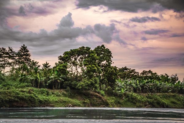
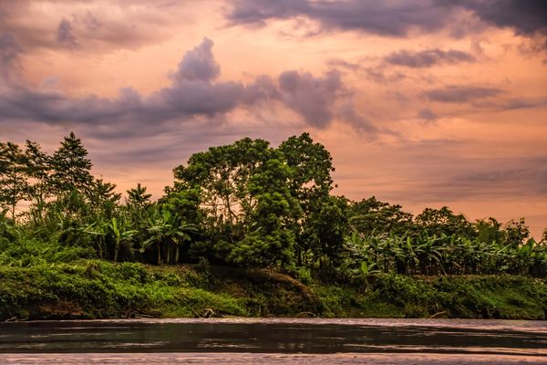
I've attached two different images. The only difference is the first image, which I like the best, is more white balanced than the second. I did see that your main interest was the color in the sky so I backed off the WB which left more of the orange color cast. Here's what I did.
1) I reduced the highlights and brought up the shadows. I adjust the whites until I began to blow-out the sky and the backed off slightly. Finally, I increased dehaze to bring out more contrast in the sky. That was it for global adjustments.
2) Using the brush tool, I selected the trees and green plants. I opened the shadows a little more, shifted temp towards yellow and tint towards green. This, I felt, better matched the color of the trees with the color of the sky.
3) Using a second brush tool, I highlighted the trees again, and selected the highlights using the luminance range mask. After making my selection, I slightly increased exposure and added more yellow and green to the highlights.
4) Using a third brush tool, I highlighted the dark clouds on the left side of the sky. I increased the clarity to bring out a little more cloud detail.
5) Finally, I went back and made a small increase global contrast.
Not being there, I felt the main emphasis was to increase exposure and detail in the trees while matching the color cast of the sky.
Mike
Mar 20, 2020 09:42:07 #

l-fox wrote:
I did think it was a bit too dark; however, I had no idea of what you saw when the pic was first captured. I did just a bit of lightening. My removing the color cast made the most difference.
The 'cubism' was just being playful. I used Topaz AI Remix and set blend to Luminosity, then played with Contrast and Opacity.
The 'cubism' was just being playful. I used Topaz AI Remix and set blend to Luminosity, then played with Contrast and Opacity.
Thanks for the info!
Mar 20, 2020 09:46:52 #
R.G. wrote:
If half the sky was that dark I'd say it was too m... (show quote)
I also have an older version, and there's no "dehaze" tool in mine either. I normally use "contrast" to take some of the haze out. I think it's the grain in the sky that bothered me. I tried a luminance setting, but wasn't sure how to apply it only to the sky. Obviously, I need to start over with this image. Thanks for all your help.
Mar 20, 2020 09:48:28 #
Curmudgeon wrote:
I am going to agree with Linda. This image is somewhere in your memory. I don't believe anyone can help you with it. Take a break, sleep on it, open the original in the morning and start over if necessary.
I'm going to do just that. With all the suggestions I've received, I can spend a lot of time on it - what with the quarantine and all. But today I'm going shooting!
Mar 20, 2020 09:51:07 #
Vince68 wrote:
Kathy,
Reading your comments, Here is my edit of your original photo. I had typed all of my edits and my reply was not as long, but not sure what I did and everything I typed disappeared, so I just attached each adjustment panel.
Sorry my reply is so long, but this way you can see all my sliders. Hope this is something close to what you saw and my interpretation of what you described.
Vince
Vince, thank you so much. And thank you for actually taking the time to include all your settings. I can actually print those out and try to replicate them. You have lightened the image quite a bit (at least frtom my memory version). Perhaps that's what it actually needs. I really appreciate all your help.
Mar 20, 2020 09:59:20 #
SalvageDiver wrote:
Hi Kathy, br br I've attached two different image... (show quote)
Thanks, Mike. The second image is closer to reality in the sky, albeit a lot brighter. And the line of trees was almost black in shadow (in reality). I'm surprised I got any detail in it at all! I assume all of this was done in LR? My version doesn't have the "dehaze" tool, so do I use "contrast" instead? I'm so bad at PP that when faced with an effort like this, I'm pretty lost. So, not sure how to "select" all of the tree area (I'll have to figure out how to do that), I'm wondering if doing that is different from simply taking "darks" up globally? I don't know, so I'm asking.
Mar 23, 2020 14:42:14 #
AzPicLady wrote:
I have an image that frankly, I like but that has problems. I'm working on them. For this image I've actually taken two different directions. I'd like suggestions on perhaps other routes I might take here, or what else I might try. THANKS!
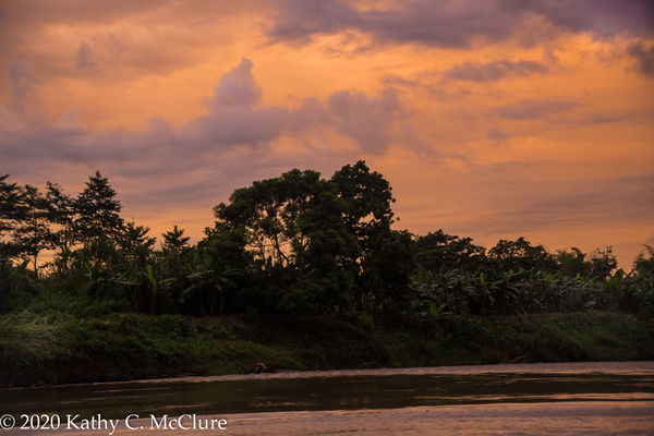
To all who worked on this image for me, I do so appreciate your time and efforts. I have worked on this off and on over several days (took the advice to "sleep on it" for awhile). I've looked at some of the versions on my own, then hit reset and started over. Right now, this is my "final" version. I know it's dark, but it was a dark time of day. I wanted some of the silhouette effect to remain in the trees while offering a bit of detail for interest. I'm going to print this out and see how it looks on the page, then probably print it on metallic paper. If anyone sees a major problem here, I'd appreciate it if you'd let me know. And thanks again!
Mar 23, 2020 14:55:19 #

AzPicLady wrote:
There's definitely a more distinctive (and for me, appealing) mood with this one because of richer colors and darker. Good luck with your printing!To all who worked on this image for me, I do so ap... (show quote)
Mar 23, 2020 15:11:14 #

AzPicLady wrote:
...If anyone sees a major problem here, I'd appreciate it if you'd let me know....
Not a major problem - just a minor quibble. The bright patch on the riverbank near the left hand edge diverts attention away from the centre, not badly but it's not a positive. You want the viewer's eye to be led into the shot, and the most natural path for that is up the centre.
Mar 23, 2020 15:36:26 #
Linda From Maine wrote:
There's definitely a more distinctive (and for me, appealing) mood with this one because of richer colors and darker. Good luck with your printing!
Thanks, Linda. I'll let you know how the printing goes.
Mar 23, 2020 15:37:36 #
R.G. wrote:
Not a major problem - just a minor quibble. The bright patch on the riverbank near the left hand edge diverts attention away from the centre, not badly but it's not a positive. You want the viewer's eye to be led into the shot, and the most natural path for that is up the centre.
Thanks, R. G. I was wondering about that. It's a spot that I deliberately lightened. Maybe I need to go back and take that down a little bit.
If you want to reply, then register here. Registration is free and your account is created instantly, so you can post right away.