Adding text to photos - please share your creative or straight approaches, suggestions, tips
Mar 1, 2020 13:36:02 #

pfrancke wrote:
Exquisite work, Piet, thank you! Your tip may sound simple but is valuable for those just starting out, or those of us who tend to forget easily. Much appreciated.only tip I can think of is to grab a color that works with the image.
Mar 1, 2020 13:36:51 #
pfrancke wrote:
And from the dark, creepy side so much fun to be had..

Mar 1, 2020 13:39:02 #
l-fox wrote:
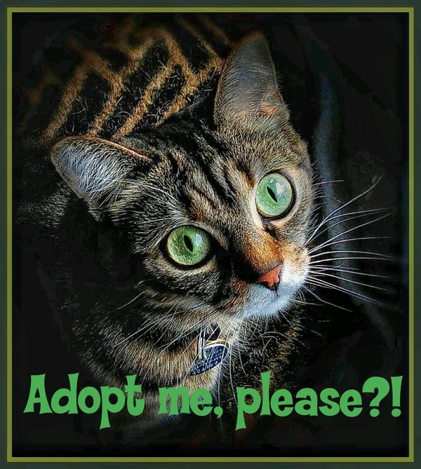
Stunning simplicity with a powerful message. Many thanks, Larry!"I have caught the moon..."
Mar 1, 2020 14:24:55 #

pfrancke wrote:
only tip I can think of is to grab a color that works with the image.
Wow, Piet!
Concise and impactful...both the image and the poem!
With your permission I’d like to download this into my “Special Study” file.
Great job!
Dave
Mar 1, 2020 14:25:43 #
Linda From Maine wrote:
Connie, your "Drink Up" cut-out of wine corks is particularly fun 
Lots of super ideas. Appreciate your posting!
Lots of super ideas. Appreciate your posting!
Clipping mask!!
Mar 1, 2020 14:48:02 #
bleirer wrote:
LOL, I had a suspicion Clipping mask!!
Thanks!Mar 1, 2020 15:28:03 #
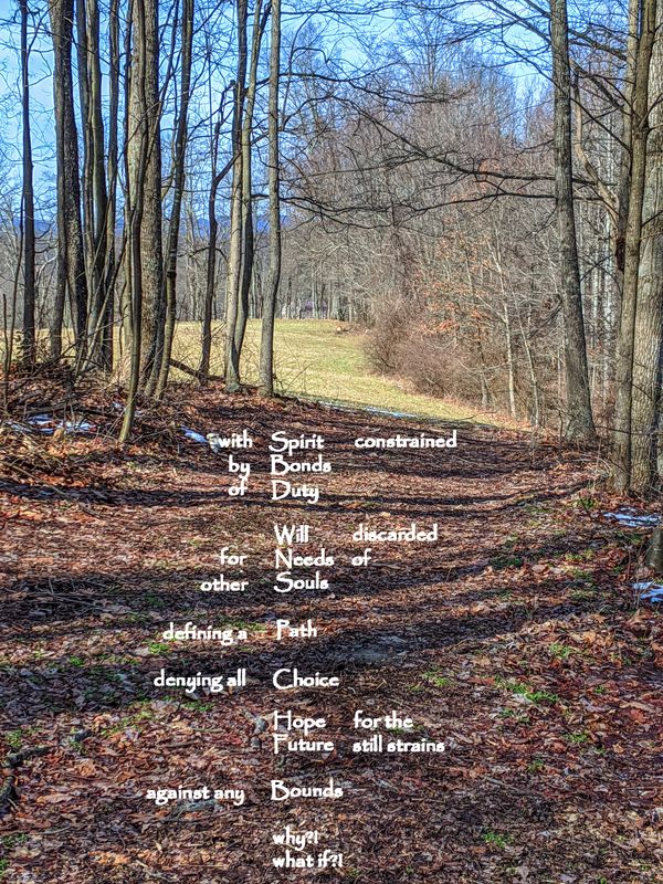
Uuglypher wrote:
Wow, Piet!
Concise and impactful...both the image and the poem!
With your permission I’d like to download this into my “Special Study” file.
Great job!
Dave
Concise and impactful...both the image and the poem!
With your permission I’d like to download this into my “Special Study” file.
Great job!
Dave
Good gosh - thanks, please do Dave.
Mar 1, 2020 19:44:13 #
Each instant in the flow of our lives is determined by the previous instant and all those before.
.
.
Mar 1, 2020 20:31:14 #

Words on pictures- certainly an interesting topic.
"There once was a man from Albuquerque who raised a 600-pound turkey..." Sorry folks but my poetic skills are severely limited to a few limericks and most of them are in poor taste! Consequently, I usually don't accompany my images with romantic, profound, or deep-meaning text. Best I could do is a good caption- I learned to do that when I worked for a newspaper-just the 5 "W"s - just the facts.
In my commercial photography work, for many decades, all I did was make photographs. In the advertising biz, we just did the images- the copywriters supplied the words, and sometimes we just needed to leave space for the copy if it was gonna be stripped in over the image. If an art director was involved, he or she specified all of this in the layout. The old adage was "A picture is worth 1,000 words" so who needs more words?
Advertising materials production was all specialized and compartmentalized- the art department created the layout, the photographers did the shots, the writers composed the copy, the pre-press trades did the graphic arts work and color separations, the printers did the typography and typesetting. and the lithographers did the final production. In some circles, it's still like this but there is more digital technology in the mix.
For commercial photographers is smaller locals, markets, times and demands have changed. The digital imaging age has brought with it many crossovers and clients are requiring many services that were formerly in other domains. Oftentimes smaller companies need shorter runs of advertising materials- posters, menus, flyers, display material, and comparatively low-budget advertising in local publications.
So...as Commerical shooters we have become copywriters, concept advisers, layout designers typographers, short-run printers, graphic artists and paste-up, and mock-up producers.
I ain't complaining- if fact I enjoy it. We can plan the shot according to our own layout. TEXT is the most fun because we can advise and help the client choose form zillions of cool fonts- the trick is to find one that fits the product or subject, Here's the most exciting aspect. Rather than the text or typography being an afterthought or an outboard caption, it can become part of the composition. We can match, pick up on the colors in the image, plan very powerful or subtle contrasts between the text and the image, or use the text to fill negative space or help balance the composition. Or we can work backward from the client's copy, words, theme or logo and create an image in keeping with his or her concept or message.
Sometimes an ad agency or publication will ask us to create a mock-up of how the potential client's product will look like in a print ad or magazine cover.
As a photographer, I still advice many of my clients that a good picture is still worth 1,000 words or perhaps only 975 words or maybe as many as 995 words and only a few actual words need to be added to bring the message home, supply product identification, tell the story or sell the product, service or concept.
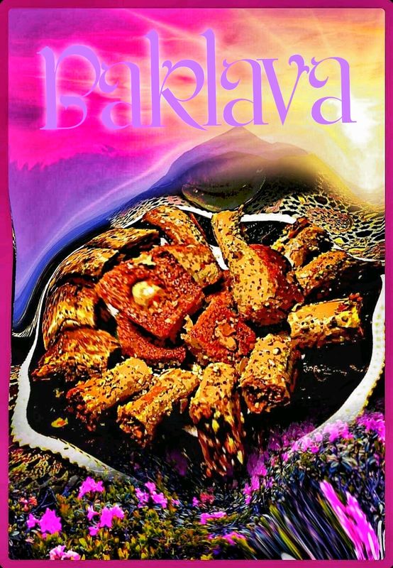
Attached: is an ad shot for a Middle-Eastern style bakery- I found a font that seems appropriate and shot image in-studio with front projection.
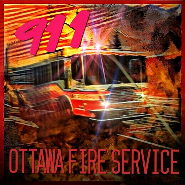
There is a job we did for our local fire department for a poster and their hand out for fire safety.
One of a series of posters and a TV ad campaign for the Ottawa Humaine Society.
A Mailbox flyer for a Pizzaria.
A Mock-up for a magazine ad for a Sushi restaurant.
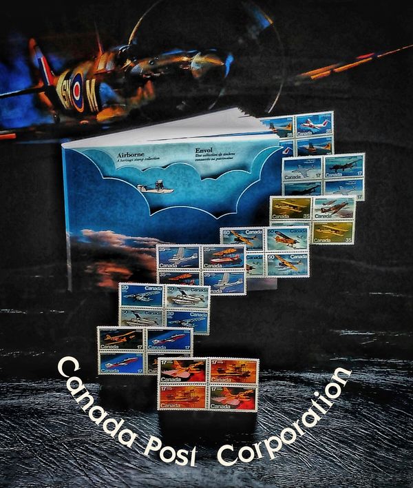
A point of sales poster for the
Canadian Post Office.
"There once was a man from Albuquerque who raised a 600-pound turkey..." Sorry folks but my poetic skills are severely limited to a few limericks and most of them are in poor taste! Consequently, I usually don't accompany my images with romantic, profound, or deep-meaning text. Best I could do is a good caption- I learned to do that when I worked for a newspaper-just the 5 "W"s - just the facts.
In my commercial photography work, for many decades, all I did was make photographs. In the advertising biz, we just did the images- the copywriters supplied the words, and sometimes we just needed to leave space for the copy if it was gonna be stripped in over the image. If an art director was involved, he or she specified all of this in the layout. The old adage was "A picture is worth 1,000 words" so who needs more words?
Advertising materials production was all specialized and compartmentalized- the art department created the layout, the photographers did the shots, the writers composed the copy, the pre-press trades did the graphic arts work and color separations, the printers did the typography and typesetting. and the lithographers did the final production. In some circles, it's still like this but there is more digital technology in the mix.
For commercial photographers is smaller locals, markets, times and demands have changed. The digital imaging age has brought with it many crossovers and clients are requiring many services that were formerly in other domains. Oftentimes smaller companies need shorter runs of advertising materials- posters, menus, flyers, display material, and comparatively low-budget advertising in local publications.
So...as Commerical shooters we have become copywriters, concept advisers, layout designers typographers, short-run printers, graphic artists and paste-up, and mock-up producers.
I ain't complaining- if fact I enjoy it. We can plan the shot according to our own layout. TEXT is the most fun because we can advise and help the client choose form zillions of cool fonts- the trick is to find one that fits the product or subject, Here's the most exciting aspect. Rather than the text or typography being an afterthought or an outboard caption, it can become part of the composition. We can match, pick up on the colors in the image, plan very powerful or subtle contrasts between the text and the image, or use the text to fill negative space or help balance the composition. Or we can work backward from the client's copy, words, theme or logo and create an image in keeping with his or her concept or message.
Sometimes an ad agency or publication will ask us to create a mock-up of how the potential client's product will look like in a print ad or magazine cover.
As a photographer, I still advice many of my clients that a good picture is still worth 1,000 words or perhaps only 975 words or maybe as many as 995 words and only a few actual words need to be added to bring the message home, supply product identification, tell the story or sell the product, service or concept.
Attached: is an ad shot for a Middle-Eastern style bakery- I found a font that seems appropriate and shot image in-studio with front projection.
There is a job we did for our local fire department for a poster and their hand out for fire safety.
One of a series of posters and a TV ad campaign for the Ottawa Humaine Society.
A Mailbox flyer for a Pizzaria.
A Mock-up for a magazine ad for a Sushi restaurant.
A point of sales poster for the
Canadian Post Office.

Mar 1, 2020 20:45:49 #
Mar 1, 2020 21:51:47 #
E.L.. Shapiro wrote:
Words on pictures- certainly an interesting topic.... (show quote)
Thanks for your words, and great examples.
Mar 2, 2020 07:21:59 #
l-fox wrote:
Larry, wow!Each instant in the flow of our lives is determined by the previous instant and all those before.
Mar 2, 2020 07:27:11 #
E.L.. Shapiro wrote:
Fascinating stories, as always, Ed. Thank you so much for your time and the cool photos too!So...as Commercial shooters we have become copywriters, concept advisers, layout designers typographers, short-run printers, graphic artists and paste-up, and mock-up producers....
Mar 2, 2020 08:59:07 #

As another member of the 52 FB group, I am working on my own contribution for this week but not done yet.
So I will share a very personal one that I made in tribute to a late photographer friend some may remember from UHH, Matt Quinn, who passed away last year. It incorporates one of my birds & a seaside image of Matt's.
I have a few more so I may dig up another, but thought to share this one in case there were some people here who knew Matt.

Mar 2, 2020 09:06:01 #
minniev wrote:
It was heartbreaking to hear of Matt's death, as it has been with several UHH members whom I feel I had come to know, and whom I enjoyed interacting with and learning from. It's a different kind of pain when you have never met the member personally, but still feel a connection....I will share a very personal one that I made in tribute to a late photographer friend some may remember from UHH, Matt Quinn, who passed away last year. It incorporates one of my birds & a seaside image of Matt's.
I have a few more so I may dig up another, but thought to share this one in case there were some people here who knew Matt.
I have a few more so I may dig up another, but thought to share this one in case there were some people here who knew Matt.
Your artistry has no boundaries, Minnie. I'm so grateful for your sharing this personal tribute with us.
If you want to reply, then register here. Registration is free and your account is created instantly, so you can post right away.