Overbaked PP...???
Feb 4, 2020 09:44:01 #
tcthome
Loc: NJ
Nice set of photos. Maybe the blue skies just a tad on top & bottom pics(you can try cutting back the saturation a bit). I really like the Havanna photos. Thanks for posting.
Feb 4, 2020 10:38:25 #
Feb 4, 2020 10:54:33 #
Feb 4, 2020 11:13:33 #
Linda From Maine wrote:
For me the sky in the ocean pic is quite beautiful... (show quote)

Exceptional response Linda. As usual.
Feb 4, 2020 12:08:17 #
StanMac
Loc: Tennessee
Of them all, I like the Alcatraz Library the best. I’d like to see that one rendered in B&W.
Stan
Stan
Feb 4, 2020 12:30:33 #

Linda From Maine wrote:
Feedback is simply part of the learning process and has nothing to do with who is right or wrong. For several years now I've enjoyed hearing what others have to say about my pictures - as long as they are thoughtful and courteous in their comments. It's only the Great Truth Tellers who believe nobody is right who doesn't agree with their pov. Ignore those types as best you can. With the rest, take what you think is of value to your own interests and journey.
Hear, hear!!

Feb 4, 2020 16:07:22 #
Raybo wrote:
I'm pretty new to post processing...didn't even re... (show quote)
I chuckled when you referred to 'the raw thing in your camera'. Overcooked?...I think not as long as you like it. Each photog as they progress, they change their style, focus, interests, etc. When I look back and see some of my old edits, I think to myself, I need to re-edit those images. I suspect that you'll do the same thing. Everyone that responds on this site are at different points in their journey and, as such, will give you varying opinions as a result. In the end, it's what you saw and what you like that matters. With that said, here's some feedback and edits based on my likes.
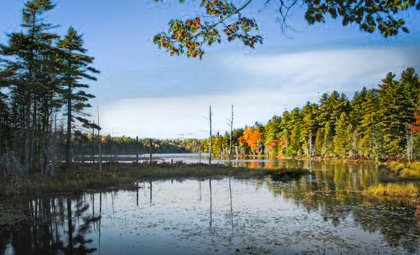
Acadia Lake is a nice image. Overall, the image was underexposed. I do agree with Linda (including most of her other comments) that the sky is a little over-saturated. I felt that the important part of the image was the colorful trees center right, so that's where I would place the emphasis for the eyes to find. The immediate foreground and some of the trees to the left didn't seem to enhance the image, so I would crop a little. To help the eyes to find the subject, I would darken the foreground just a little to make the subject stand out even more.
I especially like this image of Alcatraz Library for its simplicity. There isn't much to do to this one. All I would do is just open the shadows, just slightly, so wall details are more discernible, but not so much to bring it out of the background. I can't think of a way to improve upon the composition and lighting of this image.
There isn't anything I would really change on the Cape Code LH. You might try increasing contrast just a little so see if it make an improvement for you.
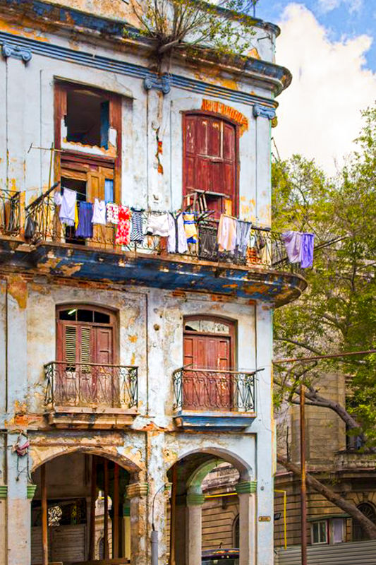
The Havana Residence is another very nice image. It appears, every seeing Cuba, that it is a very colorful place, that you've captured very well. This image had a blue color cast to it. When warmed slightly, the colors and the sky really started to stand out. The sky highlights were clipped so you lost some detail in the white clouds. Because you pointed the camera up, the building had a significant 'keystoning' effect. That is where the buildings look like they're leaning back, getting narrower at the top. After removing the blue cast and adding a little contrast, the colors really "popped" after that. Nice capture.
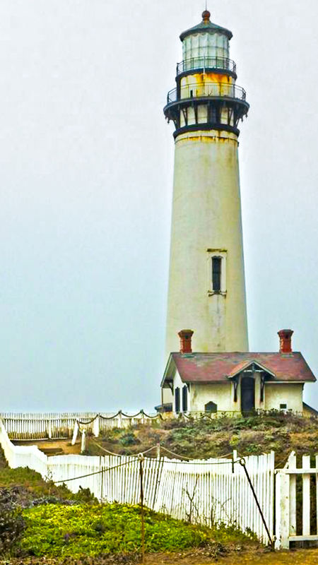
Pidgeon Point LH is another image that I really like. Probably because it was a flat lighting because of the overcast. This image also has some keystoning. A little improvement in contrast brings out the color in this image. Even though its overcast, a little variation in the sky adds a little light complexity to a flat image. I like the leading line of the white picket fence and feel it needs to have greater prominence in the image. You can do that by just brightening the fence. It then leads the eye fight up to the lighthouse.
The Havana Storefront image is another good image that can stand on its own. All I felt it needed was a little color correction of the walls of the storefront, from yellow to a little whiter. I love the old blue car in the lower left. it would ha e been great to have gotten the whole car into the image.
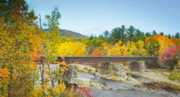
The NH RR Bridge is a location that I would like to have seen myself. This is another image that I especially like. Compositionally, the bridge feels like it is going uphill, so a slight change in the horizon fixes that. Also, I felt there was a little too much foreground that didn't enhance the bridge and the beautifully colored trees behind it. This gives it more of a panorama feel to it. The image is a little underexposed. Increasing exposure and adding a little contrast really makes the tree colors "pop". Reducing the saturation in the sky supports the colorful trees without competing with or over powering them.
I've attached my adjustments to your images just to help illustrate my comments. I assumed this to be OK since you explicitly asked for critique. Hope you find these useful.
Mike
.

Feb 5, 2020 16:12:14 #
Great photos. Could you post them as a download to that we can enlarge them to see the details?
When I was in AZ all of my outdoor pics would be considered overcooked, however, they were not. They were exactly what the camera saw, the skys were always this blue. A natural occurrence there. If you like them as they are, stick with it. If you want to change the sky a bit do so. In any event, have a ton of fun while you are mastering your new endeavor!
When I was in AZ all of my outdoor pics would be considered overcooked, however, they were not. They were exactly what the camera saw, the skys were always this blue. A natural occurrence there. If you like them as they are, stick with it. If you want to change the sky a bit do so. In any event, have a ton of fun while you are mastering your new endeavor!
Feb 5, 2020 16:27:19 #
Hamltnblue
Loc: Springfield PA
Raybo wrote:
I'm pretty new to post processing...didn't even re... (show quote)
They turned out good and not overdone.
If find with ON1 that the low dehaze preset will get most pics to a good point to work with.
Feb 5, 2020 16:35:45 #
If you want to reply, then register here. Registration is free and your account is created instantly, so you can post right away.