Processing this photo
Jan 30, 2020 16:21:37 #
Curmudgeon wrote:
I have seldom worked successfully with foggy images and I won't try this time. I think the B&W image is the jewel of this set.
Thanks Jack. Give it a shot. See what happens
Jan 30, 2020 22:37:26 #
Jan 31, 2020 01:56:32 #
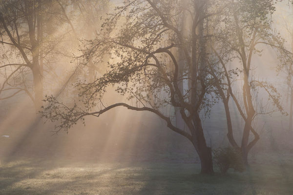
I really like #1... it has a ethereal feel to it... light and airy, almost delicate. It is not how I would have processed it myself, although lately I have really been admiring images processed like this.
But, I also really like #2 as well. I do not think it has been over-processed at all. It definitely has a different feel to it than #1. I tend to like more vivid colors myself, and do not think #2 is over-saturated by any means, but we all have own own tastes.
But, I also really like #2 as well. I do not think it has been over-processed at all. It definitely has a different feel to it than #1. I tend to like more vivid colors myself, and do not think #2 is over-saturated by any means, but we all have own own tastes.
Jan 31, 2020 07:42:18 #
maryo wrote:
I like the feel of the first one.
Thank you maryo for your feedback. This has me thinking some, with so many folks indicating they prefer a completely unprocessed image.
Jan 31, 2020 09:47:14 #
Vince68 wrote:
I really like #1... it has a ethereal feel to it... light and airy, almost delicate. It is not how I would have processed it myself, although lately I have really been admiring images processed like this.
But, I also really like #2 as well. I do not think it has been over-processed at all. It definitely has a different feel to it than #1. I tend to like more vivid colors myself, and do not think #2 is over-saturated by any means, but we all have own own tastes.
But, I also really like #2 as well. I do not think it has been over-processed at all. It definitely has a different feel to it than #1. I tend to like more vivid colors myself, and do not think #2 is over-saturated by any means, but we all have own own tastes.
Just to be clear Vince, #1 was without any processing. If I take the time to process an image, its likely I will go back to it numerous times. We learn stuff over time and our own tastes change. I appreciate your contribution to the topic!
Jan 31, 2020 16:41:53 #
I agree with Bary and enjoyed the soft ethereal feeling of the original, which #1 portrays. I don't dislike the middle and 3rd one, but feel they tell a different story.
If you want the grays warmer, I tried a couple "blend-if" curves at about 50% opacity and it appeared to keep the softness. Bev
If you want the grays warmer, I tried a couple "blend-if" curves at about 50% opacity and it appeared to keep the softness. Bev
Jan 31, 2020 16:47:42 #
Just saw your revision with the clarity slider. I like that one the best. You moved it to the left?? Some days we just have to play with an image. That's what so fascinating to me about post processing. Bev
Jan 31, 2020 19:02:42 #
NikonGal wrote:
Just saw your revision with the clarity slider. I like that one the best. You moved it to the left?? Some days we just have to play with an image. That's what so fascinating to me about post processing. Bev
Hi Bev, your edit looks good. I will have a look when I get back to the computer. Yes the clarity slider to the left. I have begun experimenting. It doesn’t yield the kind of result I expected. I’m not sure it was meant to be used that way.
Feb 21, 2020 16:24:46 #
Really nice composition!
The first one works "too soft" for me, but the second and third one are amazing, well done!
The first one works "too soft" for me, but the second and third one are amazing, well done!
Feb 21, 2020 16:32:25 #
fergmark wrote:
I took this 15 years ago with my first DSLR. I h... (show quote)
All three are very good images but for me numbers one and three stand out. Number two doesn't have the misty subltey of the others.
Graham
Feb 21, 2020 18:05:13 #
armandoluiz wrote:
Really nice composition!
The first one works "too soft" for me, but the second and third one are amazing, well done!
The first one works "too soft" for me, but the second and third one are amazing, well done!
Thank you Armando for looking. The first was of course unedited. I really didn’t have any real skills to edit photos back when I took this shot. You can change photos but it can be questionable as to whether you have made good choices. Black and white is a the zone where I am more comfortable. Still mostly experimenting and learning. Participating in the MIYV as well as other activities on UHH has broadened my awareness. Thanks again. Mark
Feb 21, 2020 18:11:56 #
Graham Smith wrote:
All three are very good images but for me numbers one and three stand out. Number two doesn't have the misty subltey of the others.
Graham
Graham
I’m so honored to have you appear in this thread Graham, and offer your thoughts. Mark
If you want to reply, then register here. Registration is free and your account is created instantly, so you can post right away.


