Please help me sharpen these
Jan 25, 2020 06:59:35 #

John N wrote:
Can't really see what the problem is, Linda. I don't much care for the Orchard shot but it does look respectably sharp to me. As the cliff - I'd be very happy with that.
Some software gives you an UNSHARP option for sharpening. This gives you finer control over your sharpening. When I use it, I look at 100% view and just nudge the sliders a bit either way to avoid halo's and things. I think I'm right in saying it'll only work on a raw file.
Some software gives you an UNSHARP option for sharpening. This gives you finer control over your sharpening. When I use it, I look at 100% view and just nudge the sliders a bit either way to avoid halo's and things. I think I'm right in saying it'll only work on a raw file.
You say "I think I'm right in saying it'll only work on a raw file". Am I wrong in thinking that what you view to edit (in any application) is no longer the RAW but a viewable file - which a RAW cannot be?

Jan 25, 2020 07:24:18 #

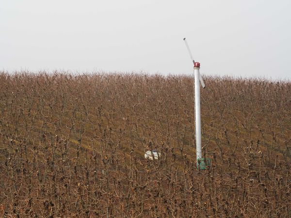
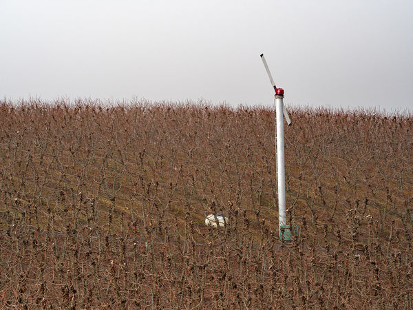
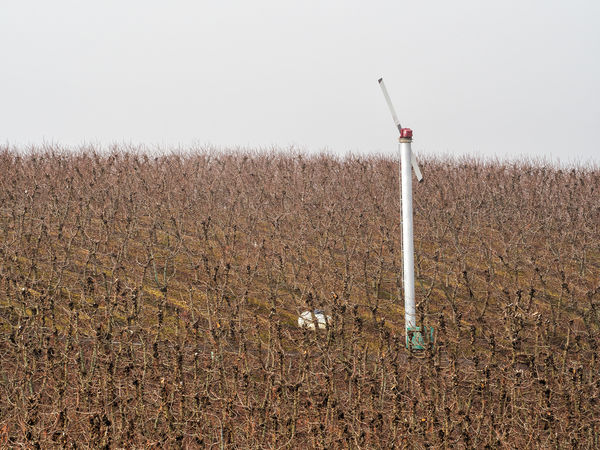
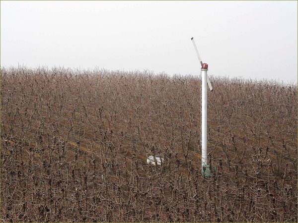
With #1 the main thing to look out for is over-sharpening. All those edges and small detail can start to look a bit too jaggedy if you aren't careful. Where the limit is is down to personal taste. I stopped short of what I thought was too much but cranked it up close to that because the sharpening does add to the clarity and vividness (I'm assuming that's what you were after). The haziness near the skyline was more of an issue, which I countered with contrast, clarity and a drop in Highlights via a selection (plus a bit of extra local sharpening thrown in).
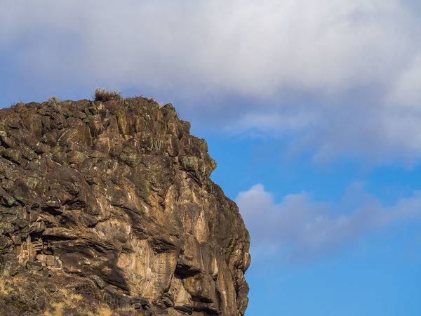
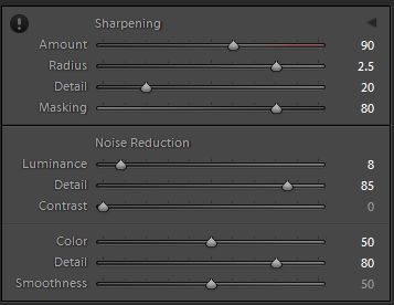
With #2 the contrast and clarity are what will make the rock face look more vivid and detailed, but a bit of edge sharpening doesn't go amiss and it gave added definition to all of those rock details. Masking keeps the sharpening away from the sky where there is a bit of noise to worry about.
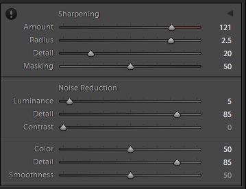
For both I used a mixture of global adjustments using the Details section plus local adjustments applied via the brush. In both cases I have the Radius slider a bit higher than the default value of 1 and the Detail slider lower than the default value of 25. And in both cases the Masking slider keeps the sharpening away from the noise and concentrated on the edges (which is where the eye perceives most of the sharpness). In #2 I added sharpening to the rocks, and to the sky I added denoise plus negative Clarity and a touch of negative Sharpen. The noise in the sky in #2 isn't really noticeable until you zoom in on it. In retrospect, if it was a problem I could probably have increased the Smoothness in the Colour Denoise section, but I didn't think it was that bad at NVD (which for me is full screen on a 27" monitor).
I find that m4/3 files usually benefit from some Colour Denoise. In both cases I used more than the default value of 25.
.
With #2 the contrast and clarity are what will make the rock face look more vivid and detailed, but a bit of edge sharpening doesn't go amiss and it gave added definition to all of those rock details. Masking keeps the sharpening away from the sky where there is a bit of noise to worry about.
For both I used a mixture of global adjustments using the Details section plus local adjustments applied via the brush. In both cases I have the Radius slider a bit higher than the default value of 1 and the Detail slider lower than the default value of 25. And in both cases the Masking slider keeps the sharpening away from the noise and concentrated on the edges (which is where the eye perceives most of the sharpness). In #2 I added sharpening to the rocks, and to the sky I added denoise plus negative Clarity and a touch of negative Sharpen. The noise in the sky in #2 isn't really noticeable until you zoom in on it. In retrospect, if it was a problem I could probably have increased the Smoothness in the Colour Denoise section, but I didn't think it was that bad at NVD (which for me is full screen on a 27" monitor).
I find that m4/3 files usually benefit from some Colour Denoise. In both cases I used more than the default value of 25.
.
Jan 25, 2020 07:25:34 #

Delderby wrote:
You say "I think I'm right in saying it'll only work on a raw file". Am I wrong in thinking that what you view to edit (in any application) is no longer the RAW but a viewable file - which a RAW cannot be?
You are. But the viewable file is drawn directly from the raw and until it is saved in a different format it is just that - a viewable file. Perhaps I should have said it won't work on JPEGS - or at least CANON DPP v4 won't. I think Linda was a one time Canon owner but now uses a Panasonic. She is pretty proficient with both.
Jan 25, 2020 07:40:18 #

A quick note to check in with all who've posted so far: I will review and attempt equal results with each of your postings, then report back later today. I'm very grateful for your time and interest!
John, I totally forgot about the "unsharp" feature, and have used that, but it's been awhile.
See you all in a few hours!
John, I totally forgot about the "unsharp" feature, and have used that, but it's been awhile.
See you all in a few hours!
Jan 25, 2020 07:42:22 #
Delderby wrote:
I knew what he meant. Let's stay with the task at hand; I have enough trouble keeping focused 😇You say "I think I'm right in saying it'll only work on a raw file". Am I wrong in thinking that what you view to edit (in any application) is no longer the RAW but a viewable file - which a RAW cannot be?
Jan 25, 2020 08:08:56 #
Jim-Pops wrote:
I played with them some but honestly I don't think I was improving them. 😳
Like Jim, I could not improve on them either. Maybe it's my old eyes playing tricks on me!!!

Jan 25, 2020 10:40:05 #
To all:
When you opened the raw, were the sliders already moved (my ACR edits)? Or clean slate?
johngault007 - the data in the exif was a bit overwhelming, so I tried to adjust mine to look like yours by visual side by side in my editor. I came close with a selective color adjustments to hue/saturation, a tweak to my levels layer adjustment, and a bit of unsharp mask on a new layer (which kept my original layer of sharpen).
This was a good exercise in re-learning/remembering what adjustments produce specific results, as well as a good exercise in attention to detail. Thanks again!
Jim-Pops - I was able to come close to your result with a combination of Nik Color Efex levels/curves adjustment and PSE levels. I appreciate the reminder of the alternate "sharpening with contrast."
SalvageDiver - the jpg sharpened vs. raw to unsharp mask was most beneficial since I could duplicate your numbers and compare my files side by side. I don't go nearly as far with pixel peeping as you (can't see that well, gives me a headache, lol), but from NVD there is definitely a difference. Your efforts are much appreciated, and your posted results will be valuable for those who have Topaz.
Rongnongno - We've had discussions and demos of the relatively new "Texture" choice in ACR, as I recall. I didn't pay attention because Elements doesn't offer. I do have Clarity in ACR, which I used for the result posted as jpg in this exercise. The rest has to be done in the normal workspace.
I like your suggestion to set ACR sharpen to zero, and I'm going to work that way from now on. I've only tried PSE's De-haze once or twice, but by combining it with levels on the rock image, I saw a pronounced difference.
Re the orchard, the "fill" slider is sort of fill light/even out contrast? Please explain further if I'm way off. (I hadn't noticed the graffiti; thanks for mentioning.) Many thanks!
John N - a clarification re your mention that Unsharp only works on raw: in PSE, the Unsharp Mask edit is located in the main workspace, and can be used on any file type. Normally, my work flow would be as you suggested. The raw has been pulled into main editor after some ACR edits, and I have not yet saved as jpg. If I'm smart, though, I'll save as PSD file as I go along...in case of catastrophic failure such as power outage
FrumCA - this was more an exercise to practice with the tools. At normal viewing distance, my old eyes miss a lot also. Thanks so much for checking in.
Jan 25, 2020 10:43:04 #
R.G. wrote:
R.G., with #2 the main difference I see between my result and yours is color saturation (vividness?).With #1 the main thing to look out for is over-sha... (show quote)
I was most interested in your edits to #1. Along with what you said, and from others, I'm posting a change below.
I zero'd out the sliders in ACR, used PSE's Dehaze in the main workspace, then Unsharp Mask, then levels and saturation adjustments, then Nik Dfine for noise removal, but only on the sky.
I like the result much better than my first. Many thanks!
Jan 25, 2020 11:06:32 #
I purchased a book written by Bruce Fraser and Jeff Schewe (2010). Bruce consulted with Adobe on Camera Raw 4.1 and LR 1.1 and created a commercial sharpening application for images. They believe in multiple sharpening. Book is "Image Sharpening with Adobe Photoshop, Camera Raw and Lightroom." I often use PS High Pass sharpening to achieve a certain look and most often do this selectively using a mask.
Jan 25, 2020 11:08:32 #
rborud
Loc: Minnesota
Linda From Maine wrote:
In PS Elements is an "Adjust Sharpness" ... (show quote)
Linda Thanks for posing this question, it is one I rarely talk about because of the diametric opposite thoughts of the subject. I find nearly all have a different attitude of the perception of sharpness. Personally sharpness tends to be somewhat lower on my list than the the totality and impact of the image. So here is my little nood to sharpness and your image. I tend to work less predictably than most so I will show before I tell. Now I will go suck my thumb in the woodshed.......... RBorud
Jan 25, 2020 11:58:45 #

Linda From Maine wrote:
.../... then Nik Dfine for noise removal, but only on the sky .../...
You do not need this if you work on a selection vs the whole image. It is a common mistake to use the whole image and then mask/repair.
If you read my method I used two selections, one to isolate the rock as a whole under a new layer then another selection (no layer) while sharpening.
This avoids the creation of noise in the non affected areas as well as prevent distortion where sharpening is not a good idea such as out of focus areas.
Jan 25, 2020 12:01:10 #
One last comment.... When presenting an image for sharpening, do not resize down the image as this will create a sharpening effect of sorts and throw off the viewer evaluation.
Jan 25, 2020 12:31:43 #
As to what fill does...
Fill is a really odd beast hard to comprehend. It is best used in texture and the like. Unlike opacity that addresses the global layer opacity Fill addresses the layer content. ie the pixels that will influence other when using layer style.
When you do not use layer style I discovered that while it works like opacity it allows for a greater opacity control when using the two at the same times. (Create a new document and shapes on it, use the sliders at 50% opacity and 50% fill this gives you 50% of 50% so 25%).
While the math is simple in this sample in reality it gives you the opportunity to enter fraction of percentage hence greater accuracy.
I know, you need to be a nut case to use the sliders this way. Just remember that you must not use layer styles when using this.
The following image is created using a 1% opacity combined with a 50% opacity and appears bi-color. Use a level on it and you will see that is not true at all. This is an extreme example of what you can do. You can go as low as 0.001% transparency !!!
-

Jan 25, 2020 12:34:03 #
via the lens wrote:
Thanks so much for the tip, Connie.I purchased a book written by Bruce Fraser and Jeff Schewe (2010). Bruce consulted with Adobe on Camera Raw 4.1 and LR 1.1 and created a commercial sharpening application for images. They believe in multiple sharpening. Book is "Image Sharpening with Adobe Photoshop, Camera Raw and Lightroom." I often use PS High Pass sharpening to achieve a certain look and most often do this selectively using a mask.
Jan 25, 2020 12:35:32 #
rborud wrote:
I confess to being mesmerized by all the details, Russ Linda Thanks for posing this question, it is one I... (show quote)
If you want to reply, then register here. Registration is free and your account is created instantly, so you can post right away.