B&W photos need …
Sep 19, 2019 13:10:50 #
gvarner
Loc: Central Oregon Coast
lamiaceae wrote:
He is not necessarily bitching. What he is talkin... (show quote)
Thank you for your understanding. You said it much better than I did. I’m just reflecting on what I’ve read, that good B&W requires a bit different vision before the shot than does color photography.
Sep 19, 2019 13:21:22 #

lamiaceae wrote:
Maybe you're using the wrong search words ...much of the "B&W" today is crap...I would say I do see a lot of great Color photography online, but very little good B&W.

Check out the dozen artists here:
http://anseladams.com/represented-artists/black-white-photography/
Or search for "best" as a place to start:
https://mymodernmet.com/black-white-photographer-year-contest-2018/
https://www.thephotoargus.com/60-inspiring-examples-of-black-and-white-photography/
.
Sep 19, 2019 16:19:18 #
gvarner wrote:
Thank you for your understanding. You said it much better than I did. I’m just reflecting on what I’ve read, that good B&W requires a bit different vision before the shot than does color photography.
That's why quiet a many folks compose in B&W ( on the LCD) while shooting color (it helps to find a good balance in the contrast of your composition)!
Sep 19, 2019 18:06:18 #
Some of you might find this previous discussion of black & white photography interesting. Good comments and visuals.
"Black & white photography in a color world..." (https://www.uglyhedgehog.com/t-566012-1.html)
"Black & white photography in a color world..." (https://www.uglyhedgehog.com/t-566012-1.html)
Sep 19, 2019 22:59:30 #

Cykdelic wrote:
Sometimes a hamburger is just a hamburger!
You’re outdoors, walking along, and see something to shoot.....ya ain’t got time to,sit down, fiddle with settings or angles, etc...... you SHOOT!
You’re outdoors, walking along, and see something to shoot.....ya ain’t got time to,sit down, fiddle with settings or angles, etc...... you SHOOT!
But getting a good B&W rendition is very difficult; often two colors that look so different to us just blend together in monochrome.
Sep 20, 2019 07:10:26 #
rehess wrote:
That's why there are lens filters for film and virtual filters in pp for digital. And why learning about how they work and when to use them (separation of gray tones, complimentary colors) is important. One article:But getting a good B&W rendition is very difficult; often two colors that look so different to us just blend together in monochrome.
https://hoyafilterusa.com/how-filters-for-black-white-photography-work/
For film, as I recall there are darkroom aids such as filters or paper that aid in contrast. In digital pp you have curves and levels: separate adjustments for blacks, whites, midtones.
It's really not difficult at all with a little knowledge

Also, learning about light (especially direction and qualities such as harsh and soft) is hugely important for all photography!
https://www.uglyhedgehog.com/t-529331-1.html
https://www.uglyhedgehog.com/t-531762-1.html
.
Sep 20, 2019 08:22:59 #
bbrown5154
Loc: Baltimore, MD
gvarner wrote:
I see a lot of B&W photos on this forum that were shot in flat light with muted colors and rendered to B&W. It seems to me that there’s a bit more to consider for a good composition that uses the B&W effect.
And?
Sep 20, 2019 08:39:05 #

Linda From Maine wrote:
As far as I can recall, it's been a long time sinc... (show quote)
Thanks Linda......that was very helpful for me. I have often wondered as to how I should view a subject with the intent of making it a B&W image despite the lure to leave it in colors. And I am hoping that studying the Infrared process will get me thinking along those lines and the use of various color filters and that Silver-Effects that you & Richard Taylor employ , clearly improves the finished product. It makes the fur,hair fibers and textiles look amazing and wonderful.
I love your work.
Sep 20, 2019 08:40:22 #

gvarner wrote:
I see a lot of B&W photos on this forum that were shot in flat light with muted colors and rendered to B&W. It seems to me that there’s a bit more to consider for a good composition that uses the B&W effect.
Way back when, I used Black and White Film. I was often forced to visualize in B&W. Then I discovered Kodak CN400 film. This was a nice film that when C41 processed, it rendered portrait with a unique Sepia tone. Most photographers feel comfortable with color. They haven't learned to visualize (imagine) in Black and White.
Sep 20, 2019 09:05:45 #
Thorburn
Loc: Virginia
Well done Linda, B&W takes on a whole other genre study the Great Ansel Adams; thanks for sharing that link it opens up alot of information for those willing to read it!
Sep 20, 2019 09:21:42 #
gvarner wrote:
I see a lot of B&W photos on this forum that were shot in flat light with muted colors and rendered to B&W. It seems to me that there’s a bit more to consider for a good composition that uses the B&W effect.
I use my Pentax Q which gets great B&W images in camera. That is what I mostly use this camera for.
It gets the best B&W images out of all my other cameras, and I have quite a few of them.
I prefer to shoot my B&W images in camera rather than converting color images to B&W.
This helps me in visualizing what I want to capture in an image.
will
Sep 20, 2019 09:59:46 #

"I see a lot of B&W photos on this forum that were shot in flat light with muted colors and rendered to B&W. It seems to me that there’s a bit more to consider for a good composition that uses the B&W effect."
Since you brought this to the forum I want to make my comments. In the first place I spent more than 6 months in The Art Institute of Fort Lauderdale under the supervision of two qualified gentlemen in the art of b&w photography while I was in photography school. I learned enough to be very satisfied with my b&w vision and my prints. I was using at the time Kodak Tri-X and HC-110 solution B and I have made exhaustive testing to determine the speed of the film and time of development for the best results. I remember that my e.i for Tri-X was 250 and my developing time was like 2 minutes less than indicated by Kodak. That combination gave me beautiful images with a virtual absence of grain in the negatives.
I am not using the darkroom any longer and I will be the first one to admit that I have lost my "touch" for b&w photography. Now with digital and just a few years ago it was a total disappointment when I could not even come close with my prints to what I was printing in the past. Things began to change when Nik and Topaz introduced software for the editing of b&w conversions but still it took me some time before I was comfortable converting color images to b&w. It was not easy either to find the lab that will make justice to my conversions.
What I see in a majority of the b&w images posted here is or excessive contrast or a total lack of it. Monochrome images are made of gray tonalities but the addition of black and white tones really makes the image pop. I spent time trying to duplicate the pristine whites in the prints of Ansel Adams. I came pretty close and stayed there. It is much easier to get those pristine whites, in my opinion with the conversion and the appropriate software but at times not that easy to get those tonalities in a print. I do not need to say that we can do in the digital darkroom what we never dreamed of in the optical darkroom. I have seen many professional conversions and to me they were as good as an original print.
Not all images yield themselves to a good conversion and the exposure with digital is not the same as when exposing film. With film we wanted detail in the shadow areas and we will expose for the shadows. With digital opening the shadows a couple of stops is not that difficult.
Development took care of the bright areas while with digital we better expose for important bright areas or we will end up clipping them. Two different medias if you ask me.
I am still in love with b&w images although I admit I do not do monochrome as much as I did when I was using film. We do not have colors to direct our eyes to but subtle tonalities in gray that need to be handled skillfully to end up with the right print.
It would be a great exercise to start a foum for the learning of b&w images.

Sep 20, 2019 10:00:43 #
Blair Shaw Jr wrote:
Thanks Linda......that was very helpful for me.
Thorburn wrote:
Thank you folks!Well done Linda, B&W takes on a whole other genre study the Great Ansel Adams; thanks for sharing that link it opens up alot of information for those willing to read it!
srt101fan hosted a more recent topic, which he linked a few comments ago:
https://www.uglyhedgehog.com/t-566012-1.html
I apologize for my brain cramp, srt!
Sep 20, 2019 10:07:10 #
Cykdelic wrote:
Sometimes a hamburger is just a hamburger!
You’re outdoors, walking along, and see something to shoot.....ya ain’t got time to,sit down, fiddle with settings or angles, etc...... you SHOOT!
You’re outdoors, walking along, and see something to shoot.....ya ain’t got time to,sit down, fiddle with settings or angles, etc...... you SHOOT!

Sep 20, 2019 10:15:18 #
gvarner wrote:
I see a lot of B&W photos on this forum that were shot in flat light with muted colors and rendered to B&W. It seems to me that there’s a bit more to consider for a good composition that uses the B&W effect.
My interest in photography as a hobby began in black and white because of the intellectual challenges B&W poses. I tried different films and printers back in the 80’s with some modest results, but was inhibited by cost. One thing I read was articles about old movies and there cinematography. Excellent information. For instance, watch the sword fight scene with Errol Flynn in Robin Hood or the original Frankenstein. Beautiful. I read all of Ansel Adams books. Went to museums. I shot as much as I could afford. Then digital hit and I was generally unhappy with my B&W results converted by photoshop. With NIK, and then with photoshop competing with NIK, that has changed. I get some images that I am happy with and many that I am not. I don’t show many images except to friends. I shoot for me. I have seen some beautiful B&W photos on UHH from photographers far more skilled than myself. But here are a few lessons from an interested amateur.
FF IQ is helpful (versus DX). It was a main reason for switching.
Always shoot raw.
Shoot in color.
Colors need to be visualized in shades of grey when composing. It takes a lot of practice to see yellow as near white and dark blue as light black, taking into account the shadows coming across the colors, in the few seconds you often have to click off a photo.
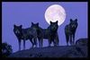
Natural light angles and time of day are more exacting in B&W than in color. They are more difficult to manipulate in PP. If I have a bright sky with no clouds and there are few shadows, I don’t even consider B&W. The full moon, on the other hand, provides plenty of contrast and sharp images using the camera, a shutter release and a tripod.
The RAW image must be razor sharp.
Subject matter is key to a good image. Some subjects are made for B&W.
When composing, not only does visualizing in grey tones matter, but so does understanding the effects of PP color filters. Sometimes I will just use a preset PP from NIK, but sometimes I am more happy with Photoshop which has a filter mode.
Shadows are more of a friend in B&W than in color when shooting digital.
Viewing the B&W renditions on a color monitor can deceive the eye in PP. Use Spyder or an equivalent frequently and always have the ambient light at the same level. I usually PP in low light.
Printing on a modern color printer on color paper does not create exceptional B&W images. Use B&W paper and black inks or a specialized professional printing company. The printed image is far more dramatic and pleasing to me than what I typically see on my monitor.
I think digital B&W is a fun medium. Enjoy.
Below is an image that the subject matter cried for B&W. As I’m sure you can guess, it is the electrified fence at Auschwitz. I have played with these images many times now, but this is a rendition that will fit on UHH and is on my iPad.
If you want to reply, then register here. Registration is free and your account is created instantly, so you can post right away.