B&W photos need …
Sep 20, 2019 18:19:20 #

gvarner wrote:
I see a lot of B&W photos on this forum that were shot in flat light with muted colors and rendered to B&W. It seems to me that there’s a bit more to consider for a good composition that uses the B&W effect.
I shoot in colour because I just might like that and B&W. I can convert the colour images into B&W in post - you just have to know how to do it. Of course, not all colour shots translate into great B&Ws. But that's fine with me.
Sep 20, 2019 20:15:07 #
ButchS
Loc: Spokane, WA
gvarner wrote:
I see a lot of B&W photos on this forum that were shot in flat light with muted colors and rendered to B&W. It seems to me that there’s a bit more to consider for a good composition that uses the B&W effect.
Contrast is the number one thing. I always shoot B&W with a 25A filter, or the digital equivalent.
Check this article for a very brief discussion about good black and white.
https://digital-photography-school.com/stunning-black-and-white-photography/?utm_source=newsletter&utm_medium=emailimg&utm_campaign=Sep-1919
Sep 20, 2019 20:19:07 #
Sep 20, 2019 21:47:48 #
RodeoMan
Loc: St Joseph, Missouri
Maybe the poster is not "bitching' but only asking a question. Perhaps the poster sees what he or she considers a problem or something that could be improved, but is not sure about how to go about getting that accomplished.
Sep 21, 2019 01:54:39 #

Linda From Maine wrote:
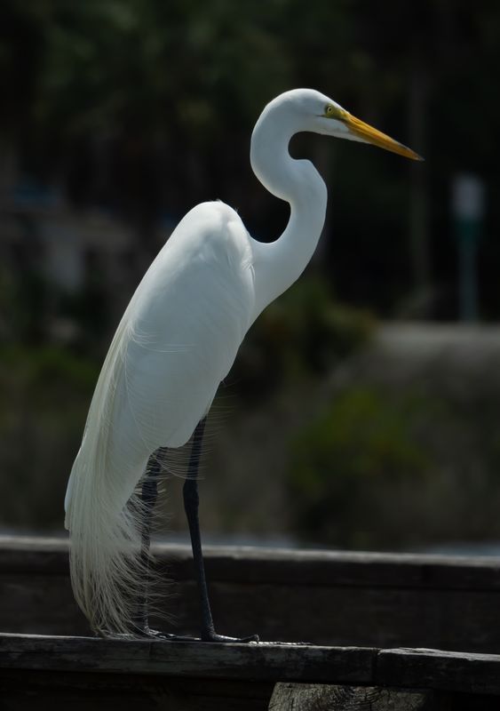
Your egret (?) is stunning! br br I'm interested ... (show quote)
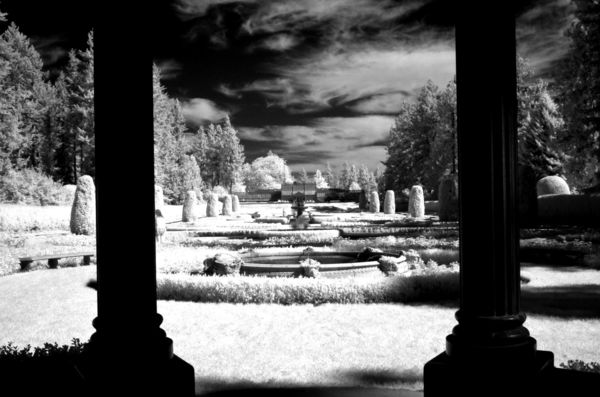
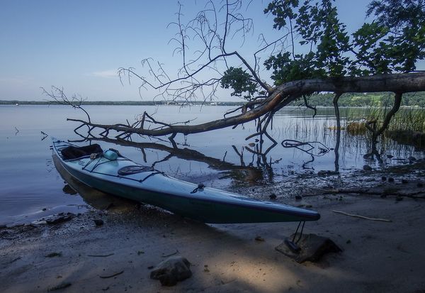
Oh, certainly believe you can make an image stronger by the choice of using either B&W or color, and certainly the light can impact that choice, but I still think you need a decent image either way. I think both of your images would make nice color images, those trees especially is a nice composition, but I agree with your choice to go B&W. In the link to Minnie’s comments, I’d actually like to see her image of the metal pipes against that sky in color. Both of the images I did in B&W here I like I color too, the kayak shot it really changed the feel and the egret I think it really helped emphasis the breeding plumage.
Sep 21, 2019 08:53:25 #

Two people have mentioned printing. After a year of b&w film classes with darkroom work back in 1990 I was very disappointed with the first couple of b&w digital files I sent to Costco to print - ha. Along with their printers being set for mass-production of color, no doubt my image was just a mediocre Picasa conversion to begin with. There are several people on UHH who shoot b&w film and some print their own; it's a tempting thought!
Dossile points out that it takes a lot of practice to visualize b&w in a color world when composing your image. I was grateful when my second digital camera (purchased in 2012) had the ability to shoot b&w jpg, which you could see via the LCD, while also producing a raw file for conversion via software. And later I bought an M/43 Panasonic G7 which can show a b&w world via the electronic viewfinder while shooting in raw.
Ed Shapiro mentioned several reasons why some color images may not have the same impact in b&w. There are occasional Photo Gallery topics in which the OP provides both a color and a b&w of the same scene and asks for preference. Sometimes the choice is made based on the quality (or lack thereof) of the conversion, and sometimes it's simply a matter of which story you want to tell (as with my autumn tree colors earlier in this topic). But often the subject, the light and the composition are what makes one more memorable than the other.
SuperflyTNT, I much prefer your color version of the kayak. Your b&w is mostly the same midtones throughout and somewhat busy. With color we can separate the elements more easily; it's a warm and inviting scene! As you pointed out, the "feel" is far different.
Minnie is on her way to Monhegan Island, Maine for her latest photography adventures, but I'll ask her in a couple of weeks if she can dig up the original of the harsh-light Iceland industrial pic. It would be fun to compare a color version.
Sep 21, 2019 08:56:13 #
SuperflyTNT wrote:
Oh, certainly believe you can make an image strong... (show quote)
I loved the b&w egret shot you posted earlier but now I might like the color version even better! Maybe it's because of the simplicity of the color scheme with the orange/yellow beak being the only standout color.....
I think for me the kayak photo works better in b&w. Not sure why; maybe in the color version the dark, almost monochromatic kayak on the left, and the light, colorful background on the right create a visual unbalance I'm not quite comfortable with....
If you want to reply, then register here. Registration is free and your account is created instantly, so you can post right away.