Check out Printers and Color Printing Forum section of our forum.
Color or monochrome?
Jul 8, 2019 07:18:41 #

TylerDurdensReel wrote:
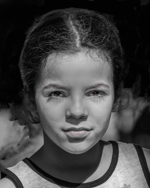
I'm interested in hearing what you feel or see when you look at these images. They are copies of two captures and cropped to 8x10. One of the color copies is cropped more but still for 8x10. Any technical feed back is welcome too.
Color is the winner for me.

Jul 8, 2019 07:39:20 #

Color because the black and whites are too dark to show off the pretty girl.
Jul 8, 2019 08:31:29 #

TylerDurdensReel wrote:
I'm interested in hearing what you feel or see when you look at these images. They are copies of two captures and cropped to 8x10. One of the color copies is cropped more but still for 8x10. Any technical feed back is welcome too.
Color photographs definitely have merit. I like the first because it is tighter and well cropped. I offer a light critique on the monochromes shots.
Dial up the ISO so your beautiful model's hair doesn't blend into the background. Compensate by slowing down the shutter and opening the aperature. Reflect the Sun onto her face especially her chin. Have that beautiful model look off to either side to make her seem to be thinking of something other than the lens. By looking off to the side, the photograph brings in some definition.
In either case, the composition is quite remarkable.
Check out Commercial and Industrial Photography section of our forum.
Jul 8, 2019 08:32:21 #
mizzee
Loc: Boston,Ma
To me, the monos clash with your subject. They add a harshness to what is a “soft” image. Beautiful little girls are softness and light.
Jul 8, 2019 08:34:24 #

I love the color shot (#2) in your original post. It is shadowy which makes it harder to convert to B&W. But I do like your second attempt at opening the shadows (#1). I like B&W portraits. This little girl looks like a strong individual and her shirt saying The Future makes it an even more powerful portrait. I think the B&W brings that out. It's a little shadowy but I think it works.
Jul 8, 2019 08:44:51 #
Jul 8, 2019 09:51:26 #
Bob Locher
Loc: Southwest Oregon
I very much like the presentation of the first image the best. There is an intensity and a feeling of character that comes through that is nowhere near as strong as in the other images. The color works better too.
Nice job!
Nice job!
Check out Advice from the Pros section of our forum.
Jul 8, 2019 10:02:34 #
StanMac
Loc: Tennessee
For this subject, the color images work much better, IMO. Even after opening the shadows in PP, I think the shadows on her eyes are still too deep. The only suggestion I would make is next time, in strong directional light like this, use a white card or other reflector to soften the shadows or place the subject so it is backlit and expose accordingly.
Stan
Stan
Jul 8, 2019 10:40:43 #

Jul 8, 2019 10:42:58 #
StevenG
Loc: Long Island, NY
TylerDurdensReel wrote:
I'm interested in hearing what you feel or see when you look at these images. They are copies of two captures and cropped to 8x10. One of the color copies is cropped more but still for 8x10. Any technical feed back is welcome too.
She is a beautiful, vibrant looking girl who looks good in living color. The b and w makes her look dull and lackluster.
Steve
Jul 8, 2019 11:21:18 #

TylerDurdensReel .., there is a kazillion ways to work on the B&W Shot allowing her face to shine ...the color rendition shows this beautiful brown eyes and the saying on the “T” Shirt says it all ...what a precious gem she is ...
I just took a few minutes on my IPAD Pro 12.9 to make some adjustments as a quick example ... of changes that can be done to the B&W ... there are another hours worth to perfect the adjustments ...
I just took a few minutes on my IPAD Pro 12.9 to make some adjustments as a quick example ... of changes that can be done to the B&W ... there are another hours worth to perfect the adjustments ...
Check out Street Photography section of our forum.
Jul 8, 2019 12:46:29 #

TylerDurdensReel wrote:
I'm interested in hearing what you feel or see when you look at these images. They are copies of two captures and cropped to 8x10. One of the color copies is cropped more but still for 8x10. Any technical feed back is welcome too.
I like the first color image most.
Jul 8, 2019 12:57:05 #
Jul 8, 2019 14:11:25 #
StanMac
Loc: Tennessee
Dr.Nikon wrote:
TylerDurdensReel .., there is a kazillion ways to work on the B&W Shot allowing her face to shine ...the color rendition shows this beautiful brown eyes and the saying on the “T” Shirt says it all ...what a precious gem she is ...
I just took a few minutes on my IPAD Pro 12.9 to make some adjustments as a quick example ... of changes that can be done to the B&W ... there are another hours worth to perfect the adjustments ...
I just took a few minutes on my IPAD Pro 12.9 to make some adjustments as a quick example ... of changes that can be done to the B&W ... there are another hours worth to perfect the adjustments ...
Starting to get some posterization in there ……
Stan
Jul 8, 2019 14:54:20 #

If you want to reply, then register here. Registration is free and your account is created instantly, so you can post right away.