Color or monochrome?
Jul 7, 2019 21:25:39 #
TylerDurdensReel
Loc: Fresno Ca.
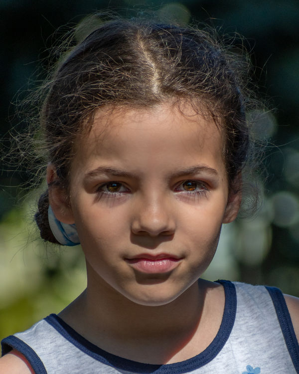
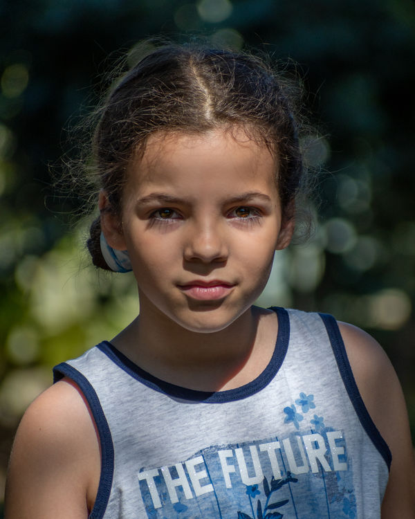
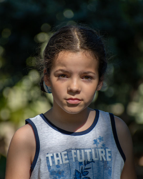
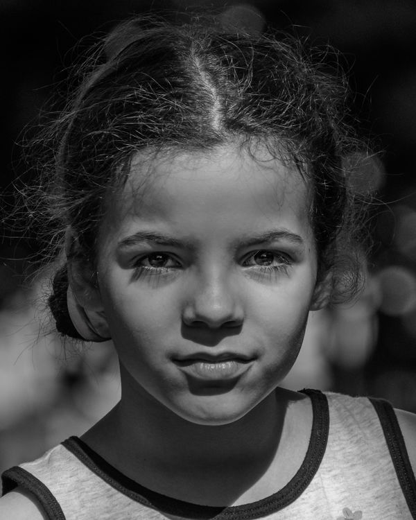
I'm interested in hearing what you feel or see when you look at these images. They are copies of two captures and cropped to 8x10. One of the color copies is cropped more but still for 8x10. Any technical feed back is welcome too.
Jul 7, 2019 21:34:59 #
bertloomis
Loc: Fort Worth, Texas
Definitely color. Those beautiful brown eyes come through really well in the first two.
Jul 7, 2019 21:56:21 #

Jul 7, 2019 22:06:16 #

Jul 7, 2019 22:40:28 #
Jul 7, 2019 22:45:51 #

TylerDurdensReel wrote:
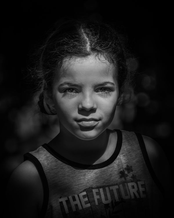
Thanks for the feedback. How is this approach?
Nope.
Jul 7, 2019 22:52:03 #
TylerDurdensReel
Loc: Fresno Ca.
WILLARD98407 wrote:
Nope.
Can you elaborate? Is it the monochrome in itself or is it something about a feeling or thought that the image evokes?
Jul 7, 2019 22:53:05 #
OneShot1
Loc: Wichita, KS, USA
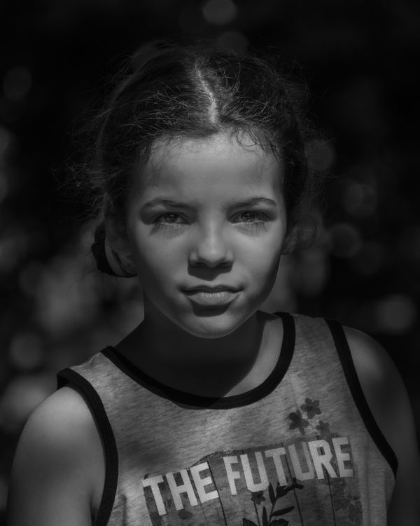
While I love monochrome I think the color #1 is the best. The lens falloff or vignetting seems too severe. The eyes are the window to the soul and all the B&W's downplay the eyes. A monochrome with bright eyes might win. How's this?
Jul 7, 2019 23:03:36 #
Color is much better, but the shadow over her eyes subdues the color of her irises. I would try again and bring out the eye color more.
Jul 7, 2019 23:29:05 #
TylerDurdensReel wrote:
Can you elaborate? Is it the monochrome in itself or is it something about a feeling or thought that the image evokes?
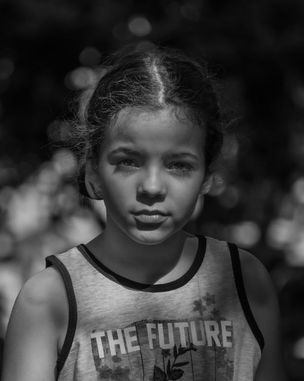
Sorry, but to me the contrast and shading makes this look like a mug shot more than a portrait.
I'd go with no. 4 in the original series and work on opening the shadows for starters
Jul 7, 2019 23:44:52 #
TylerDurdensReel
Loc: Fresno Ca.
WILLARD98407 wrote:
Sorry, but to me the contrast and shading makes this look like a mug shot more than a portrait.
I'd go with no. 4 in the original series and work on opening the shadows for starters
I'd go with no. 4 in the original series and work on opening the shadows for starters
Please, no apologies necessary. I welcome the feedback. Thanks
Jul 8, 2019 00:02:52 #
TylerDurdensReel
Loc: Fresno Ca.
OneShot1 wrote:
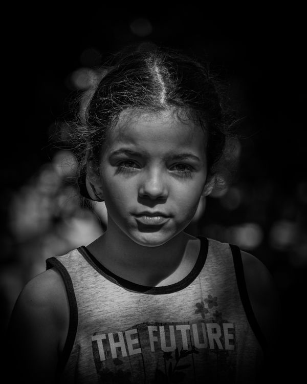
While I love monochrome I think the color #1 is the best. The lens falloff or vignetting seems too severe. The eyes are the window to the soul and all the B&W's downplay the eyes. A monochrome with bright eyes might win. How's this?
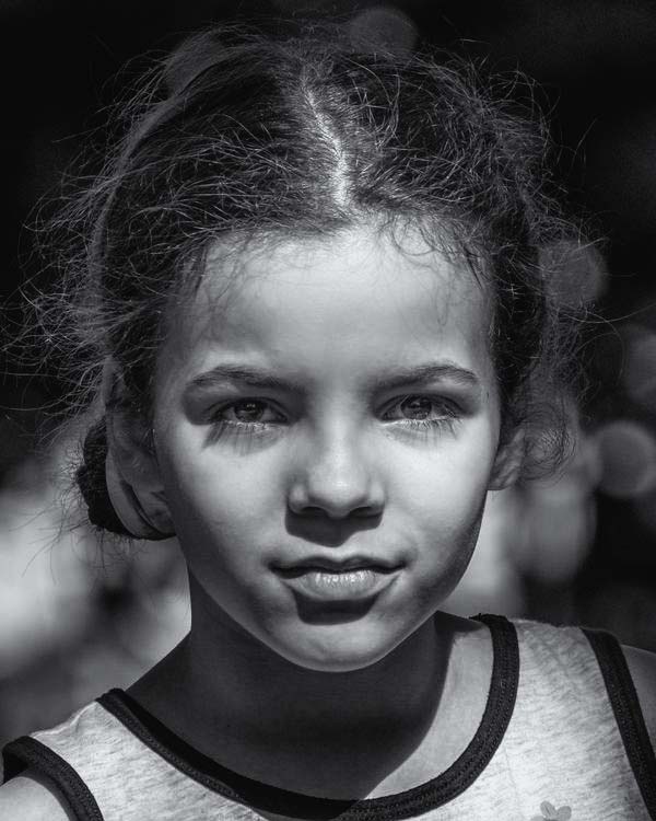
This is as far as I can go with the eyes without making them look out of context with the rest of the image. I like the closer cropped version but the text on the shirt has to be on the image. I'm also working with a new monitor and I'm not sure if I have it calibrated just right yet.
Thanks again for the suggestion and feedback.
Jul 8, 2019 07:10:11 #

Jul 8, 2019 07:10:57 #

For my tastes , the colored versions are more desirable. If I were going to do monochrome , I would choose a silverized type of finish ......similar to old print development processes from years gone by. I wish I could recall the newer version of this method. Hopefully someone here may actually know the exact title for it . Lovely girl and her eyes are so well captured.....that's important.
Thanks for submitting it.
Thanks for submitting it.
Jul 8, 2019 07:13:08 #

If you want to reply, then register here. Registration is free and your account is created instantly, so you can post right away.