Monthly Masters' Critique - Thomas Kinkade - Kitsch or Classic?
Jul 2, 2019 11:20:01 #

kenievans wrote:
Minnie I use some of his techniques as well. I le... (show quote)

I like this one.
For myself, as an Australian, I was probably influenced by my fathers (who was a coal miner) Saturday Evening Post ,magazines in the mid to late 1950's. So when we were fortunate enougth have at least 3 weeks, in the fall, in New England as part of our 2008 vacation, A visit to the Norman Rockwell museum was a natural.
.
Jul 2, 2019 18:37:05 #
minniev wrote:
b Introduction /b br Those of you who’ve followe... (show quote)
It is unfortunate that the discussion of this topic started with lampooning those that don't like Kinkade's work. Oh well, I'll proudly stand with the "stuffed shirt swollen headed" artistes and the members of the "superior/elite class" to express my dislike of Kinkade's paintings.
Kinkade, the King of Kitsch..... Assuming the mantle "Painter of Light" is preposterous when the art world has given us the likes of Vermeer, Rembrandt and Turner! If Kinkade did influence landscape photography, I see that as a sad development that helps explain the preponderance of the garish colors we see today....
Here's some interesting commentary from an article in the National Catholic Register (http://www.ncregister.com/blog/simcha-fisher/whats-so-bad-about-thomas-kinkade):
"By showing light in the form of exaggerated highlights, fuzzy halos, and a hyperluminescent shine on everything, regardless of where they are in the composition, he isn’t revealing the true nature of—anything. It’s a bafflingly incoherent mish-mosh of light: an orange sunset here, a pearly mid-morning sheen there, a crystal-clear reflection in one spot, a hazy mist in the other—all impossibly coexisting in the same scene."
And:
"Kinkade isn’t content with shying away from ugliness: He sees nothing beautiful in the world the way it is. He thinks it needs polishing. He loves the world in the same way that a pageant mom thinks her child is just adorable—or will be, after she loses ten pounds, dyes and curls her hair, gets implants, and makes herself almost unrecognizable with a thick layer of make-up. Normal people recoil from such extreme artifice—not because they hate beauty, but because they love it.
Kinkade-style light doesn’t show an affection for natural beauty—it shows his disdain for it. His light doesn’t reveal, it distorts. His paintings aren’t merely trivial, they’re a statement of contempt for the world."
Jul 3, 2019 00:15:50 #
minniev wrote:
b Introduction /b br Those of you who’ve followe... (show quote)
I am, definitely, a fan of Thomas Kincade (TK). I have been fascinated by his work for a long time. But like all artists, and many other things in life, there are images that I like and others that I don’t. I especially like his landscape, cityscape and seascapes. I’m not fond of his Disney, superhero, sports and summer tradition images. For me, the idealistic/fantasy of many of his images are fascinating. After years of ‘hustle and bustle’ of everyday life, his images present imaginative views of stress-free beautiful getaways. Couldn’t you imagine spending a week or two in the cottage and setting of TK’s “Mountain Paradise”?
I also find that his landscape views have a lot of similarities to some of the great American West artists of the mid-to-late 1800’s. Two artists that I’ve always greatly admired is Albert Bierstadt and Thomas Cole who painted in the style of the Hudson River School, i.e., large grand landscape views. A couple of favorites of AB is “Mount Corcoran” and “Among the Sierra Nevada’s. One of my favorites paintings of Thomas Cole is “The Course of Empire”. Compare these to TK’s “High Country Wilderness”. I find a lot of similarities. I would find it interesting to hear your opinions on this.
In the case of your selected image, it’s not one of my favorites. But, it is in the style that I like.
Questions to answer:
1) I like this selected painting, but it’s not one of my favorites. But the image is in the style that I like of his. The composition works well. The focal point of the image is the lights of the cottage and the surrounding reflections. My eyes, first, goes to the light. The I roam around the image in a clockwise manner viewing the mountains, then the lake and back to the cabin. The light begins on one side and is balanced by the subdued light of the lake on the other side. The bright area are lower left and upper right, balanced by the darker upper left and lower right. There is enough secondary stories, such as the wildlife (ducks, deer, dog), a fisherman on the lake and a mountain stream flowing into the lake, to keep the mind interested. I see this in a lot of museum paintings.
The lighting fits the subject, which is the cottage. The mountains are lighted just enough to complement the scene and provide a sense of direction and time of day. As an engineer, I’m used to paying attention to the small details and looking for inconsistencies. When I view this scene, my mind isn’t confused or conflicted.
The subject matter is of particular interest. We are hikers and we spend a lot of time in the wilderness. We’ve seen many scenes like this, less the cottage, while walking mountain trails. This lake with the mountain backdrop could easily be based in scenes from the Rocky Mountains, Glacier, Grand Tetons, etc., during a nice sunset. Many times we’ve fantasized about having a small house/cottage on one of the many lakes we visited. This scene easily represents the mood we’ve felt during those times.
2) Some of his work, especially his earlier work was very good. Much of his later work, I feel pandered to the tourist and younger audiences, such as the Disney and super hero themes. However, I have no problem with this. There is definitely a market for this art, so others must like it. TK was not only an artist, but also a savvy businessman. He provided a desirable product to his market segment. I can’t fault him for that and I’m sure he satisfied many of his customers. So, what I consider ‘kitsch” others would consider “Classic”. And at the same time, what I consider “Classic” others might not give it a second glance.
The bottom line is, there are many many reproductions of his art hanging on walls in homes all around the world.
3) I can’t say that modern landscape photography is influenced by Kincade, but there is a lot of similarities between his paintings and good photography. Just go to 500px and search on landscape or cityscapes for examples. I follow a few photographers and a couple that come to mind is a Korean Photographer, Jaewoon U and a French photographer, Serge Ramelli. Both use a lot of bright and subdued colors in their scenes and they’re definitely not SOOC photographers. I’ve attached links to a few images of each that I find have a lot of similarities to TK’s. They're definitely worth a lot at.
Jaewoon U
“Arrives in Heaven”
https://500px.com/photo/129299193/arrives-in-heaven-by-jaewoon-u?ctx_page=1&from=search&ctx_type=photos&ctx_q=Jaewoon+U
“Another Day”
https://500px.com/photo/235548135/another-day-by-jaewoon-u?ctx_page=7&from=search&ctx_type=photos&ctx_q=jaewoon+u
Serge Ramelli
“Ile Rousse Panorama”
https://500px.com/photo/15246555/ile-rousse-panorama-by-serge-ramelli?ctx_page=12&from=search&ctx_type=photos&ctx_q=serge+ramelli
“Winner of the competition”
https://500px.com/photo/217960101/winner-of-the-competition-by-serge-ramelli?ctx_page=24&from=search&ctx_type=photos&ctx_q=serge+ramelli
4) I don’t think so. I visit the Getty museum in LA, periodically, to enjoy the paintings of some of the old masters. TK’s images aren’t any more or less colorful, brilliant, detailed than many of the old masters. This is just the difference between painting and photography. I think many photographers would become better photographers if they studied the paintings of those old masters. It doesn’t have anything to do with the “HDR techniques”. HDR is a technique that attempts to replicate paintings. Let’s face it, painters aren’t constrained by the lack of dynamic range in an image as photographers are.
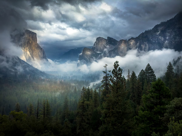
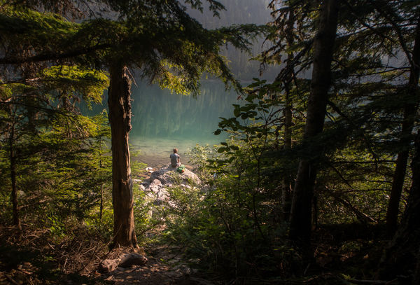
5) Here are a couple of grab shots. I didn’t think about any artists when I captured these images, but the scenes could have need painted by TK. BTW, both images were taken with the camera that I had available at the time, my iphone.
Yosemite valley was taken as we were coming back from the southern end of the park. We were headed back to the hotel and based by Tunnel View. I hadn’t thought about stopping because I have lots of images from that location. But the drama in the sky and the low lying clouds were exceptionally interesting, so I stopped. I intentionally processed the image for a painterly effect, i.e., lower contrast, muted colors and a bright focal point.
The second image was another grab shot as my wife and I were hiking along Avalanche Lake in Glacier. The lone hiker in the bright morning sunlight, the contrasting colors and reflections in the background water and the shaded tress framing the subject makes me think of TK where he uses light to highlight his subject.
Mike
Jul 3, 2019 00:39:57 #

AzPicLady wrote:
I was sitting in a discussion group of artists led... (show quote)
Thanks for sharing a thoughtful consideration of the artist and the image.. It is interesting that you separate the scenes from the paintings, which may explain my own contradictory feelings about Kinkade. I think I’d like them better as jigsaw puzzles too, I’ve always liked jigsaw puzzles from Currier and Ives prints. Last year I was on a cruise where the art galllery was a Kinkade exhibit and I found my teeth on edge when I walked through it. Yet I am attracted to scenes like those in some of his paintings...
Jul 3, 2019 00:48:53 #
kenievans wrote:
Minnie I use some of his techniques as well. I le... (show quote)
Nice image Kennie, and not as sugary as the paintings but rich and softly mysterious.
Yes, I like Rockwell better too. He idealized life in many cases but not the people so much, they seemed like ordinary folks you might know. .
Jul 3, 2019 00:52:31 #
RichardTaylor wrote:
So do I.
How far away from 'realism" are B&W images, especially B&W landscapes?
Here are a couple of mine that are a nod to Thomas Kincade.
Mostly it is just PPing the original raw files, however the second one has a big dose of of Topaz Adjust (a HDR preset).
.
How far away from 'realism" are B&W images, especially B&W landscapes?
Here are a couple of mine that are a nod to Thomas Kincade.
Mostly it is just PPing the original raw files, however the second one has a big dose of of Topaz Adjust (a HDR preset).
.
I like both, Richard. I love doing this kind of creation, and can get lost in the fun of it.
Jul 3, 2019 01:04:34 #
srt101fan wrote:
It is unfortunate that the discussion of this topi... (show quote)
Thanks for sharing a persuasive case for the “kitsch” side! All opinions are welcome here!
Interestingly, we had similar diverse and strong opinions when we did a thread on Peter Lik, who has been accused of being the Kincade of landscape photography (though there are others I think are equally deserving of that dubious honor).
The last section of the article you quote is especially interesting in light of Kinkade’s troubled, conflicted life.
Jul 3, 2019 01:09:15 #
SalvageDiver wrote:
I am, definitely, a fan of Thomas Kincade (TK). I... (show quote)
Some great example, and thanks for the links.
Jul 3, 2019 03:46:48 #
SalvageDiver wrote:
I am, definitely, a fan of Thomas Kincade (TK). I... (show quote)
Your two photos are great.
Jul 3, 2019 08:48:43 #
SalvageDiver wrote:
I am, definitely, a fan of Thomas Kincade (TK). I... (show quote)
Thank you for a thorough and thoughtful discourse on the appeal Kinkade holds for you and for many viewers. And especially for answering the questions! Yes, I see some distinct similarities between “Among the High Sierras” and “High Country Wilderness”. Was it intended? I don’t know. For my part, the components of Kinkade’s work that appeal to me have to do with my own attraction to the Hudson River School painters. The Hudson River paintings are often idealized landscapes, and some critics found fault with them as well.
I’m glad you shared the links. I agree with you on the similarity to Kinkade. I would have identified Ramelli as one who produced such works, but I hadn’t heard of Jaewoon U, so thanks for the introduction. I had also thought of Mark Adamus in this circle of dramatic use of light and color. A lot of landscape photographers on 500px seem to use various elements of this style of photography. I personally have some mixed feelings about it, though at the same time I use some of the elements myself.
Your shared images are lovely. The tunnel view one is especially beautiful.
Jul 3, 2019 14:18:08 #
SalvageDiver wrote:
I am, definitely, a fan of Thomas Kincade (TK). I... (show quote)
Now I have had time to go back and look at the links also. Outstanding from my pov. They all share a "look" with many of Kinkade's works and as Minneiv has said the Hudson Valley School landscape artists. I will add that many features of this look appear in the Romantic artists in general.
As one very successful European singer said after being told that many critics thought her style was "just pretty music" - "What's wrong with pretty?" Or something close to that, I read it a long time ago.
Jul 3, 2019 15:35:10 #
robertjerl wrote:
Now I have had time to go back and look at the lin... (show quote)
Hi Robert,
I was unaware of the controversies around TK until I read this thread. I think your European singer had it exactly right. I also wonder about the artistic skills of those critics that throw stones?
I'm not a good study of the arts. I only became familiar with the Hudson Valley School thru appreciating Albert Bierstadt's paintings, especially his painting of Mt Corcoran. I read some of the history behind this painting only to learn that it was in my back yard and also there's some confusion about what peak was actually painted. This introduced me to the Hudson Valley School painters and found that I enjoyed a lot of the works from these artists also. I've even hiked out to the mountain looking for the spot illustrated in the Mt Corcoran painting. And I have an opinion on that also.
I also see a lot of similarities to the landscape paintings of the Renaissance period as well in many of the landscape photographs of today. Based on what I read in Minnie's reference articles, I'm of the opinion that those critics have grossly overinflated egos. In the latter part of AB's life, the art establishment treated him pretty harshly also. But today, if I had even one of AB's paintings, I could afford all the camera gear I ever dreamed of without regard to brand or price and then some.
In the end, only mother time is the final arbiter of someones value to society, not the long forgotten critics. So, like your singer, I like what I like and that's my opinion.
Thanks for the conversation
Mike
Jul 5, 2019 12:28:00 #

A very thorough and unusually fair approach to Kincade. Fine questions, too.
Questions to Consider
1. What do you think of the painting? Composition? Subject matter? Lighting? Color? Level of detail? Mood? Would you want this on your wall? Why or why not?
The painting checks a lot of important compositional boxes. It is a balanced triangular composition with counter-triangles. The color theory is good for directing attention and having unity with variety. Blur it and you have a pretty good abstract.
However it is not an abstract, and there's the potential problem: the subject matter. Compare this painting to others inspired by nature scenes. The Hudson River School painters Asher Durand, Thomas Cole, Frederic Edwin Church, and George Inness, who painted to show America in the 19th century: discovery, exploration, and settlement. Or the awe of The Luminists, who painted to show the presence of a divine Being in nature. Or Andrew Wyeth, who painted the awesomeness of nature in an entirely different way, often from solitude and separation. All of these, and other "realistic" painters were painting about something grand in the human condition. Kinkade? He seems to try to just please, with hyper satureated "pretty." Too saccharine for some, a high emotional pitch for those enjoying the imagined nostalgia
2. What is your opinion of Kinkade’s body of work? Classic or kitsch? Why?
Kinkade's work is nice entertainment for some. As decoration, i.e., not meant to convey deep meanings about the human condition (usually obvious when comparing him to museum-level landscape painters), his work comes down to taste, like favoring a certain ice cream flavor.
3. Do you see any indication of influence of the Kinkade style on modern landscape photography?
Some certainly work that way, commercially. Fine Art Photography? No.
4. Some critics that cross the boundaries of painting and photography have ventured that HDR is the photographic expression of the Kinkade style. What are your thoughts on that “accusation”?
Baloney. 😊 HDR has little to do with hyper-saturated color, and besides, the subject matter and the photographer's intent are primary. The style is just the best means the photography feels he has to convey his idea/emotion.
5. Any of us would probably have screeched to a stop if we passed such a scene as this on our travels, intent to capture it. Have you run across similar scenes? Share one if you will, and tell us about your experience and your editing. Then tell us if the Kincade approach might have influenced your choices. (Extra points if you create a new Kinkade-ish image using the suggestions he gave in the Vanity Fair article)
I often am stopped by something that touches my basics interests as conveyed in my work. So, just a "lovely scene" is not enough for me. A beautiful scene that holds somethin unique but true, does stop me. Attached is an example.
Jul 5, 2019 14:17:26 #
artBob wrote:
A very thorough and unusually fair approach to Kin... (show quote)
Thanks for a detailed reply (and for your ongoing support for these Masters discussions). I tend to agree with your description of Kinkade’s work as entertainment and decoration, where it is immensely successful. I doubt that his work will ever be displayed in prestigious museums but I don’t think Kinkade imagined them to be either. If he is showing us any grand human truth through his art, it is the power of nostalgia, particularly imaginative nostalgia. The yearning for the perfect little cottage in the most beautiful and romantic location, lit by lantern-light and beckoning us “home” is not product of our own real experience but of an imaginary past, or a past imagining. Kinkade harnessed that power successfully.
Jul 5, 2019 14:23:18 #
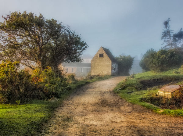
Here is my Kinkade-ish offering. I have made several trips to the island of Monhegan, which features many Kinkade-ish scenes because it’s kind of like Brigadoon, a village caught in another time with historic weather worn cottages, unpaved streets with no street lights, people engaged in the same fishing trade as their great grandparents. It is a place sprung straight from the pages of Sarah Orne Jewett. The mists and fog and light make these kinds of images fun to capture.
If you want to reply, then register here. Registration is free and your account is created instantly, so you can post right away.